Page Contents
Do you get the desired traffic on your website, but can’t convert your visitors into customers? And do you know that a great checkout page design is essential for any eCommerce website to prevent losing online sales?
The checkout page is one of the most important stages of your online store’s customers’ journey. Shoppers might go through all the steps before checkout, but if you haven’t designed the page carefully, you will fail to convert them. That’s why you should design a high-converting checkout page manually or with the help of a CRO tool.
As the checkout page is where the conversion happens, you must ensure that the process is smooth enough to get the most out of your visitors. Therefore, you should constantly test and optimize your checkout process to get more and more conversions.
To help you out, we’ll discuss some of the best practices for designing a better checkout page and, then, show you some great examples of checkout page designs for both desktop and mobile devices.
What Is a Checkout Page?
To sell your products or services, all your clients must pass through the last stage of your sales funnel.
This final step is going through the checkout page on your eCommerce website, where the payment process and transaction occur. Here, your customers see all the shipping information as well.
The checkout page is also where customers complete their order, choose a shipment and payment method, and enter their information.
Basically, there are two types of checkout pages: one-page and multi-page. Just keep reading to see how these two are different.
1- One-Page Checkout
As it speeds up the payment process and is more convenient for customers, one-page checkout has become more popular. This type of eCommerce checkout page design improves the user experience since customers don’t have to wait for multiple pages to load. Also, users don’t need to navigate back in the browser to edit the information they have entered.
However, designing a one-page checkout is challenging when collecting a larger amount of data. Why? Because the shopper might get overwhelmed by all the information they have to enter and also by the messy page layout.
Nevertheless, if you think your customers abandon their cart due to a technical or marketing issue, you can use a website visitor tracking tool to find the solution to your problem.
2- Multiple-Page Checkout
Despite being less user-friendly, this type of checkout page design facilitates collecting customer data. For instance, if a shopper abandons the checkout process at later stages, you still have captured the data entered earlier. Remember that creating clean and simple page layouts is easier when the forms and fields are divided between several pages.
One-page Checkout vs. Multi-page Checkout – Which One Is Better
Although single-page checkout is more popular among eCommerce and online retailers, multi-page checkouts can be just as efficient, especially for mobile users. And each of these checkout pages has its advantages and disadvantages. Let’s take a look at their pros and cons.
One-page Checkout Pros
- Faster checkout process: Since all the fields are in one place, it takes less time to complete single-page checkouts. And no additional clicks or loading screens are required.
- Easier to navigate: If customers need to check what information they had written in the previous sections, they just have to scroll the checkout page up. There is no need to go back to the previous page which makes it more convenient.
One-page Checkout Cons
- Not suitable for data collection: It’s always possible that customers get bored and abandon their shopping cards. Unless you use a session recording tool for your checkout process, there is no way for you to understand why they didn’t finish checkout. And all the information they have filled in will be gone.
- Not easy to design: Designing a one-page checkout is a nightmare for UX designers. And most of the time, these check out pages are long, messy, and even confusing.
Multi-page Checkout Pros
- Better organization: Multi-page checkout UI/UX designs are much more user-friendly and less imitating. Since the checkout process is divided into separate pages and layers, customers won’t be overwhelmed by lots of empty fields in one place. Simplicity is the key to eCommerce checkout page design.
- Perfect for analyzing sales funnel: Since you have split the checkout process into different pages, with the use of web analytics tools you can exactly detect where customers are dropping out of the process, and make the changes accordingly.
- Suitable for email marketing: Even if customers don’t finish their shopping, you can still collect some precious information like their email addresses. This allows you to send follow-up emails in case they end up abandoning the checkout. In addition, you can use the information for running more personalized email marketing campaigns.
Multi-page Checkout Cons
- Slower checkout process: The worst part about multi-page checkout page design is its longer duration. Dividing the checkout process into separate parts results in more clicks and more waiting for each page to load.
- Frustrating navigation: Editing or reviewing the previously entered information in a multi-page checkout is a time-consuming procedure. Customers have no choice but to go back and forth between different pages which may result in abandoning the purchase altogether.
Importance of Great Checkout Page Design
Imagine you’ve done everything right until the user enters the checkout funnel. Your marketing efforts have paid off, and your website’s design and navigation have brought them to the payment stage. Now, they are ready to take the last step and make a purchase.
However, because of the poor checkout page design, suddenly, all your hard work vanishes into thin air. Feels bad, doesn’t it?
According to Baymard research, %22 of shoppers abandon their cart just because the checkout process is either very long or complicated.
While shopping cart abandonment is inevitable, you can take steps to avoid it. The very least you can do is minimize the number of people who abandon the checkout process. Shopify checkout page design is one good example of big corporations that use this approach.
Basically, you don’t want to give the customer an excuse to leave. It is best to use a great checkout page design, disclose shipping prices, provide payment alternatives, and employ the appropriate CTAs.
Everything you do here should lower the time and effort required to finish the checkout process. To do so, you can use a website visitor recording tool and see where your users tend to leave the payment page.
This way, you can also recognize whether they face a technical bug or any inconvenient in the process that prevents them from completing the purchase.
Using WatchThemLive’s website visitor recording tool, you can record your customer journey and share it with your team members, track all the events, and reach simplified analytics by applying different filters to the recorded sessions.
Top 10 Checkout Page Design Best Practices
To convert a visitor into a loyal customer and create an exceptional buying experience, you need to consider some important tips. Here are some great strategies for a better checkout page design so you can optimize your conversion rate and create the best checkout experience:
1- Enable Guest Checkout
%23 A large number of buyers abandon online stores if they have to create a new account. Forcing customers to create an account to complete their purchase is one of the most significant friction points in a checkout design that prevents conversions. That’s why you should allow guest checkout if you don’t want to disappoint your customers.
2- Minimize Distractions
It’s important to eliminate distractions so that shoppers can focus on completing the payment. Therefore, make sure to remove any unnecessary elements from your eCommerce checkout page design.
An excellent way to identify distractions on your website is to use a heatmap tool. To set up heatmaps on your website, you need a behavior analytics tool such as WatchThemLive. With this tool, you can track visitors’ interactions on your website and find distracting elements.
WatchThemLive heatmap tool enables you to detect the areas users click the most. Therefore, you will see which elements might be distracting your visitors and drawing their attention away from the main goal.
3- Don’t Forget Mobile Users
Creating a mobile-friendly design is a must, as more than %58 of website traffic originates from mobile devices. Optimizing your checkout page design for mobile users is essential if you don’t want to lose these customers.
Mobile users tend to behave differently during their time on the check out page. With a behavior analytics tool, you can track users’ activity and design an Optimized checkout page.
4- Include Trust Signals
Letting users know their data is safe with you will make them willing to make a purchase on your website. Trust signals make customers more confident and secure about buying from your online store.
5- Inform Shoppers of Additional Costs
One of the main reasons buyers abandon their purchase is unexpected costs. Therefore, make all the information about taxes, shipping costs, and other charges clear as soon as possible in the checkout process. This is an important factor if you want to make the best checkout page design
6- Use Form Validation
Don’t wait for customers to complete a whole step to notify them about input errors. Instead, let users know as soon as they enter the wrong input. When customers encounter multiple error messages at once, they might get frustrated.
7- Offer Multiple Payment Options
One of the most important reasons for cart abandonment is the unavailability of multiple payment options. Customers enter your sales funnel and walk through every step of the user journey. But right before purchasing, they find out their favorite method of payment is not available on your website. And just like that, all your efforts go down the drain. Therefore, having multiple payment methods on the checkout page is vital for online retail.
8- Prioritize Your Audience Comfort
Using a simple layout for your checkout page UI will go a long way. There are a few matters that must be met to reach this level of simplicity:
- Keep all the similar information near each other. For example, if your customer must fill out a form that requires information about address and name, make sure to put them near each other. Keep this logic in mind while designing other parts as well.
- It’s better to include sample text in your form fields to show the exact data that you need from your customers. This will reduce the distraction and the time spent on the forms overall.
9- Use a Progress Bar
Giving your consumers methods to see their progress, such as a bar graph or step-by-step guide, lets them know where they are in their cart checkout process.
Customers can better grasp how many steps remain to complete their purchase and get a feeling of direction from this visual indication.
Additionally, a checkout design with this feature makes the process seem less complicated to customers, which motivates them to finish it all the way through.
10- Send Confirmation Email
Make sure to use a well-known bulk email sender to reach out to your customers after their purchase is finalized. These emails must contain detailed information on the order, the process of shipping, and perhaps some sort of discounts or promotional offers for their next purchase.
This kind of email will go a long way in building trust between you and your customers.
Top 10 Checkout Page Design Examples
To have a bigger picture of what we’ve already mentioned, let’s see some of the best checkout page design examples so you can better understand how to develop and optimize yours.
1- Walmart Single Page Checkout
First of all, Walmart allows customers to complete their purchases without signing up.
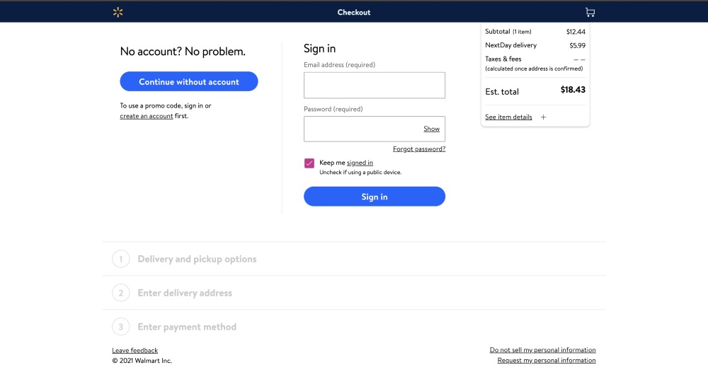

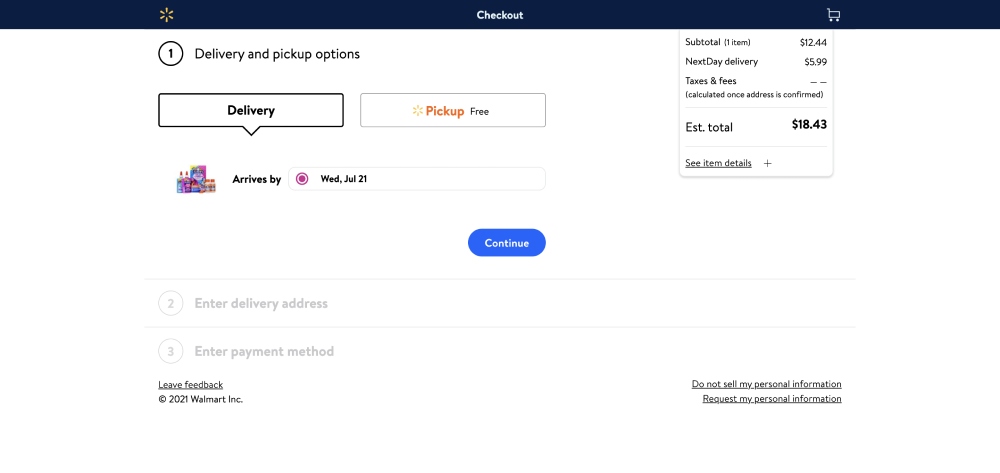
This eCommerce store has divided the one-page checkout into three sections, so users don’t have to fill out a single long form.

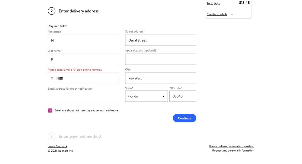
Also, it notifies the customer whenever they enter a wrong input.

2- Nike Checkout Page
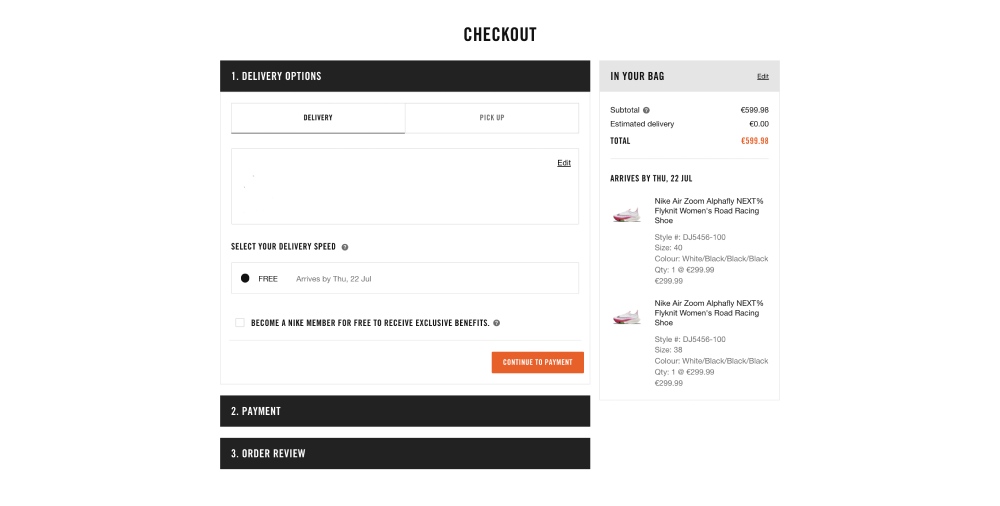
This platform also has a three-step checkout page with a minimalist approach in mind. Whenever you fill a field, you’ll see a green checkmark if the input is acceptable or an error message if not.
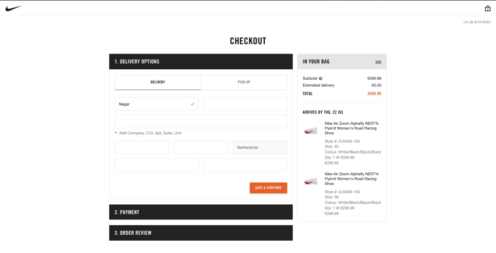

You can select from multiple payment methods, which is a great strategy to increase conversions as it allows shoppers to choose their preferred method.

3- Best Buy Checkout Design
Another eCommerce store with a good design that is one of the good checkout page examples and allows guest checkout is Best Buy.
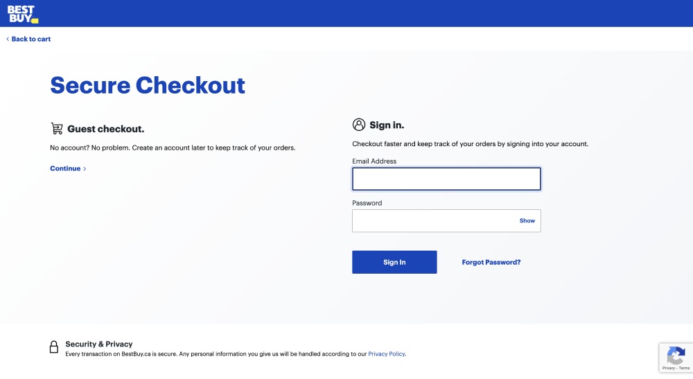

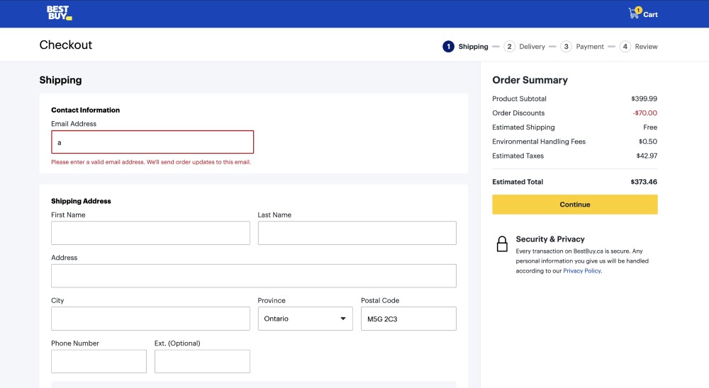
This online store has a multiple-page checkout and uses a progress indicator to inform the shopper at which step they are. The progress indicator also enables users to navigate between the checkout steps.

4- ASOS Checkout Page
Although ASOS enables customers to purchase without creating an account, the guest checkout option is less visible than in the other examples; you can find it on the signup page.
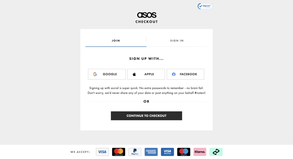

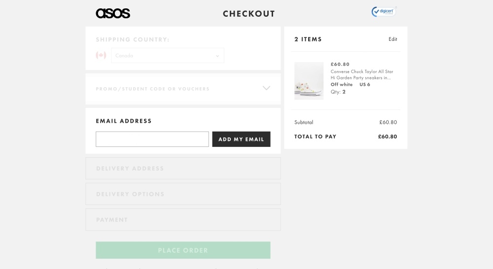
As you can see, the checkout page design is clear, simple, and user-friendly, and the checkout process includes 4 small steps, removing all distractions.
Moreover, you can see a trust signal in the upper-right corner.

5- Etsy Multiple Checkout Template
Etsy offers guest checkout as the first option to deliver a better user experience.
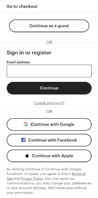

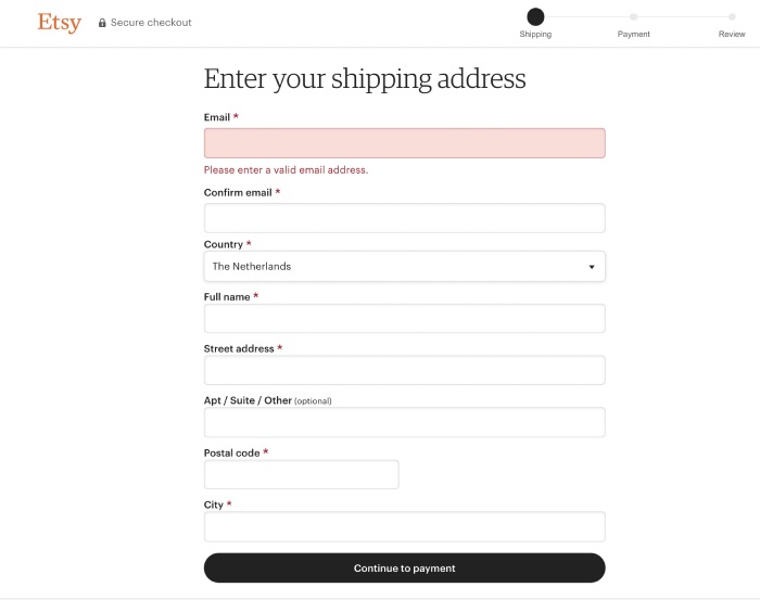
This eCommerce store has a very simple multiple-page checkout process. You can’t see any unrelated element to the checkout process to avoid distractions.

6- Rollink Checkout Design
This collapsible suitcase producer uses a one-page approach for its eCommerce checkout page design.
As you can see, they have considered every practice that we have mentioned before. No distractions on the page, good CTA positioning, multiple purchase options, and an easy-to-understand form to be filled out.
These characteristics make Rollink a good example of a well-designed checkout page.
7- Threadless Checkout Template
A great example of an eCommerce checkout page design that skillfully combines design and functionality is provided by Threadless. They are a well-known design-led company with a thriving artist community. Their checkout process is beautifully showing their brand and the values they stand for.
The two important features that can be seen immediately are a secure payment option and the ability of real-time cart editing.
8- Amazon Checkout Design
The world’s largest online shop, Amazon, has outstanding checkout pages. Amazon makes a huge impact on customers by streamlining the purchasing experience and emphasizing ease of use, security, and user-friendliness.
As you can see, the process is in a one-page design which has been divided into three sections. This helps prevent customers from feeling overwhelmed and abandoning the process. You can also easily notice the shipping price which is one of the best practices for a good checkout page design.
9- Byredo Checkout Template
Byredo is a makeup producer and distributor that has an outstanding checkout page design. They employ best practices like producing a clean, straightforward design that makes their checkout page stand out.
Some features that can not be seen in the picture are that they offer error alerts and form validation to guarantee that users submit their data accurately.
10- Tommy Hilfiger Single Page Checkout
Tommy Hilfiger’s checkout page design balances style and readability beautifully. The order summary area provides users with a clear demonstration of what information they need, such as shipping and tax costs.
This page checkout’s two standout features are that it includes a back-to-top button for simpler navigation, in addition to a section dedicated to donations invites people to support the community.
Now that you are familiar with the best eCommerce checkout page designs, it’s time to introduce the top cart page designs for mobile users.
3 Best Mobile Checkout Page Examples
Considering that nearly one-third of online shoppers are mobile users, optimizing the eCommerce checkout page design template for mobile users is a must. And the good news is that there is not much difference between websites and mobile checkout pages. Therefore, the same rules are applied to both platforms.
However, due to limited space on the mobile screens, the checkout page UI/UX design should be extra optimized. Therefore, most of the mobile checkout page designs are divided into different sections to make it less confusing for mobile users.
Let’s discuss the top three checkout page examples for mobile devices to give you a better understanding.
1- Casper Shopping Cart Design
Casper requires no sign-up for purchasing. And there are no distractions in its checkout page design. This eCommerce website was designed as a simple one-page checkout but structured as multiple steps to make navigation easier.
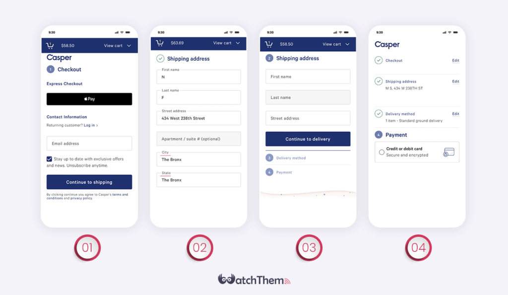

The most interesting point about Casper’s checkout process UX is that all the sections on each page are not going to be displayed altogether. Instead, after entering the information in the first field, the next one will be visible.
In case of noticing any mistakes, the edit button for each section is always available. Undoubtedly, Casper has designed one of the best checkout pages for mobile users.
2- Maplin Checkout Page Design
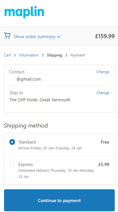
Only necessary items are displayed on Maplin’s mobile checkout page design. This platform has a 4-step multi-page checkout. And its progress indicator displays how far you are to the end of finishing your shopping.
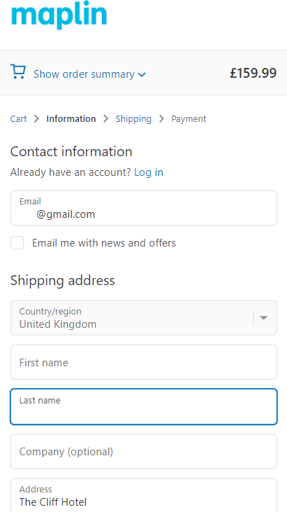

Please notice how ‘show order summary’ enables customers to take a short glance at all the information they have entered and prevents a messy checkout page design. This simple and clever design removed one of the main obstacles in mobile users’ checkout journey.

3- Apple Checkout Process
Similar to many other eCommerce websites, Apple allows users to checkout as guest users. In this checkout page example, you find nothing extra. In fact, Apple even removed the progress indicator to make its checkout page UI design even simpler.
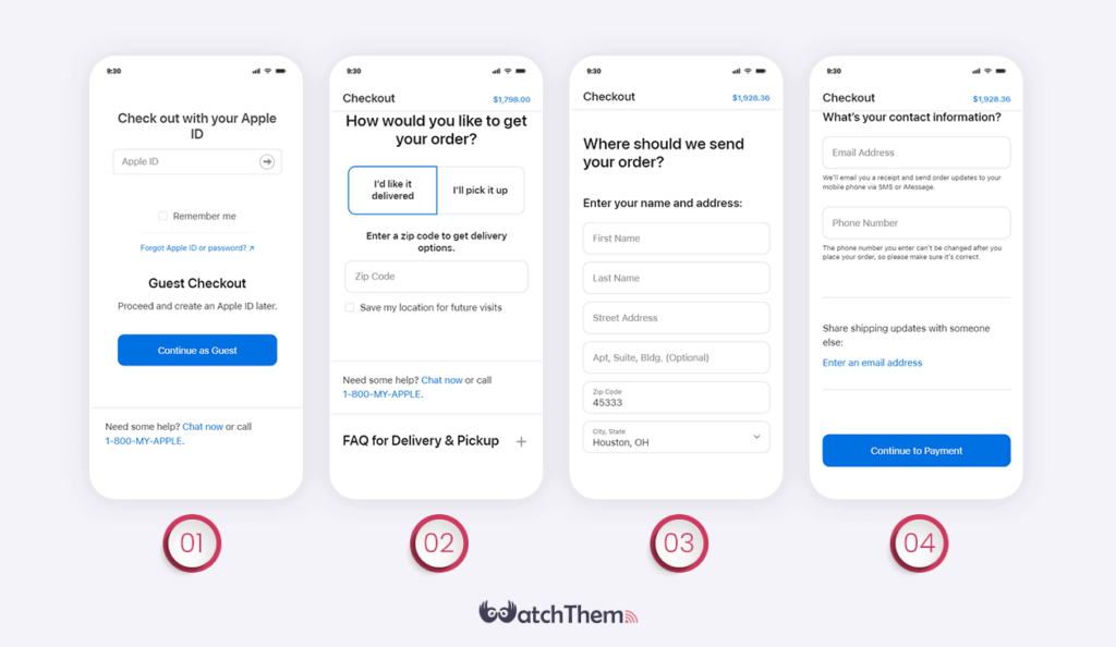

Apple gives you no excuse to abandon your card. There is always a chat button and a call button at the end of its checkout page template.
Plus, to provide a better user experience and minimize cart abandonment, there is a list of frequently asked questions to provide you with every information you need to finish your buying journey.
also, there are no distracting elements or unnecessary steps in this company’s mobile check out page design. That’s exactly what everybody expects from a brand like Apple.
FAQs on Checkout UX
Now that we have given you some checkout page design examples to clarify what characteristics a good design must have, it’s time to take a look at some frequently asked questions about eCommerce checkout.
1. What Is a Check Out Page?
In order to sell your products or services, you need to lead your customers to the end of your conversion funnel. A checkout page is where visitors complete their purchase process.
2. What Is The Checkout Process in UX?
This process starts with a user deciding to react to a ‘Buy’ CTA button related to a service or product.
Then, it continues by providing the data the website asks for, and, finally, ends with paying the money through a payment channel.
3. How to Optimize a Checkout Page Design?
There are some tips that prevent your users from abandoning your website while checking out:
- Using a simple structure,
- Providing more than one payment option,
- Asking clear and to-the-point questions,
- Offering customer support by email.
Last Words on Checkout Page Design
To develop a great checkout page design, you need to understand your customers’ expectations and test different ideas. Optimizing this page is necessary to convert more shoppers. Therefore, keep in mind to create a smooth and frictionless checkout experience to achieve your desired conversion rate.
Both types of checkout designs, one-page and multiple-page, have their own advantages and disadvantages. One-page checkout speeds up the process, but the challenge is to keep the page layout clean and uncluttered. On the other hand, a multiple-page checkout makes the process seem longer, but it’s easier to create a cleaner design.
After choosing your checkout design type, there are some strategies you should consider to improve the design. These strategies include enabling guest checkout, minimizing distractions, and optimizing the design for mobile users.
To better understand how to implement some of the best strategies for designing a great checkout page, we discussed some famous checkout page examples. Make sure to follow these examples to boost your eCommerce sales.
Remember that one of the best ways to optimize your checkout page design is by using heatmaps to identify opportunities for improvement.

