Page Contents
Leading more traffic to your online store usually is very expensive. Either you are spending on ads or creating valuable content or any other eCommerce marketing strategies. As a result, it is critical to convert the traffic you are already getting as much as you can.
Your Shopify landing pages have a significant role in your success as an online store. There are many things to consider. For example, to avoid missing purchases due to client impatience, your pages must load quickly. The pages must look and load flawlessly on a wide range of devices. You must find a good balance between catching customers’ eyes and not overwhelming them with visual information.
So let’s dive in to know what a landing page is, why it is important, and how to have a compelling Shopify landing page.
What Is a Shopify Landing Page?
A Shopify landing page is a separate page on your site designed to help you achieve a conversion goal.
The end purpose of these Shopify landing pages is to convince visitors to make a specific conversion move, such as:
- Purchasing a product.
- Promoting a sale or a limited-time offer.
- Signing up to get your store’s email newsletters
- Requesting for a free product sample
- Joining an exclusive waiting list to know about a particular product.
- Promoting a collection.
Because of a phenomenon known as the Paradox of Choice, dedicated landing pages focusing on only one eCommerce offer convert better. The more alternative offers you include, the more difficult it is for the customer to decide.
However, presenting a single clear option to visitors telling them what to do next simplifies the decision-making process.
Some eCommerce landing page types that are most common within businesses are:
- Product pages
- Product collections pages
- Discount pages
- Bundle pages
- Collaboration pages
- Seasonal pages
- Coming soon pages
- Consultation pages
How Is a Landing Page Different from a Product Page and a Homepage?
A product page is technically a type of landing page. However, there are some differences between them.
Unlike product pages, you can create landing pages for the different steps of the buyer’s journey. They are often made up of unique components such as:
- A heading
- A subheading
- A strong call to action
- A unique selling proposition
- Engaging visuals
Landing pages don’t include components such as navigational links to reduce distractions from the conversion goal.
The homepage of your Shopify store may be used for a variety of objectives, such as brand introduction, product introduction, and so on. In contrast, landing pages are utilized with a single goal in mind: to increase your online store’s conversion rates.
Why a Shopify Landing Page?
One of the best ways to increase revenue quickly is to create a landing page for Shopify. Consumers of eCommerce sites who arrive on a single-purpose landing page are more likely to buy than visitors to your homepage.
Visitors who arrive on a landing page rather than a product detail page (PDP) are less likely to bounce. This leads to fewer cart abandonments and more revenues for you.
In 2018, Monetate discovered the following differences between product detail landing pages and other landing pages:
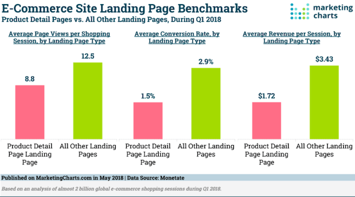

- In terms of conversion rate, visitors who landed on a landing page converted nearly twice (2.9%) as well as those who landed on a PDP (1.5%.)
- Visitors who arrive at a product page, visit 42% fewer pages than those who arrive at a Shopify landing page.
- Landing pages also generate two times as much income per session as PDPs (3.43% vs. 1.72%.)
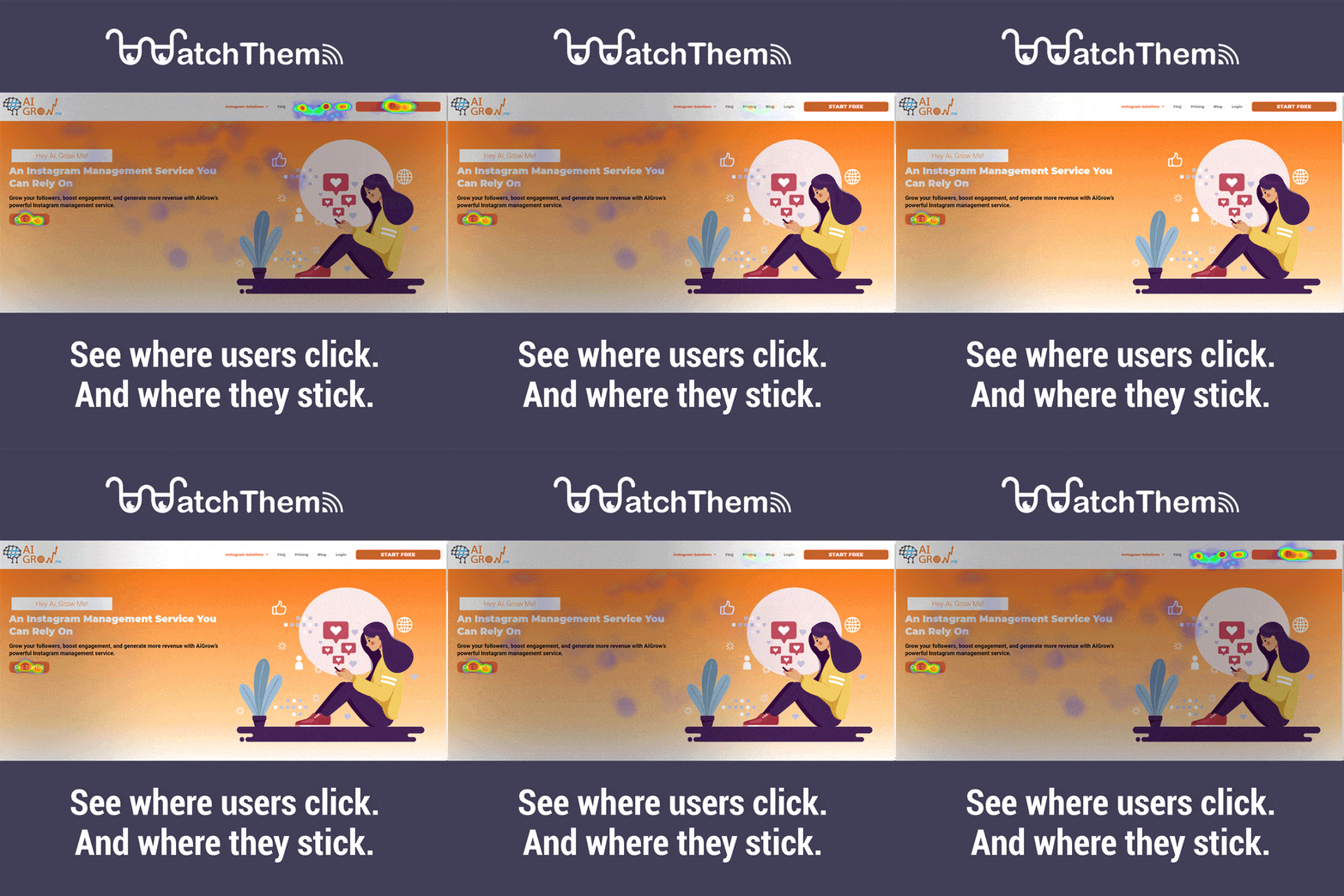
So, don’t waste those hard-won clicks and ad dollars on a regular product page. Test your Shopify landing page to see how it can be improved. Instead of relying on guessing, you may collect data to increase the performance of your marketing campaigns, using tools like heatmaps. A heatmap reveals which areas of your landing page are the most engaging. It will show you if key aspects on the landing page aren’t compelling enough; perhaps your call to action isn’t getting enough attention. You’ll be able to continue to readjust your landing pages over time to ensure you’re using the most effective content for your target audience since you know what problems there are.

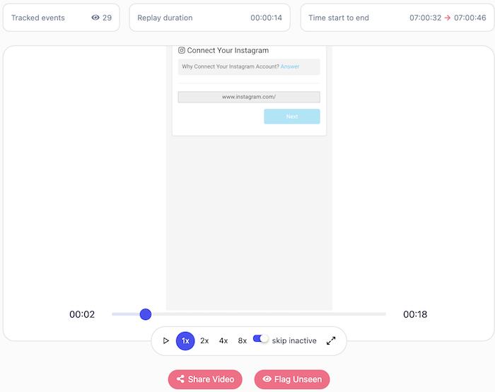
You can also use different tools of WatchThemLive such as session recordings which allow you to observe how people interact with your landing page. You can determine whether or not users are interacting as you intended.

It is important to know your audience. Website analytics is another feature you can use to know your audience and segment them more easily. This information enables you to design specific and personalized Shopify landing pages.
Want to try out WatchThemLive Website Analytics to optimize your Shopify landing page? Sign up now and get started.

Aside from increasing sales, creating customized Shopify landing pages for your site may help you in many ways, such as:
- You can speak to a certain segment of your customers. Creating tailored landing pages that show unique benefits for different consumer categories will let your visitors know they’ve arrived at the right place, encouraging them to make a purchase.
- After an ad click, your Shopify landing pages may provide users with relevant experiences, preventing them from leaving immediately.
Tips to Increase Your Conversion Rate with Compelling Shopify Landing Pages
Remember to make the Shopify landing pages as user-friendly as possible to increase your conversion rate. You can use different Shopify plugins to add more features to your Shopify landing page. For example, using a behavior analysis tool on your online store can help you better understand your customers and increase sales. WatchThemLive is one of these tools that provides you with powerful website visitor tracking features such as heatmaps and session replays.
When creating your Shopify landing page, keep the following points in mind to increase eCommerce sales:
1. Consistency
Here’s how you can keep your landing page design consistent and relevant:
- Make sure that your page matches the ad or link that directs people to it.
- Make sure the colors, tone, visuals, and other features on your Shopify landing page match your overall brand tone. This way, potential buyers will be able to recognize and trust the page right away.
2. Simplicity:
According to HBR, you should not make your customers think too hard.
- In your Shopify landing page design, make sure your visitors know where they are and why they are there at all times.
- After you’ve introduced your lead magnet or product, don’t leave the potential client wondering about what they should do next. Tell them what they should do with an attention-grabbing call to action button that is difficult to overlook.
- Make use of meta titles that clearly and simply express the value you are providing immediately.
- Try to use no more than one call to action (CTA) on each page. Make sure you’re directing the visitor to a specific action.
- Offer free delivery, free returns, and money-back guarantees near the buy button to minimize cart abandonment.
3. Trust
Here’s how you can gain customers’ trust:
- Don’t only focus on explaining your product’s details; instead, emphasize how it will improve the customer’s life.
- It’s a great idea to make video testimonials. Motion graphics not only capture and hold the viewer’s attention on the page but also make customers emotionally connect with the customer’s story and relate to it.
- Increase trust by including customer feedback, partner logos, and security badges.
- Make the landing pages as visually appealing as possible by using vibrant colors and high-quality graphics. Blurry graphics and poor branding weaken customer trust and raise bounce rates.
4. Nudges
Add little nudges that make your offer more attractive such as scarcity, urgency, or FOMO.
How to Have an Amazing Shopify Landing Page Design (And Some Examples)
Building a landing page is one thing, but knowing how your Shopify landing page design should be is another. Every Shopify landing page has different parts, and it’s necessary to know what content to add to each part.
Keep in mind that there are two main parts:
1. Above the fold (what visitors see first when they land on your page)
2. Below the fold (what your Shopify landing page visitors view as they scroll down).
Above The Fold (Header)
Let’s begin with above the fold because if you don’t nail it and capture your visitor’s attention, they’ll just click away.
1. Write an Eye-Catching Headline
The magnet that attracts people is your Shopify landing page headline. There are various ways to write a brilliant headline, but the simplest is to outline your product’s fundamental value and address the most common pain points.
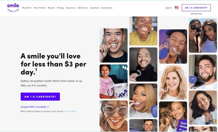

Smile Direct Club tempts visitors with “A smile you’ll love…” while addressing the most common objection (dental care is pricey) with “…for less than $3 per day”.
Have a powerful headline that speaks straight to your client. Ask yourself what the key problem is that your product solves, and then go from there.
2. Provide Value with Your Subheading
Every successful landing page contains a subheading that extends the headline’s goal and delivers additional info to visitors.
Here you should briefly describe what you do and highlight secondary benefits that clients should be aware of.
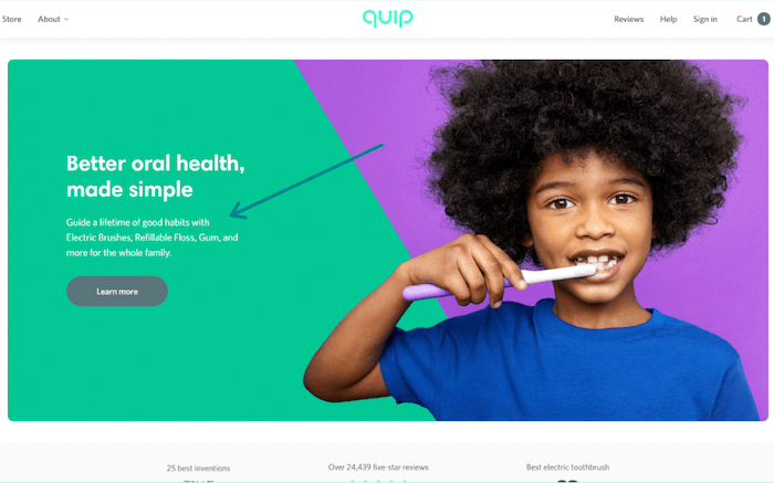

For example, Quip’s subheading says: “Guide a lifetime of good habits with electric toothbrushes, refillable floss, and more for the whole family.”
This subheading shows parents that they are not just buying a toothbrush. Instead, they are teaching good habits to their children, which is far more important.
3. Let People Visualize Your Offer and Feel It
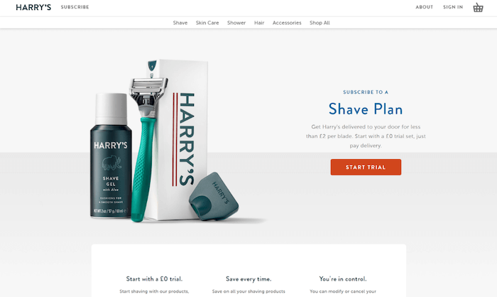
Visuals are an important element of good Shopify landing pages. Display your product in all its glory above the fold, like Harry’s does here:

4. Use Social Proof
Including social proof above the fold is a great way to instantly boost your brand’s credibility.
For example, The Farmer’s Dog uses reviews from large brands and Google customer reviews on their landing page:
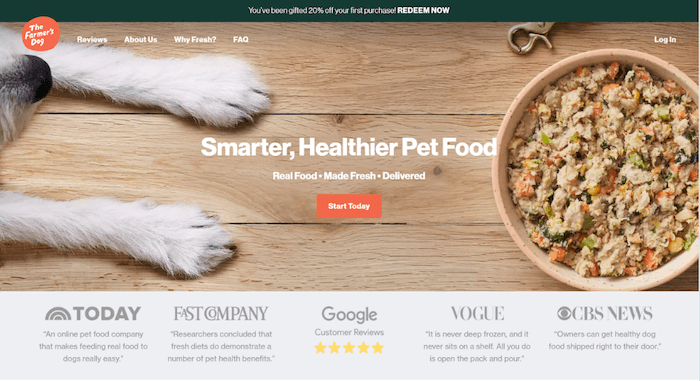

There are several firms that sell dog food, but not all of them have been named in Vogue. The addition of these well-known logos adds authority to The Farmer’s Dog.
5. Make the Next Step Clear
Every landing page must have a strong call to action. Your call to action states your conversion goal. It must be a button with high contrast to the background.
Here’s how Trade Coffee does it with a noticeable red-catchy button in a white background to draw visitor’s attention:
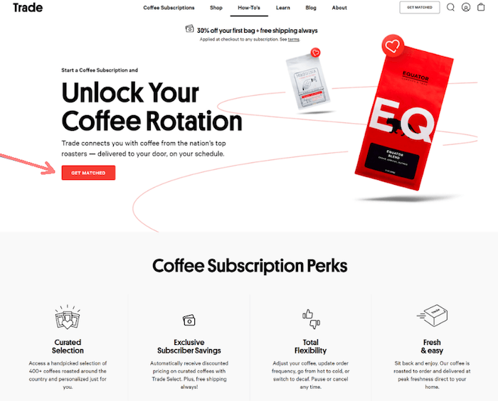

When creating your CTA, the most important thing to remember is to use a value-based phrase wherever possible. Instead of “Learn more,” try something more specific like “Get matched.”
Below The Fold
If you’ve got the customer’s attention until now from above the fold, you’ll be able to make the sale below the fold. Here are some below the fold design tips:
1. Outline Features and Address Objections
As soon as a visitor scrolls down your website, you must show them the value of your product and address any issues they may have.
For example, HelloFresh has four symbols just below the fold that back up their headline statement and address users’ problems.
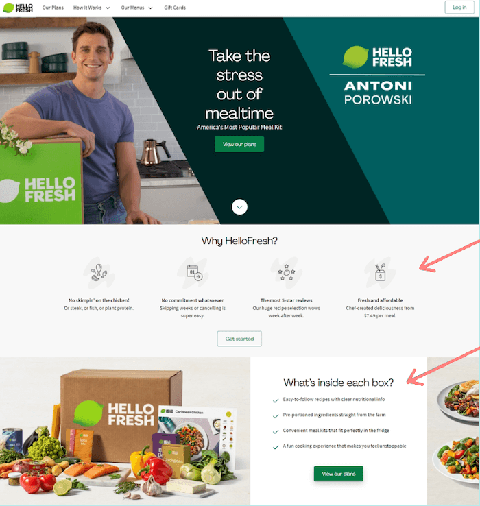

HelloFresh says that there is no commitment whatsoever, they have the most five-star ratings, and that family dinner may be cooked for only $7.49 a meal.
In the next part, HelloFresh describes what’s within the box and uses bullet points to emphasize how simple, enjoyable, and quick it is to prepare delicious homemade meals.
Consider how you may answer each objection clients may have about buying your product or accepting your offer.
2. More Social Proof
You’ve already established your credibility by presenting social proof above the fold. It’s now time to confirm that and motivate customers to act.
Using consumer reviews here is very effective because such reviews significantly impact visitors. They display the true results you’ve achieved.
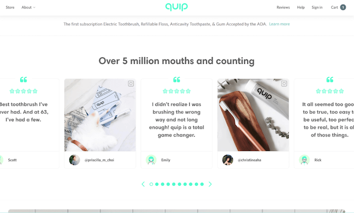

Returning to Quip, they use consumer reviews near the bottom of their landing page to boost clicks.
3. Add a Final CTA
If a user makes it all the way to the bottom of your landing page, there’s a good possibility they’ll convert. Add another CTA at the bottom of your page to avoid having them scroll back up for taking your offer. At this stage, you’ve grabbed the visitor’s attention and they are more likely to complete a sale.
As Winc does here, use your final CTA as another chance to answer any lingering concerns.
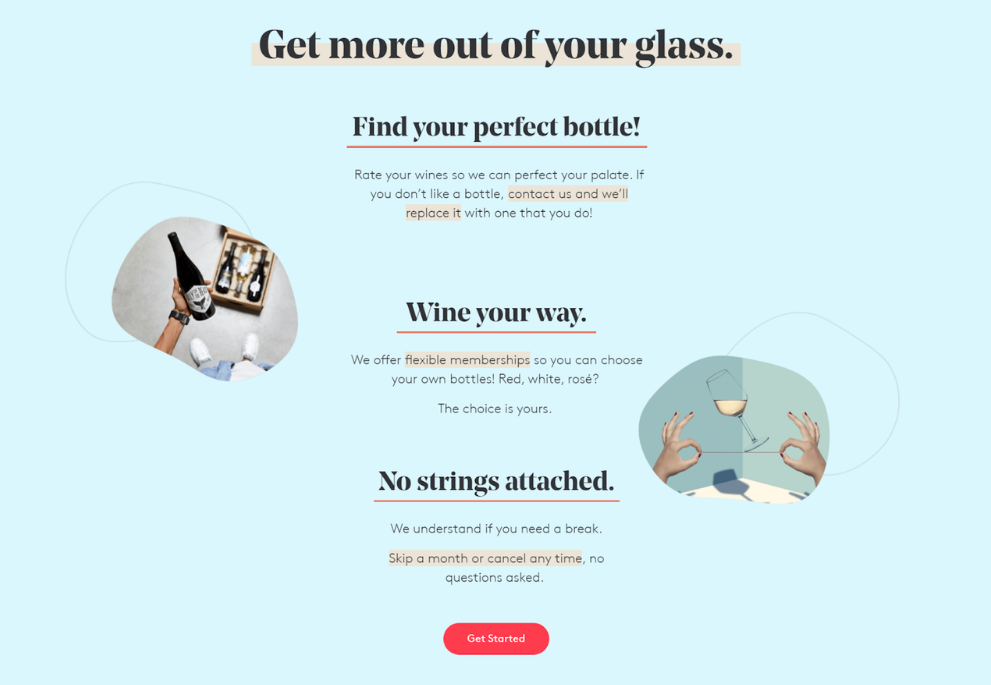

Then, they place a contrasting CTA at the end to make it easy for visitors to take the next step.
Conclusion
A well-designed landing page for your Shopify store will help you increase sales and decrease abandonment. Use the strategies we discussed above to design a Shopify landing page that gets you new customers, every day. Also, you can follow the tips for a higher Shopify conversion rate and remember to design your page with your target audience in mind. It is critical that you develop the page for your ideal consumer, both in terms of style and content.
Finally, keep in mind that you should never stop testing your landing pages. It’s uncommon to hit a well-performing landing page on the first try. The finest landing pages are the result of repetitive testing to find the magical combination of components and content that tempts visitors to click. Do you know what Landing Page Metrics you should be tracking in your tests?
Begin testing and tracking your Shopify landing page right now with WatchThemLive. Sign up for free to get started.
