If you are looking for a more effective way to improve your website and conversion rate, you should consider using a heatmap.
Here you will discover everything you need to know about this powerful analytics tool.
What Is a Heatmap?
A Heatmap is a data visualization method. It uses different colors to display the data and its different values.
The method has been used since the 19th century. In 1991, software designer Cormac Kinney trademarked the term heatmap. He used heat mapping to show financial market information.
Nowadays, heatmaps are used in different industries, such as:
- Weather
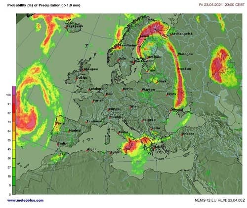
Image source: meteoblue.com
- Sports
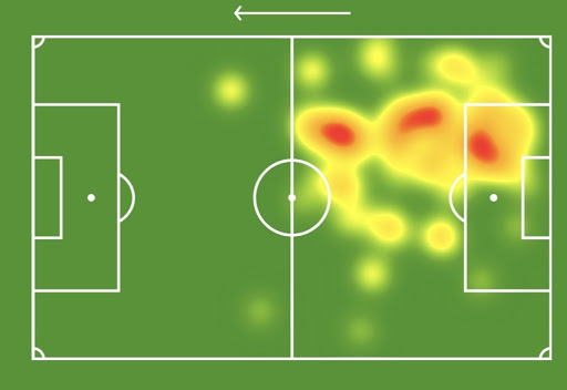
Image source: psgtalk.com
- Geography
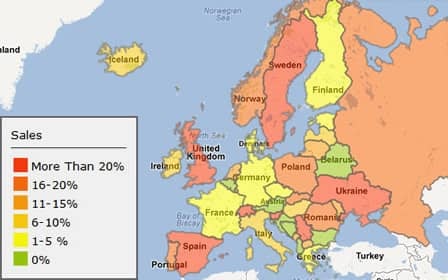
Image source: imapbuilder.net
- Stock market
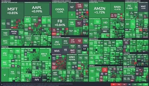
Image source: vividmaps.com
- Websites
We will discuss website heatmaps in more depth later.
What Is a Heatmap Used for?
A heatmap is an analytics tool used for making complex data easily understandable. The colors on heatmaps offer a clear and instant insight.
Heatmapping helps us make sense of numerical data quickly. It is instrumental when we are working with lots of data. The important thing about heat maps is that they are simple and don’t require extra input, unlike other data visualization methods.
What Is a Website Heatmap?
A website heatmap is an excellent analytical tool for marketers and website owners. Website heatmaps use colors on a scale from red to blue to show the most and least engaging elements on a webpage.
Website heat mapping is used to analyze users’ behavior on web pages and provides valuable information about their interactions. These include clicks, taps, scrolling, mouse movement, etc.
Heat map analytics has become very popular among marketers because of all the valuable information it provides.
The Advantages of Website Heat Mapping
Website heatmaps can help businesses grow in many ways. Here are some examples:
1- Improving Click-Through Rate
Using a heat map on your website lets you find out popular areas on web pages. Then, you can add important content in these areas for a higher CTR.
2- Improving Your Website’s Usability
Are users interacting with your website effectively? Can they perform actions quickly? Is your website engaging enough? Heat maps can help you figure out the answers to these questions to improve your website’s usability.
3- Coming Up with Web Design Ideas
Website heat maps give you ideas for optimizing your website’s design considering your visitors’ needs and behavior.
4- Making Better Decisions
Website heatmapping gives helpful insights into users’ behavior. With a more comprehensive understanding of your website’s visitors, you can meet their needs and grow your business.
5- Eliminating Distractions on Your Website
Heatmaps will tell you if your call-to-action elements are not receiving enough clicks. They can also show what factors are probably distracting users from the CTAs, so that you can minimize these distractions for a more effective call-to-action element.
6- Detecting and Fixing Problems
Using a heatmap is a quick way to figure out your website’s problems. If the users’ interactions are not as planned, there must be a problem.
7- Facilitating User Testing
Website heat maps are an excellent tool for facilitating user testing. For example, imagine performing A/B testing on your landing page. Most user testing tools will only tell you which variation performed better, but you need more information to understand why. You can use heat map visualization to obtain information about the users’ interactions with each variation. It shows you exactly why one of them is more effective.
8- Increasing Conversion Rate
A heatmap can show you if users are taking steps toward the conversion goal or abandoning your website. You can find out what’s preventing users from converting and fix it. Heat mapping helps you create a better user experience, resulting in a higher conversion rate.
Types of Website Heatmap
Different types of heatmap visualization are used on websites, and each of them displays a distinct aspect of user behavior on your website. Here is what heat maps lets you to track on your website:
- Clicks
- Scrolling
- Mouse movement
- Users’ locations
- Compare website performance on different devices
- Areas of your website that users pay more attention
- Where people are looking when browsing your website
Let’s take a closer look at the types of website heatmaps.
1- Click Maps
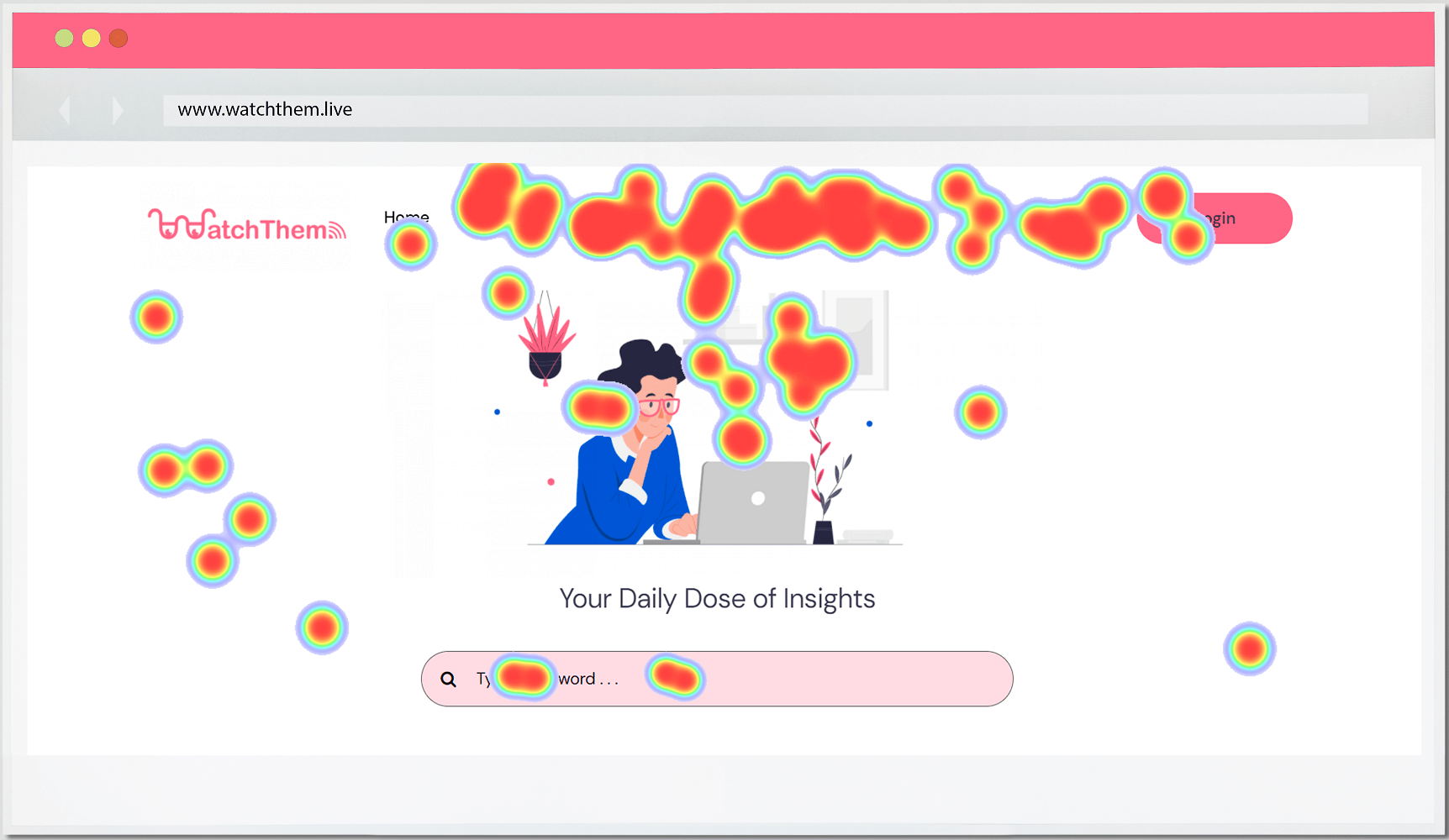
A click heatmap shows you users’ clicking or tapping (on mobile and tablet devices) behavior on your website. It can tell you which elements on the web page are more engaging, as well as the number of clicks each has received. Moreover, the warmer the color of each component is, the higher clicks it has received.
With click-tracking heatmaps, you can figure out whether you have placed the elements on the web page effectively or not. For example, are links or CTAs gaining enough attention? Using a click heat map, you can find the answer right away.
Click maps also show you the clicks on unclickable elements. This helps you determine if an unclickable element is receiving too many clicks. If so, users are expecting it to be clickable, and you have to eliminate this confusion.
2- Scroll Maps
A Scroll heatmap displays the percentage of users that scroll down to each point on your website. It also shows the average time spent on each color section. Usually, on a scroll map, the top of the page is red, and the color gets colder towards the bottom of the page. This means fewer people scroll down till the end of the page.
Scroll maps tell if your content is engaging enough to keep users scrolling further down.
It’s essential to place your important content above the fold to be visible to all of your visitors.
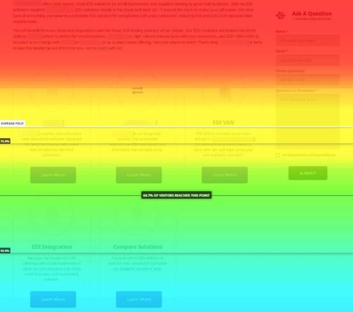
Image source: topspot.com
3- Move Maps
A move heatmap tracks users’ mouse movements while browsing web pages. The redder spots on a mouse heatmap indicate more mouse movements in that area.
A move map can be used as a website eye-tracking heat map since people’s eyes usually follow their cursor.
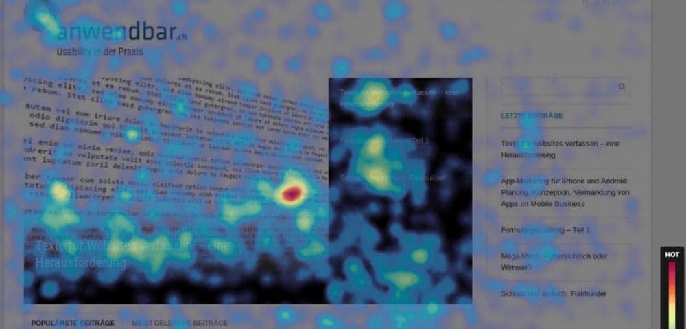
Image source: topspot.com
4- Device Heatmaps
A device heatmap compares a website’s performance on different devices. You can see how users interact with your website on each device. If one of them performs poorly compared to the others, you can quickly detect the problem and make changes. For example, maybe the placement of your call to action on mobile devices is not as effective as on desktops.
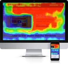
Image source: mockingfish.com
5- Geographical Heatmaps
A geographical heatmap tells you where your website visitors are mostly from. You can optimize your website and campaigns for your audience based on their location with this information.
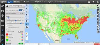
Image source: maptive.com
6- Attention Heatmaps
An attention heatmap shows which areas on your website capture the most attention. You can find out which content on your website engages users the most and which they ignore.
Attention heat maps use data such as:
- The average time spent on each part of the page
- The percentage of users who have seen each part of the page
- The average time of users’ engagement (activities like clicking, tapping, mouse movement, etc.) in each part of the page
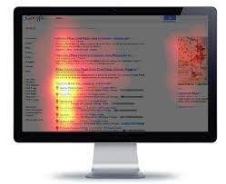
Image source: mockingfish.com
7- Eye-tracking Heatmaps
Eye-tracking heatmaps show what users are looking at the most on your website. This heatmap is a potent tool, but it’s not accessible to most website owners.
Eye-tracking heat mapping is more expensive than other types, requires special tools and can be performed remotely and in person. The remote method uses the user’s webcam, while the in-person method employs eye-tracking glasses.
A cheaper alternative is a predictive eye-tracking heatmap. It uses pre-collected eye-tracking data to determine the most and the least eye-catching parts of a website.
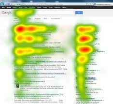
Image source: eyetracking.ch
FAQs about Heat Maps
A heat map is a data visualization method that represents values by color. A website heat map shows how users interact with a web page.
A heat map collects your website’s data and uses a scale of colors to display the popular and unpopular parts of the website.
A website heat map uses colors on a scale from red to blue. The hotter colors on a heat map depict more user interactions and colder colors fewer user interactions.
