
Page Contents
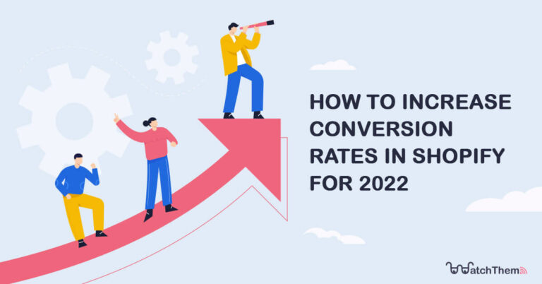
Shopify conversion rate optimization is crucial if you own a Shopify store and want to increase sales. It will help you save time and money and understand where to focus your efforts for the best results.
But what are some of the best eCommerce conversion rate optimization strategies to get the most out of your online store? How can you entice customers to buy from you? What are the key aspects of your website that you should improve to boost conversions?
I will share with you what I have learned about optimizing Shopify conversion rate from Shopify Learn.
Let’s begin.
Looking for the best ways to increase your Shopify conversion rate? Sign up to WatchThemLive and get instant access to its features to gain actionable insights!

What Is Shopify Conversion Rate Optimization?
First and foremost, we must define “conversion” in the context of e-commerce websites. The importance of conversion cannot be overstated. It’s the moment when a random visitor does what you want them to do. For instance, when they eventually buy one of your products, or on a smaller scale, when they register their email address, add a product to their cart, or take other actions that will finally lead to them finalizing their purchase.
Now, what is the conversion rate? The straightforward definition of an online conversion rate is the percentage of visitors to your website that convert.
Finally, Shopify conversion rate optimization is a method for raising the percentage of visitors who convert on your Shopify website using website optimization tools. It employs persuasive psychology to persuade individuals to do a desired action.
How to Calculate the Conversion Rate?
To figure out your conversion rate, divide the number of conversions you receive in a particular period by the total number of visitors that visited your website during that time. To acquire a percentage, multiply the value by 100.
If you want to calculate more metrics and KPIs for your online business and learn how to analyze them to improve Shopify conversion rate, you should check out our complete eCommerce analytics guide.
Now that you fully understand what Shopify conversion rate optimization is and you can calculate your conversion rate, it’s time to learn how to increase Shopify conversion rate.
How Do I Increase My Sales Conversion Rate on Shopify?
Let’s find out how to improve your Shopify conversion rate optimization.
The first impression you make on customers can lead to the success or failure of your business, especially for eCommerce. Many factors can affect the first impression, including your website layout, colors, what you share about your business, etc.
It’s crucial to focus on factors that make customers behave in a way you want them to. So, find out the elements on your website that encourage buyers to purchase or take any other desired action.
Now, here are the elements you should focus on for Shopify conversion optimization:
1- Make a Great First Impression with Your Home Page
A good home page gives the visitors what they are looking for and answers their questions. If someone visits your website for a specific deal or product, you must ensure they can easily find what they are looking for. And for those visitors who are not looking for anything specific, your website has to be user-friendly.
Also, keep in mind that your online store’s design and layout can disappoint your first-time visitors more.
Decision avoidance is a psychological process you should keep in mind when designing your home page. This process refers to the brain’s tendency to avoid decision-making when it takes too long. Knowing that visitors won’t spend more than 20 seconds on your home page on average, you have to keep your navigation structure clear. This way, visitors will be able to immediately choose the path that’s best for them and your business.
Now, let’s see what you should do concerning your home page layout to improve Shopify conversion rate optimization.
First, see what content you have placed above the fold. Above the fold is a web design term that refers to the space of your website that you can see without scrolling down.
While you are thinking about what content to put above the fold, you have to focus on the actions you want visitors to take. What information are they looking for when they first visit your website? How can you take advantage of the above the fold to help them make decisions? Again, make sure to keep everything simple.
Makeup for Melanin Girls’ home page is a good example. Their conversion goal is to encourage potential shoppers to purchase their products. They have used a clear hero image and a CTA button that persuades visitors to browse the products.
The visitor only has two choices on the home page: click on the button or scroll down to see more information. So, this is an example of a well-designed home page that entices customers to make a purchase.

To design an effective and high-converting home page, you have to make sure its content is consistent, includes high-quality images, and the copy is correct.
Think carefully about the content you want to show on your home page and make sure it aligns with your brand. Also, ensure the message is clear and your website looks good on mobile devices. All these factors play a crucial role in the effectiveness of your home page.
An excellent way to see information on your home page’s performance is using heat maps. By setting up a heat map on your home page, you can recognize the least and most popular areas. Therefore, you will know where to place your most important content to attract more attention.
You can use WatchThemLive, a website visitor tracking tool that offers heatmaps and other valuable features such as session replays, user tracking, page optimization, etc.

Want to try out WatchThemLive heatmaps to optimize your homepage? Sign up for FREE now and get started.

2- Simplify Your Website’s Navigation
Navigation is one of the key aspects of your website. Let’s see how you can make the navigation intuitive on your home page. Your top navigation bar should be as simple as possible. Make sure to prioritize the paths that are most important to visitors. Here are some of the essential categories it should include:
- About us
- Shop
- Contact
Websites that offer too many options for navigating can overwhelm visitors and seem cluttered. Therefore, more visitors will drop off or take the incorrect path. On the navigation bar, display links from left to right, placing the most important ones on the left.
If you sell many products and product categories, only include the top-level categories on the home page and use drop-down menus for the sub-navigation. Take a look at Kinto’s home page as an example.

Creating sub-navigation enables you to organize your products and pages. This way, your visitors can explore your website without getting overwhelmed. For example, some websites link to pages like About Us, Contact, FAQ, etc., in the header navigation as they align with their goals. However, if these pages don’t convert, maybe these links distract your visitors from the goal. If so, add the links on your website’s footer instead.
This is what Kinto has done, as you can see below.

Related Article: How to Improve Website Navigation with Breadcrumb Trail
3- Give Customers the Essential Information on Product Pages
When new customers visit your online store, they normally land on the home page. Then, they will navigate to a product page. This is where the buyer understands the value of the product. They can see what the product looks like and how it works. If you have designed an effective product page, the buyer is likely to want the product.
Here are some of the most important details you should consider to build trust, no matter what industry you’re in. First of all, remember to add multiple product photos on each page. Customers will be more likely to trust your product if you include several images. This way, they can have a complete picture of the product without examining it physically.
Let’s see how Manitobah Mukluks displays product photos on product pages. Each page includes at least four images of the product. Each picture offers a different view. You can get a closeup of the product’s color, shape, or texture. As the customer can’t physically see or touch the product, these images will give them all the information they need to purchase. Therefore, this is an excellent Shopify conversion rate optimization strategy.
Also, you should organize product descriptions into digestible parts to make them more readable.
Let’s take another look at Manitobah Mukluks and see what they have done. Everything is organized clearly and put into sections. The buyer can easily see the most important information, such as pricing, colors, and customer reviews. And more information is available in the dropdown menus. This way, the buyer can immediately see the key information while they have the option to explore further.

You can also see a size chart when you select the sizing dropdown and see how they display the sizing. Here, they tell the buyer that the product fits true to size, and below the size chart, there’s a link to their sizing guide. Buyers can see all the information about sizing here and there’s no need to navigate away from the site.
It’s a great idea to add a size chart and conversions on product pages. This will make buyers more confident about their purchase as it enables them to make informed decisions.

To make product descriptions more readable, you should organize them into digestible sections.
Let’s take another look at Manitobah Mukluks and see what they have done. Everything is organized clearly and into sections. The buyer can easily see the most important information, such as pricing, colors, and customer reviews. More information is available in the dropdown menus. This way, the buyer can immediately see key information and have the option to explore further.

4- Make Transactions More Transparent and Easy
You should also consider price transparency on product pages for Shopify conversion rate optimization. Customers want to know how much they will pay, including discounts and fees, as early as possible. So, don’t surprise customers with your pricing. Also, keep in mind this is an excellent way to build trust.
First, make sure you have a clear and straightforward return policy. Then, if you provide international shipping, your shipping policy should clearly state who will pay the duties and taxes.
Now, here are some tips that help you gain customers’ trust and improve Shopify conversion rate optimization:
- Don’t forget to include specific shipping costs.
- Let the buyers apply discount codes directly in their shopping cart.
- Make sure the customer can easily edit their shopping cart’s content.
- Provide contact information to enable the customer to reach you.
5- Reassure Customers That You Are a Legitimate Business
It’s necessary to reassure the customer your business is legit. A good example is Jomami Jewelry. They display their brand value effectively and share their story and why they started this business. They also discuss their sustainability and mission in the about section.

Many buyers visit the about us page to better know the brand. They usually will navigate to this page if they have one of these two questions:
- Is this a real and legitimate business?
- What are the values of this business?
Let’s see KOTN as an example. Looking at their “About” page, you will learn they are an established brand with a strong identity.

Having shared values with a brand is really important to customers. That’s why they go the the “About Us” page; to understand the brand and who they are. Some customers even go further and want to know how the business is run.
Conclusion
Having a user-friendly website not only builds customer trust but is a determining factor in improving Shopify conversion rate optimization.
As discussed in this article, focus on your home page, product pages, pricing transparency, “About Us” page, and contact information. Focusing your efforts on these areas will help you gain customers’ trust. And this is what matters most for the success of your business.
Get to know your users better than ever before! Sign up to WatchThemLive to boost your conversion rate.
