Page Contents
Are wondering ‘how to read a heatmap’? Do you find it difficult to interpret the colors and patterns on your screen? If so, you’re not alone. Many people are intimidated by the complexity of heatmaps, but with the right approach, they can be a powerful tool for understanding data.
Reading a heatmap can be intimidating at first, but with a little practice, you’ll be able to make sense of even the most complex data sets and make the best out of free heatmap tools.
At WatchThemLive, we specialize in helping businesses and organizations make sense of their data. Our powerful analytics tools include easy-to-use heatmaps that allow you to visualize your data in new ways for free.
In this article, we’ll take you through the basics of how to read a heatmap and show you how it can benefit your business.
What is a Heatmap
Before we dive into the details of how to read a heatmap, let’s start with the basics. A heatmap is a visual representation of data that uses color to visualize information.
Heatmaps are often used to represent large data sets in a way that is easy to understand, making them a popular tool in a variety of fields, including business, CRO tools, science, and marketing.
A heatmap is created by mapping data onto a grid and then assigning colors to the values in the data. Typically, the colors range from light to dark, with lighter colors representing lower values and darker colors representing higher values.
The result is a visual representation of the data that highlights patterns and outliers that might be difficult to see in other forms of data visualization.
Heatmaps can be used to represent different types of data, including website traffic, customer behavior, customer retention metrics, and scientific data. They can also be customized to highlight specific aspects of the data, such as the distribution of values or the relationship between different variables.
In addition to their visual appeal, heatmaps have several benefits over other forms of data visualization. They are easy to interpret, making it simple to identify trends and patterns in the data. Many businesses improve their user experience with heatmaps.
They are also highly customizable, allowing you to tailor the visualization to meet your specific needs. Finally, heatmaps can be used to represent complex data sets in a way that is easy to understand, making them a valuable tool for anyone who needs to make sense of large amounts of data.
Why Use a Heatmap
Heatmaps are incredibly useful for identifying patterns and trends in large data sets. They can be used to quickly identify areas of high and low activity or to highlight trends that might be difficult to see in a more traditional chart or graph.
For example, a heatmap of website traffic might show that certain pages or sections of a site are more popular than others, or that certain times of day are more active than others.
This information can be incredibly valuable for businesses looking to optimize their website or marketing campaigns, as it can help them identify areas that need improvement or areas that are performing particularly well.
In addition, heatmaps can be customized to represent different types of data, such as density maps or contour maps. This means that they can be used to represent complex data sets in a way that is easy to understand, making them a valuable tool for anyone who needs to make sense of large amounts of data.
Now let’s get to our main topic – how to read a heatmap! So keep scrolling to learn everything you need to know!
How to Read a Heatmap
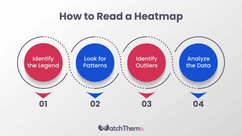
When it comes to reading a heatmap, there are several key steps to follow in order to make sense of the data it presents. Here’s a more detailed breakdown of how to read a heatmap:


#1 Identify the Legend
The legend, also known as the color scale, is a key component of any heatmap. It explains what the colors on the heatmap represent and the range of values they cover.
The legend is usually located on the side or bottom of the heatmap, and it typically includes a color gradient that shows the progression from the lowest to the highest values. Understanding the legend is crucial for interpreting the heatmap’s data.
#2 Look for Patterns
Once you’ve identified the legend, the next step is to look for patterns in the data. Patterns can help you identify areas of high or low intensity and clusters of similar values.
For example, in a heatmap that represents website traffic, you might notice that the pages with the most traffic are consistently colored red, while the pages with the least traffic are colored blue or green.
#3 Identify Outliers
Outliers are data points that fall outside of the normal range. They can be indicators of unusual or unexpected behavior in your data. When looking at a heatmap, outliers might appear as areas that are significantly different from the surrounding colors. Identifying outliers can be useful for understanding the data and making decisions based on it.
#4 Analyze the Data
Once you’ve identified the patterns and outliers in the data, you can start to draw conclusions about what the data is telling you.
For example, you might notice that the areas with the highest intensity on a heatmap of website traffic data correspond to the pages with the most conversions. This insight could help with your website optimization plans to increase conversions even further.
It’s important to note that reading a heatmap can be complex and require some practice. Depending on the data you’re analyzing, there may be additional steps involved in interpreting the heatmap.
However, by following these basic steps, you can start to make sense of even the most complex heatmaps.
Additionally, it’s important to remember that heatmaps are just one tool in your data analysis toolbox. They can be incredibly useful for visualizing and understanding data, but they should be used in conjunction with other tools and methods to get a complete picture of your data.
Now you know how to read a heatmap! Easy, right?
Pro Tip: here’s an article to help you out in case you’re wondering how to create a heatmap.
How Heatmaps Help Online Businesses
According to a study, 48% of organizations currently use heatmaps or plan to use them in the next two years for data visualization and analysis.
Heatmaps are particularly useful for online businesses, as they can help businesses gain insights into customer behavior, website traffic, and other key metrics.
For example, a heatmap of website traffic might show which pages are the most popular, which pages are causing users to leave the site, and which pages are leading to conversions. This information can help businesses optimize their website design and content to improve user experience and increase conversions.
Similarly, heatmaps of email campaigns can show which links are being clicked on the most, which links are leading to conversions, and which links are being ignored. This information can help businesses optimize their email campaigns to improve engagement and increase conversions.
In addition to helping businesses improve their online presence, heatmaps can also be used to gain insights into customer behavior in physical stores.
For example, a heatmap of foot traffic in a retail store might show which areas are the most popular, which areas are being ignored, and which areas are leading to purchases.
This information can help businesses optimize their store layout and product placement to improve the customer experience and increase sales.
Different Types of Heatmaps
There are many different types of heatmaps that can be used to represent different types of data. Some common types of heatmaps include:
- Density maps: They are used to represent the density of a particular variable, such as the number of people in a certain area.
- Contour maps: These heatmaps are used to represent the contours of a particular variable, such as elevation or temperature.
- Choropleth maps: These kinds of heatmaps are used to represent the distribution of a particular variable across geographic regions, such as income or population density.
Each type of heatmap has its own strengths and weaknesses, and choosing the right type of heatmap will depend on the specific data you are working with and the insights you are looking to gain.
People Also Asked About How to Read a Heatmap
So far, we tried to guide you through how to read a heatmap successfully and explained why heatmaps are essential for e-commerce businesses.
By understanding these FAQs, you can get a better understanding of how to use and interpret heatmaps in your own work. Now, let’s go over some frequently asked questions!
Q1. Can Heatmaps Be Customized?
Yes! Most heatmap tools allow you to customize the colors used in the heatmap to better fit your needs. For example, you may want to use a gradient that ranges from blue to red to show low and high values, or you may want to use a single color to highlight specific data points.
Q2. What Types of Data Are Best Suited for Heatmaps?
Heatmaps work best with large sets of data that can be easily represented using colors. They are commonly used in marketing, web analytics, and scientific research.
Q3. How Can I Use Heatmaps to Improve My Business?
Heatmaps can help you identify areas of your website or business that are underperforming, allowing you to make data-driven decisions about how to improve them.
Q4. Are There Any Limitations to Using Heatmaps?
Like any data visualization tool, heatmaps have some limitations. For example, they can be less effective in representing data with a large number of categories or values.
Additionally, heatmaps are only as good as the data they represent, so it’s important to ensure that your data is accurate and complete before creating a heatmap.
Conclusion
Learning how to read a heatmap is an essential skill for anyone who wants to gain insights from large data sets. Heatmaps are incredibly versatile and can be used to represent a wide variety of data types, from website traffic to customer behavior to geographic trends.
By using heatmaps, businesses can gain a deeper understanding of their customers and their behavior, which can help them make data-driven decisions and optimize their marketing campaigns, website design, and overall strategy.
At WatchThemLive, we offer a range of analytics tools that can help you make sense of your data, including easy-to-use heatmaps. Our tools are designed to be accessible to people with all levels of data analysis experience, so you can start using them right away to gain insights into your data. Ready to see the power of heatmaps in action? Sign up on WatchThemLive and take your data analysis to the next level!

