Page Contents
There are some popular areas on your website that your visitors engage with more than the other parts. The question is, which are the sections that attract the visitors the most? This is one of the many questions that UX designers can find the solution to.
If your website fails to attract visitors’ attention, they leave your page. Therefore, your conversion rate decreases. So you must know where people pay attention to.
Heatmaps are the key answer to this question. They are visual interpretations of users’ interactions that reveal their engagement on each page. It helps you realize where they pay the most attention.
Note: WatchThemLive’s heatmaps show you an overall representation of your visitors’ interactions with your website, so you will realize which parts of your pages are getting the right amount of attention and which parts aren’t. Sign up right now and get your free package!
In this article, we discuss how to improve the user experience with heatmaps.
What Is a Heatmap?
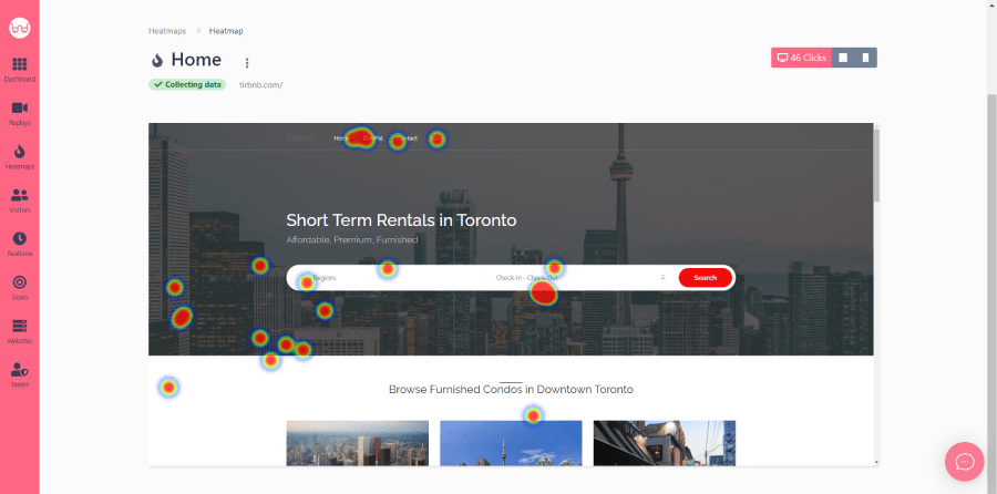
A Heatmap is a visual representation of where users are clicking. It provides insights to help you take action to improve the UX and conversion rate of your website. It enables you to assess visitor behavior on your site to understand how visitors interact with different web pages.


Importance of Heatmaps
To provide the best visitor experience for your visitors, you must find out where the problematic areas are and why your visitors get confused.
Heatmap data is crucial because it shows information in a visual format, so it’s easier for a business owner to digest it and decide what to do and what changes to make in the future.
Website heatmaps let you test and optimize the main design elements of your site like CTA buttons, images and texts, navigation, page length, and the overall layout.
UX, Heatmap, and the Types of Data
The main goal of UX design is to provide the best experience to the customers visiting your site. By having a strategic approach to your design, your visitors will be able to find what they’re looking for in the least amount of time.
But before getting to the next point, you’d better know the difference between quantitative and qualitative data.
- Quantitative data: It is similar to the kind of data provided by Google Analytics (GA). It’s just numbers, so you can’t figure out the reason behind the data for each metric and whether it is right or wrong.
- Qualitative data: It is collected through interviews, observations, or questionaries which not only allows you to look deeper at quantitative results but also allows you to analyze ideas.
Here is where website heatmaps which are among the qualitative UX research tools, take the stage and allow you to pay attention to the visitors’ behaviors from page to page.
Types of Heatmaps
To tell you the truth, there is no final, fixed design that will fit everyone forever. Everything changes through time, so you may change your mind about your past decisions and preferences.
Instead of looking for a final, fixed design, you can update your platform, change your design, and analyze your users’ behavior to fix their pain points. But HOW?
Heatmap tools can provide you with information about your website’s design and the placement of its elements. They have various data visualization types such as click maps, scroll maps, move maps, attention heatmaps, and eye-tracking heatmaps.
Before discussing how to improve your UX design with heatmaps, we need to get familiar with some of the heatmap types we mentioned above.
1. Clickmaps
The click map tool shows where people are clicking on your webpage. It’s very instructive in giving you a good idea of the places people interact with and places that are causing rage clicks. It can be very frustrating for your visitors if they click on things and expect something to happen when they’re not designed to be clickable.
2. Scrollmaps
The scroll map tool shows you how far down people are scrolling on your web page. It is obvious why this is important. If you have important content at the bottom of your page, you want to see what percentage of people are scrolling down far enough to notice it.
For example, one of the mistakes that some web marketers make is that they put an important element of a web page, like something that causes trust and credibility, down at the bottom, and when they look at the scroll map, they realize that only 25% of the visitors or less scroll that far down. What this leads to is your visitors not feeling comfortable because they’re not seeing that element that causes trust and credibility.
So it is important to know where the proper place to put your website’s elements is to create a more enticing experience and get people to continue their journey on your website.
3. Movemaps
The move map tool shows you how people move their mouse on your web page. But why is that important? There’s generally a correlation between how visitors move their cursor and what they read.
So you can get a good sense of how people are engaging with different parts of your page by looking at the move map. Consequently, if you’ve got some important content on your page but the move map shows very little interaction, maybe you need to make a change.
How to Improve UX Design with Heatmaps
Now it’s time to see how you can improve your UX design with heatmaps.
1. CTA Buttons
CTA buttons are important in both websites and apps. Your CTA should have an explanation in terms of what the button is about and what its function is.
Moreover, you need to know the best location for putting your CTA button in a way that visitors won’t ignore it. So, by having clear CTAs with optimized copies and proper placement, you can increase your conversion rate.
Using heatmaps allows you to realize whether the main CTAs are getting enough attention or they are being ignored.
2. Images and Texts
Images and texts are among the most essential elements in a website’s design. The problem arises when the quality and placement of both pictures and texts are not acceptable.
Using heatmaps can help you identify the most proper section of your website for these items.
3. Navigation
You may ask yourself, “What causes a bad UX?” The answer is when visitors have problems finding their needs or desires on your site or when the navigation flow demands a high cognitive load from the visitors. It causes people to abandon your page without converting.
Using heatmaps, you can analyze visitors’ navigational patterns to construct a navigation map that matches visitor expectations.
For instance, an eCommerce website’s UX team can analyze its homepage’s heatmap that shows the navigation flow and analyze visitors’ journey from point A to point B and identify potential distractions.
4. General Page Layout
You’d better test every element of your page to ensure each of them works properly. You may have an appropriate copy written for your website, but the image may seize all the attention. You may have a powerful product page, but your visitors can’t find your CTA button. You have to balance the different elements of your page.
If you know the most popular sections of your page, you can place important information there. Website heatmaps highlight the most and least popular sections of a page to make designing the perfect layout for a high converting landing page possible.
5. Page Length
There is no fixed page length that suits every business. The page length depends on the purpose of your site. Therefore, scroll maps can help you determine your site’s suitable page length.
For example, scroll maps can show you different parts of your site that visitors never reach, helping you to ascertain the ideal length for your blogs and articles.
Conclusion
In this article, we discussed the power of information that heatmaps can give you. Consistently updating your blog and digital content helps you to improve your user experience and keep your users coming back to you. The more you understand how your users interact with your pages, the more you can improve your UX, and that’s exactly what heatmaps can help you with.
Want to know the problems of your site? WatchThemLive’s heatmap enables you to track your visitors’ clicks and improve your clickthrough rate. Sign up now to get started with heatmaps.

