Page Contents
Since Google Analytics is one of the most popular website tracking tools, many website owners would prefer Google Analytics heatmapping. This feature allows you to visualize the website’s data on and make it easier to understand.
In this article, we will discuss Google Analytics heatmapping in 2023, how to use it, and what information it provides. After that, we will introduce the best alternatives that can help you optimize your website. Stay tuned and keep reading to find out all information you need for analytics heatmaps.
Data collection is nothing without data analysis. If you’re one of those who have issues with data and analyses and looking for a quick getaway, we highly recommend WatchThemLive. Sign up on WatchThemLive to be provided with all features of Google Analytics and much more.
What Is Analytics Heat Map
Before getting into Google Analytics heatmapping, let’s see what a heat map is in the first place. Heat maps are a visualization of numerical data using colors on a scale from red to blue. Red represents the most popular areas of the web page, and blue the least.
Heat maps can not only help website owners make sense of their quantitative data but also show you what visitors are doing on your website. They are a great way to facilitate data analysis to identify problems, how to deal with them, and how to optimize your website based on user behavior.
Types of Heat Maps
There are four types of heat maps. Each one can give information about a different aspect of your website. So let’s take a look at them:
1- Scroll Maps: Scroll maps can tell you the percentage of users who have scrolled down to any point on the web page. The top of the page will be red, and the color will gradually turn blue towards the bottom, indicating fewer people scroll down till the end.
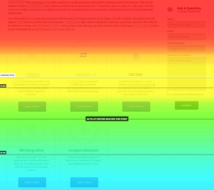

Image credits: topspot.com
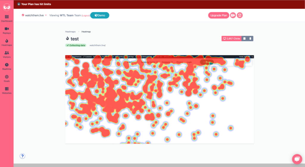
2- Click Maps: Click maps show the percentage of people who have clicked or tapped (for mobile and tablet devices) on any web page area. Although these heat maps tell which elements have been clicked the most, some of them can even include unclickable areas.


3- Mouse Move Maps: Mouse move maps show the mouse move heat maps. This heat map can tell you where users are probably looking when they are browsing a web page.
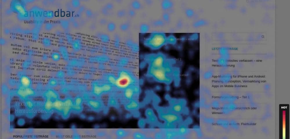

Image credits: anwendbar.ch
4- Device Maps: Device maps allow you to compare your website data on different devices. This is a great way to design your website for different devices properly.
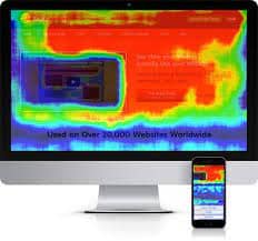

Image credits: mockingfish.com
Benefits of Google Analytics Website Heat Maps
Now let’s see some of the benefits of using a service such as Google Analytics heatmapping:
1- User Behavior Data Visualization
Heat maps visualize visitors’ on-screen activities on your website. This way, you can better understand your target audience and your website’s numerical data.
2- Seeing What Elements Get Clicks
With click heatmaps, you can see what elements users click on and which they ignore. Analyzing click maps help you see which content is more engaging and what you should improve to attract more attention.
3- Understanding A/B Testing Results
You can set up heat maps on your test variations to determine why one is outperforming the other. You can measure the effectiveness of the changes you’ve made and find out what you should focus on.
4. Identify Problems with Your Web Performance
The heat map can be used to identify which sections of the page need to perform better. You can improve your pages by eliminating the areas your users are not interested in and convert better by using Geo heatmaps to focus on the most important areas!
More Points about Google Analytics Heatmaps:
- It uses your existing Google Analytics data since it works retroactively,
- You can view heatmaps using real-time traffic,
- It doesn’t limit page views and works on any page with Google Analytics tracking code installed.
What Is Google Analytics Heat Map
Google offers a Chrome extension for Google Analytics heatmapping. This extension, Page Analytics (by Google), can be used for the web pages you have added to Google Analytics.


Google introduced this feature so that people could access a visual representation of their Google Analytics data. This feature visually shows you how users interact with your website and which areas are more engaging.
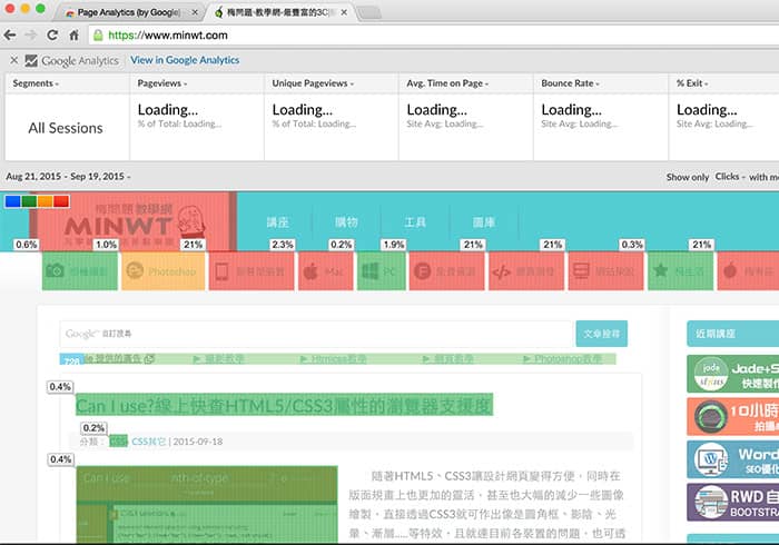

Image credits: minwt.com
This information teaches you to improve your website based on users’ behavior and, as a result, optimize your conversion rate.
However, the Page Analytics extension for Google Chrome was deprecated in 2017 and hasn’t been updated since then. Moreover, if you read the user reviews written after the deprecation, you will understand that it stopped working for many users.
How Do I Use Google Analytics Heat Map
You can follow the steps below to use Google Analytics heatmapping:
- First of all, if you don’t have a Google Analytics account, you need to create one. After you sign up, GA will give you a code that you should insert on each of your website’s pages you want to track.
- Now you have to download the Page Analytics Chrome extension.
- After installing the extension to your browser, log in to your GA account. You will see the Page Analytics icon in the Chrome toolbar. Click on this icon, and if you see a green tick, it means that Page analytics is connected to GA.
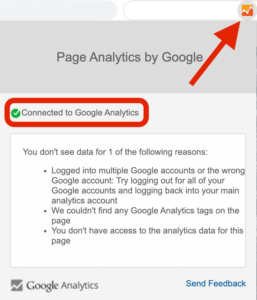

If you successfully follow these steps, you will be provided with Google Analytics heatmapping, which gives you the information needed to create heatmaps for tracking web pages.
When you go to your website, you will see scorecards showing some metrics at the top of the page. These metrics include:
- Pageviews
- Unique page views
- Average time on page
- Bounce rate
- Exit rate
You can also see the number of active users in real-time and an in-page click analysis, which shows where visitors click on that page.


How to Create a Google Heat Map
To better understand the Google Analytics heat
mapping, let’s take a look at what else is there on the Google Analytics bar:
- Date Range: The date range menu allows you to select a specific period in which you want to see the data. You can also choose to compare two time frames together.
- Bubble Icon: The bubble icon will display the percentage of the users who have clicked on each element of the page. If you click on each of these bubbles, you can also see the number of clicks.
- Color Icon: If you select the color icon, it will assign a color (blue, green, orange, or red) to each bubble based on the relative percentage of clicks. Red indicates the most clicked areas, and blue the least.
- Click Threshold: You can choose a threshold for showing the bubbles on the click threshold menu. You will only be able to see the bubbles for the elements whose clicks are higher than the threshold.
- Segments: This is a list of all the segments you have access to. You can select up to four segments to see their metrics on the Google Analytics bar.
- Real-time or all data: In the real-time section, you can choose to see all the metrics or only the data in real time.
- Metrics: You can change the default metrics to the metrics you want to see on the page.
As you may have noticed, Page Analytics only offers a simple click map. While this data can be beneficial, it’s not enough for those using heat maps to improve their website based on users’ behavior.
In addition, there is more information that can be used to create heat maps. Given the fact that Page Analytics is deprecated, you might want to consider using another service that offers a heatmapping feature. Therefore, we will introduce one of the best digital marketing tools, WatchThmLive, as a great alternative to Google Analytics heatmapping.
How Do I Create a Heatmap in Google Analytics
Google Analytics allows you to make customized heatmaps to meet your needs. Here are the steps you must take in order to make a custom report.
- Creating a new report: First, you need to find the custom menu on the right side of your page, click on customization, then click on the new report. Now it’s time to enter the details, such as dimensions, metrics you want to measure, and the report’s title.
- Setting the range: Here, you are able to set the range for your Google Analytics heat map analysis. After creating the report, you will find this option on the top right.
- Exporting the data: Exporting the data to Excel is your next step. Create a pivot table. Use ‘day of the week’ as columns and ‘hours of the day’ as rows. Then check the information you want by placing it in the values section.
- Applying the heat map: In the value section, choose the color to see your heat map in different colors. If you want to reapply the heatmap, change the metrics by editing the table.
Keep in mind that a website heatmap works best with a large amount of data. So, select a larger amount of data by a higher percentage of session durations and page views.
For more in-depth data analysis, you can use the Google Analytics reporting tool.
Drawbacks of Google Analytics Heatmapping
As you may have noticed, as useful as heatmaps are, they do have their limitations. Similar to some other tools, Google Analytics heatmap is not perfect. Here are some of its shortcomings:
- Heatmaps may be hard to interpret.
- It is possible that they may not work well with dynamic pages.
- If you’re trying to keep your devices in sync, it may be difficult to reconcile them across different devices.
- It has no scroll depth and mouse movement heatmaps.
- It retains data for 26 months.
Also, while it provides a wealth of data for free, there are some limitations to be aware of when using Google Analytics:
- GDPR compliance issues,
- Data ownership,
- Technical skills,
- No plug-and-play funnel visualization,
- No easy reporting features,
- Need for supplemental tools.
Best Alternatives to Google Analytics Heat Mapping
Needless to say, Google Analytics may not meet your expectations. Here, we’ve compiled a list of the top 5 alternatives to Google Analytics to help you align your on-site performance directly with your overall business objectives.
1. WatchThemLive: The Best Google Analytics Heatmap Alternative
It is a website analytics tool that offers all the Page Analytics features and much more. Let’s discuss WatchThemLive features and how they can help you improve your website in the best way possible.


WatchThemLive Key Features
Here is what this CRO tool offers:
#1 Heat Mapping
WatchThemLive’s heatmap is like a Thermal Imaging Camera for your website providing a visual representation of your website’s analytics. This straightforward data visualization is the best way to find out the most engaging areas of your website.
Moreover, it allows you to collect users’ mouse movements on your website with the help of a mouse-tracking feature.
Here you can learn how to get started with WatchThemLive heatmaps.


#2 Session Replays
By using this user behavior analytics tool, you will have access to users’ session recordings. This feature allows you to see all the on-screen actions each user has performed on your website. These actions include scrolls, clicks, taps, mouse movements, etc. These session replay videos help you to find out what’s working well on your website and what’s going wrong.
With this useful tool, you can see how users are interacting with your website and what is capturing their attention. This is the most effective manner to obtain accurate feedback from users.
Pro Tip: Want to hire Sherlock Holmes for your website? WatchThemLive‘s session replay lets you legally spy on users’ behavior on your website.
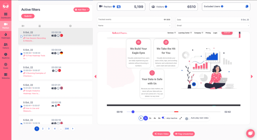

#3 Advanced Filers
Google Analytics’s filters are destructive. Once you filter the data, it’s gone. Filtering your incoming hits permanently includes, excludes, or alters those hits in that view, according to the type of filter you’ve selected. Unfortunately, all incoming hits are permanently modified for that particular view when you set them up.
Also, once you set up your filters, they take 24 hours before they are applied to your data. Check Google help to get more information.
On the other hand, WatchThemLive allows you to filter your data by name, email, page, country code, etc. If you receive a bug report from a customer, you can easily filter their name or email and monitor their journeys to fix the issue.
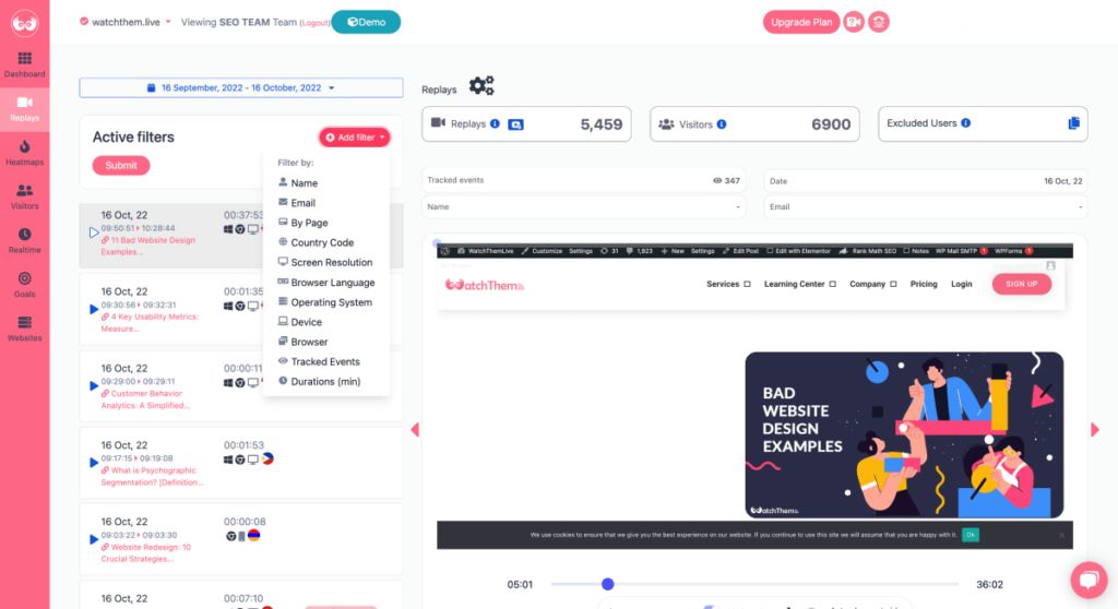

#4 Website Analytics
This tool offers a set of useful analytics like page views, user sessions, referrers, and user segmentation (countries, devices, languages, etc.). This information allows you to obtain a comprehensive and deep understanding of your audience and website viewers.
Compared to Google Analytics and other tools, WatchtThemLive’s website analytics is simple and easy to understand, especially for novice users. It doesn’t require any pre-knowledge, so you don’t need to know much about data science and web analytics to get the job done.
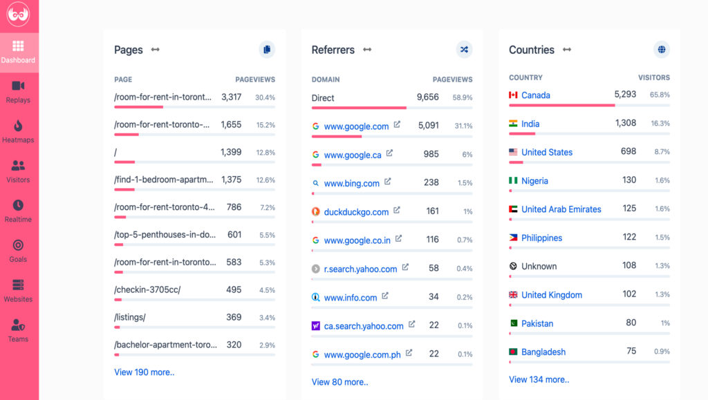

#5 Real-time Data
WatchThemLlive also gives you the option to see real-time data. Having access to online users’ data can help you in many ways and provide you with lots of opportunities. For example, if a sudden problem occurs, you can detect and fix it more quickly.
#6 Video Testimonials
Are you tired of not receiving feedback? WatchThemLive’s video testimonials enable you to collect your customers’ feedback in no time. But how? All you need to do is preset several questions you want them to answer; then, they should hit the record button and record a video while answering them. Good job! You got their shareable feedback now.
#7 Visual Live Chat
Probably, this situation has happened to every customer service: your customer support receives a report email, and they can’t realize what the problem is. Do you prefer to lose your customer or solve the problem? I think the answer is obvious. WatchThemLive’s visual live chat enables you to pair your session recording with live chat, so you can chat with your visitors in real time and monitor their journeys to see the obstacles on their way.
Want to try out WatchThemLive? Check out our plans here and choose the one that best suits your needs.
Why Should You Use WatchThemLive
Having a deep understanding of your audience is crucial to learning how to improve your website. This tool allows you to track each user’s journey through your website and see how they are experiencing it.
Having access to all this data helps you create a better user experience and make better marketing decisions. And you know that improving the user experience leads to a higher conversion rate.
The important thing is that all of this is done without invading your visitors’ privacy. Also, keep in mind that all your data will be safe. You will have full control of your information, and you can be sure it will never be shared.
WatchThemLive Plans and Pricing
- Free plan: ✅
- Individual Silver: $29/month
- Individual Gold: $49/month
- Team Silver: $69/month
- Team Gold: $ 99/month
WatchThemLive Pros and Cons
- Free plan ✅
- Click maps ✅
- Mouse tracking ✅
- Advanced filtering and data segmentation ✅
- Affordable pricing package ✅
- Fully CCPA and GDPR compliant ✅
- Scroll maps ❌
- Event and goal tracking ✅
- Real-time mode ✅
- Browser console recording ✅
- Video testimonials ✅
- Visual live chat ✅
- A/B testing ❌
- 60 days data retention ✅
- Responsive customer support ✅
- Public roadmap ✅
- Mobile app ❌
- Export all your data to CSV or PDF ✅
- Case studies ✅
- API access ✅
2. Plerdy
Plerdy’s motto is ‘It’s not just marketers who need heatmap tools’. We AGREE! But how can you fulfill their needs? As a heatmap tool, Plerdy promises to increase revenue, convert traffic into sales, and create a decent user interface based on collected data.
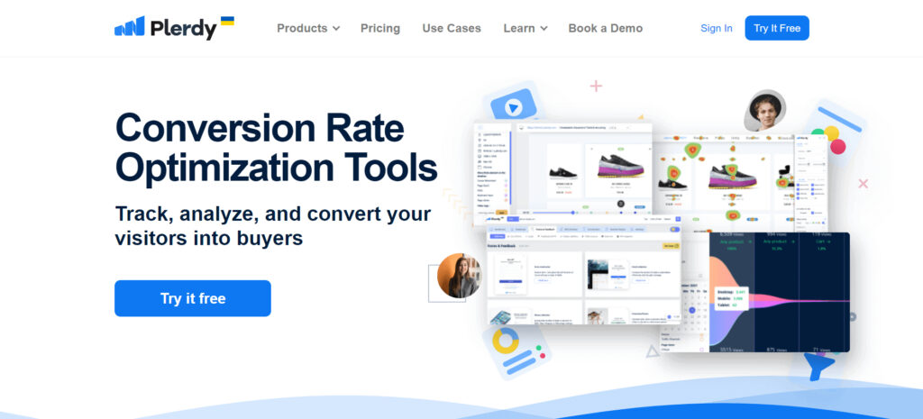

When you open your dashboard, you see different categories:
- Clicks: It displays click metrics and URLs segmented by device. But they are not easy to understand at first sight, and you may get confused.
- Clicks in Percentage: We can see clicks in percentage as well. So, the website is divided into five colored heatmap sections, allowing you to see how many have seen the specific section and clicked on it.
- Highlight Text: You can see what words are used the most on the website, and if we want to see a specific word, we just click on it, and then it will be highlighted. Moreover, you can get some text statistics that show the characters, the total words, the number of unique words, etc.
- Scroll Depth: Unlike Google Analytics heatmap, it allows you to check the scroll depth per page and device and see how far down people scroll.
- Mouse Cursor Movement: Some users don’t scroll down the page. Instead, they just move their mouse cursor around until they find what they’re looking for. So, you can see the cursor hover in percentage.m
- Click Sequences: Plerdy’s heatmap data shows what users click on first and the sequences they take.
Warning: If you want to try out Plerdy, use Google Chrome because you will encounter many bugs and issues within Safari.
Plerdy Key Features
- Session replay software
- Funnel analysis
- Heatmaps
- Net Promotor Score
- Event tracking
Plerdy Plans and Pricing
- Free plan: ✅
- Start: $23/month
- Business: $47/month
- Premium: $79/month
Plerdy Pros and Cons
- Free plan ✅
- Click maps ✅
- Curser hover ✅
- Advanced filtering and data segmentation ✅
- Affordable pricing package ✅
- Fully CCPA and GDPR compliant ✅
- Scroll depth ✅
- Event and goal tracking ✅
- Browser console recording ❌
- Video testimonials ❌
- Visual live chat ❌
- A/B testing ❌
- Data retention depends on the service plan you’ve chosen ✅
- Public roadmap ❌
- Mobile app ❌
- Case studies ✅
3. Lucky Orange
Lucky Orange takes ‘heatmap snapshots’ showing which elements on your page get the most attention from visitors. It also allows you to collect data on dynamic elements.
They claim you can ‘See which parts of a page drive conversions and which get in people’s way.’

Lucky Orange’s Dynamic Heatmaps Include:
- Scroll Heatmap,
- Click Heatmap,
- NO Mouse Movement Heatmap.
It enables you to change the look and opacity of the Heatmaps based on analysis or presentation needs. Furthermore, you can track every visit and give the user a picture of what is happening.
Warning: Lucky orange can be a good alternative to Google Analytics heatmapping; but remember that aside from the fact that more and more platforms are including scroll Heatmaps in their features, Lucky Orange does not have that.
Lucky Orange Key Features
- Heatmaps
- Session recording
- Conversion funnels
- Surveys
- Form Analytics
Lucky Orange Plans and Pricing
- Free plan:✅
- Build: $18/mo
- Grow: $35/mo
- Expand: $70/mo
- Scale: $150/mo
Lucky Orange Pros and Cons
- Free plan ✅
- Click heatmaps ✅
- No Mouse movement heatmaps✅
- Advanced recording filtering ✅
- Fully CCPA and GDPR compliant ✅
- Scroll heatmaps ✅
- Event tracking ✅
- Real-time mode ✅
- Browser console recording ❌
- Video testimonials ❌
- Visual live chat ❌
- A/B testing ❌
- 60-90 days data retention ✅
- Public roadmap ❌
- Mobile app ❌
- Export all your data to CSV or PDF ✅
- API access ✅
4. FullStory
You will have access to the click map and scroll map by clicking on ‘Page Insights’. Click map can be filtered by most clicked, most error clicked, most rage clicked, and most dead clicked areas.


Let’s explain each of them!
- Rage clicks: When a user repeatedly presses a button, and nothing happens.
- Dead clicks: When a user clicks on elements of a page that aren’t meant to be clicked.
- Error clicks: When a user clicks on buttons or elements that don’t work properly, which can cause system errors. Technically, when a user clicks an element that triggers a client-side JavaScript error, those error events are indexed as ‘error clicks.’
- Thrashed cursor: When a user moves their mouse cursor around in confusion which means they are confused, annoyed, and/or stuck.
FullStory Key Features
- Session replays
- Heatmaps
- Funnels and conversions
- Journey mapping
* FullStory plans and pricing is not available on their website.
FullStory Pros and Cons
- Free plan ❌
- Click maps ✅
- Mouse movement heatmaps ❌
- User segments ✅
- Ambiguous pricing package ❌
- Fully CCPA and GDPR compliant ✅
- Scroll maps ✅
- Real-time mode ✅
- Browser console recording ❌
- Video testimonials ❌
- Visual live chat ❌
- A/B testing ❌
- Data retention depends on the service plan you’ve chosen ✅
- Public roadmap ❌
- Mobile app ❌
- Export all your data to CSV or PDF ✅
- Case studies ✅
- API access ✅
5. Capturly
By now, you must have understood how helpful heatmaps are. And Capturly is the last alternative to Google Analytics heat map, which provides features for user behavior analysis, including click heatmaps, scroll heatmaps, segment heatmaps, and session recording.
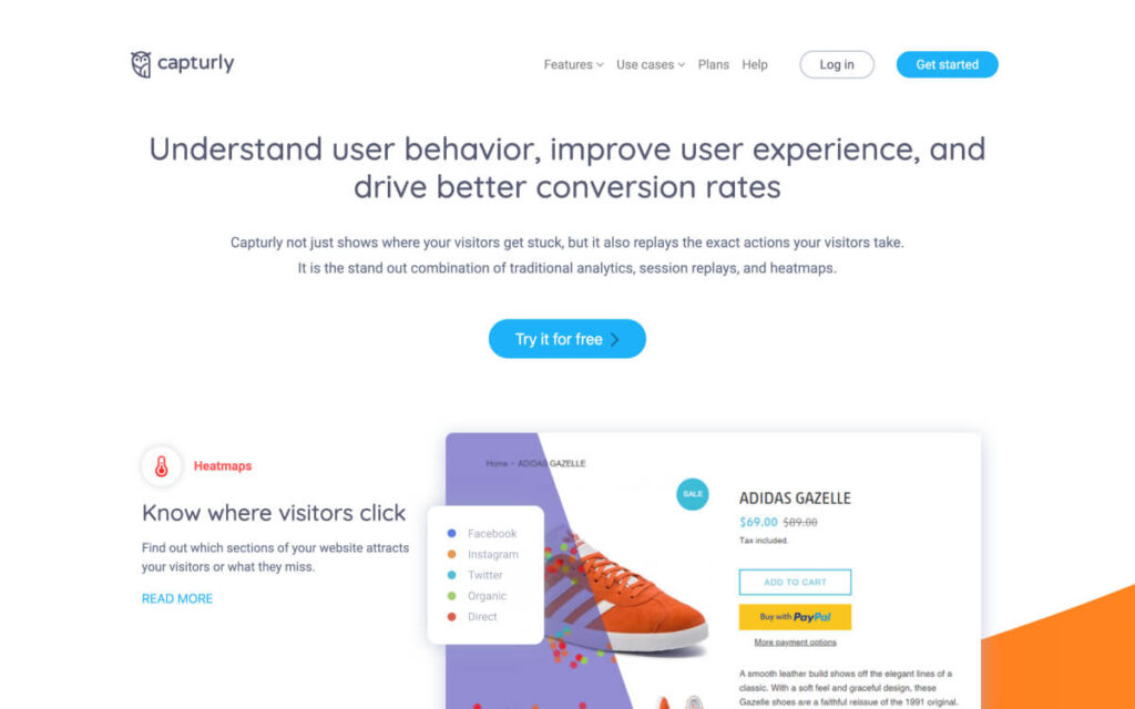

Capturly Key Features
- Heatmaps
- Conversion funnel
- Session replay
- Analytics platform
Capturly Plans and Pricing
- Free plan: ✅
- Lite: Starting at $29/mo
- Growth: Starting at $79/mo
- Custom: Contact them
Capturly Pros and Cons
- Free plan ✅
- Click heamaps ✅
- Mouse movement heatmaps ❌
- Segement heatmaps ✅
- Advanced filtering ✅
- Affordable pricing package ✅
- Scroll heat maps ✅
- Event tracking ✅
- Browser console recording ❌
- Video testimonials ❌
- Visual live chat ❌
- A/B testing ❌
- 6 months data retention ✅
- Public roadmap ❌
- Mobile app ❌
- Export all your data to CSV or PDF ✅
- Case studies ✅
- API access ✅
Google Analytics Heatmap FAQs
In this section, we’ll try to answer all the questions occupying your mind.
1. What Is Segment Heatmap?
You already know the click heatmaps and scroll heatmaps, right? What about segment heatmaps? Segment heatmaps are shown in different colors for easy distinction. To know which referrers bring the most active visitors to your site, you can use segment heatmaps to check the traffic source. Sadly, Google Analytics heatmap doesn’t provide you with this type of heat map
2. How Do I Create a Custom Heatmap Using Google Analytics?
Take the steps below to create your own custom report:
- Create a new report,
- Click on customization,
- Select ‘New report’ and enter details,
- Set the range,
- Export data,
- Apply the heatmap.
Conclusion
Google Analytics heatmapping is a useful tool that can help you improve your website. This feature offers you a visualization of the numerical data on Google Analytics. However, it comes short compared to other available heatmapping tools because it doesn’t receive any updates anymore and only provides click maps.
We introduced WatchThemLive as a great alternative to Google Analytics heatmapping. This service offers heatmapping along with many other features that can help improve your website most effectively.
Add a banner.
Sign up and seize them now!

