Page Contents
One of the biggest challenges for an online store is offering a seamless checkout flow that can convert visitors to buyers. The process, design, and features of eCommerce checkout flow are essential in satisfying customers; it also allows them to order and pay quickly on your website.
The best checkout flow can improve conversions, create a great user experience and reduce checkout abandonment. In this article, we provide you with the best practices to design a seamless checkout flow for your eCommerce. We also cover some questions in this regard.
Note: Looking for the best ways to improve your eCommerce checkout flow and increase the conversion rates? watchThemLive can help you with that! Keep reading to learn how.
What is the checkout flow?
The checkout flow is the process of buying the product in their shopping cart on an online store. It starts when the customer visits your website, continues reviewing the products, and ends when the payment transaction is completed. The great checkout process includes every step that converts a customer to a purchaser and reduces abandonment.
What Is the Best Checkout Process?
The best eCommerce checkout has a clear flow and is designed seamless and frictionless for customers. It can increase conversion rate and reduce cart abandonments. The ideal checkout process will help customers to have a good experience in an online shopping store.
What Does Checkout Mean in Marketing?
The checkout process includes the process when a user places an order in your online shop and continues to complete their payment. The checkout process seems simple, but there can be complex processes behind it that affect the eCommerce customer experience.
Why Is the Checkout Process Important?
The checkout process is essential for optimizing your eCommerce store’s payment and improving conversions. However, one breakout stands between the shopping cart and checkout flow: cart abandonment. In short, optimizing the checkout process is a crucial step because it can affect the users’ experience and selling rate in your eCommerce. So, a good checkout process reduces negative user experience and prevents cart abandonment.
What Is Checkout Abandonment? Why is it Important?
Checkout abandonment is when the customer leaves the payment flow after they have initiated it. In checkout abandonment, customers add some items to their cart, enter their credit card information, and then decide not to complete the transaction. Cart abandonment is when customers add some things to their cart and then abandon the website for whatever reasons.
WatchThemLive is a behavioral analytic tool that records your customers’ journey and helps you find the reasons behind their behaviors. It will give you a deep understanding of what your customers go through when using your product to deliver a good user experience. You can exactly see their last interaction before they abandon your website. For example, a user might leave after seeing your limited payment options. When you watch this user’s session, you will understand that this was their reason for leaving your website. Now you can optimize it for the best results! Sign up here and get started with WatchThemLive’s session replays.
These abandonments show your lost revenue, so you should always reduce your abandonment rate. If you identify where the customers often leave the process, you can start to find shopping cart abandonment solutions.
Reasons for Checkout Abandonments
There are various reasons for checkout abandonments. These reasons vary across industries, even from customer to customer. But there are common reasons for checkout abandonments in eCommerce:
The following are some reasons why customers may be leaving:
Forced Creation of an Account or Sign-up
Demanding users to create an account on your website puts a barrier in their way. This may stop them from buying.
Complex Checkout Process
Provide an uncomplicated and seamless checkout process to reduce customer drop-offs during the purchase.
Limited Shipping Options or Delivery Methods
Include different shipping methods in your checkout flow for customers to select since the delivery options are essential for most customers.
Lack of Different Payment Methods
When the customer’s preferred payment method is unavailable, they may leave the flow and not complete the payment process.
Performance Issues and Errors in the Checkout Flow
The truth is that all customers are looking for a fast and frictionless experience. The consistent performance issues on your website or app’s checkout flow will turn your customers away.
You can check out this article for more information: Digital Shopping Cart Abandonment Effects You Need To Know.
8 Checkout Flow Best Practices
These best practices for checkout flow design will bump up the conversion rate optimization of your eCommerce store and also reduce cart or checkout abandonment as much as possible. Here, we will enlist eCommerce checkout flow best practices along with examples; join us.
1. Optimize Your Checkout Flow for Mobile Devices
Any checkout page should have a mobile-friendly flow alongside the website checkout flow; even you may have mobile checkout versions prioritized over websites. Therefore, a mobile-friendly checkout flow is essential because most online shopping is done through mobile devices. If you do not optimize your checkout flow for mobile devices, you will lose many customers.
2. Design a Simple Checkout Flow
It is so obvious that keeping your checkout flow as simple as possible goes a long way in conversion optimization. To design a checkout process as simple as possible, you should remove the header and footer at checkout. They may pull the customer away from multiple options. Some of the examples of friction in checkout flow include long forms with too many fields and forced sign-up. You should design a distraction-free checkout and remove friction to ensure it becomes seamless.
The WatchThemLive analysis tool is one of the best tools to help you optimize conversion. It will give you deeper insights into users’ behaviors, drop-off points, and purchase barriers and identify your target audiences’ needs.
The following are some ways to ensure a seamless checkout flow:
Using Single Page Checkout
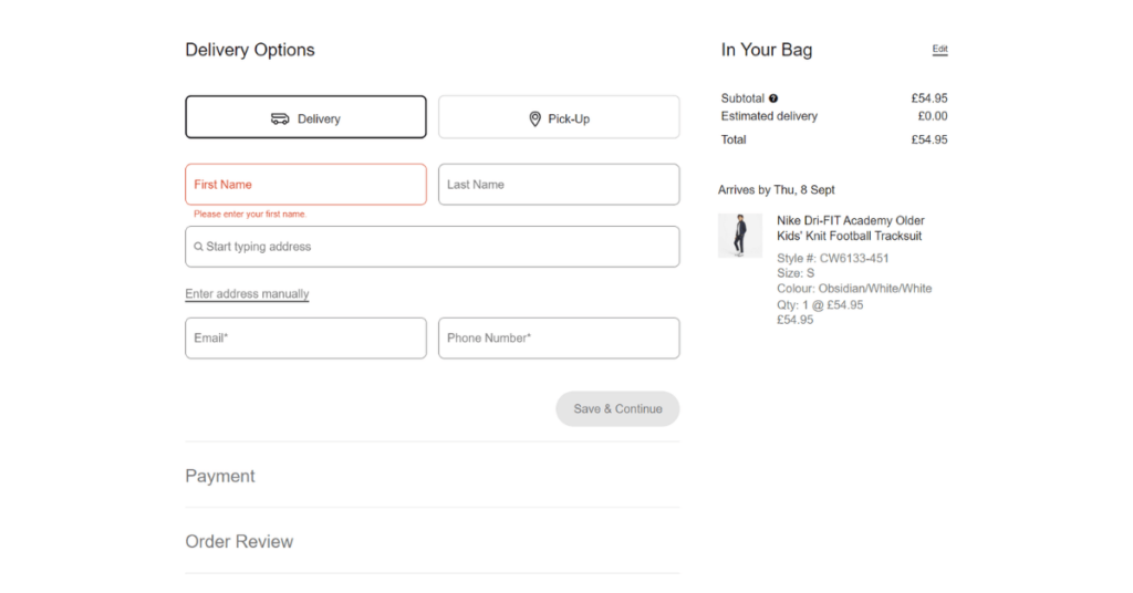
From a user point of view, one-page checkouts are more straightforward than multi-page checkouts. In a one-page checkout, all the steps of purchasing are displayed on a single page. Putting all the information on a single page makes it lengthy. To cope with this, you can add a progress indicator. It allows customers to fill out information without any distractions.
Check out Nike’s checkout, which uses a one-page checkout.

Enable Smart Form Filling in Checkout
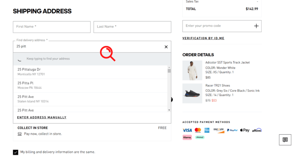
The intelligent form filling includes using autofill options or additional shipping address predictor tools in both b2C and b2b eCommerce checkout flow. This will help you have field validation. For billing addresses, use a radio button or a small checkbox. By using these tools, the process of form filling gets efficient, quick, and error-free. Take a look at the example below for a better understanding.

Allow Guest Checkout
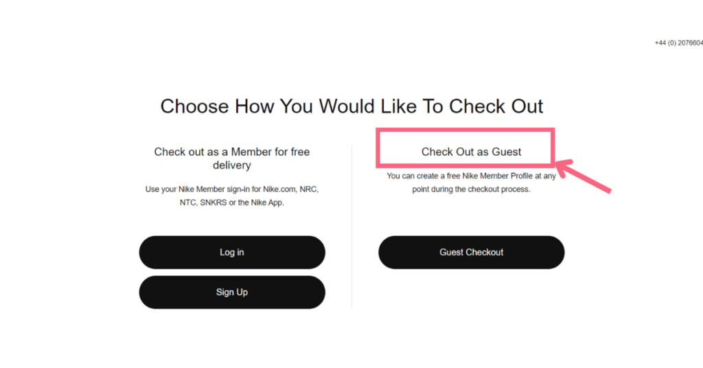
Customers often want to purchase a product and move on with their lives quickly. The worst thing in this process is forcing them to create an account. This is a result of cart abandonment. You should allow customers to checkout as a guest to finish their purchases before changing their minds. It is important because you do not want to make a barrier for users who want to buy your products. Instead of the forced register part, you should make the buying process as easy as possible. You can take a look at examples of an exceptional checkout page design to get inspired.
Check out Nike’s checkout, which provides a guest checkout for new customers without an account.

3. Think Global
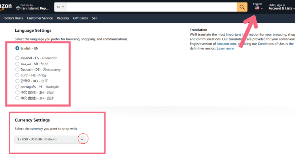
When an eCommerce business has customers from different countries, it is crucial to think about localization in the checkout experience. It has a higher chance of conversion because it removes any hurdles foreign users may have. You can do so by applying the following ways:
- Support multiple currencies
- Support global tax guidelines
- Support multiple languages
On Amazon, customers can change the language settings of the website. Amazon also supports different currencies for its customers.

4. Get the Best Out of the Checkout by Optimizing for Conversions
Are there any other methods to increase the conversion rate on your eCommerce store? Do your best and take all steps that an online buyer goes to proceed with the checkout flow. Here’s how you can do so:
Take Advantage of Upselling
Upselling is a significant way to tempt a buyer to make more purchases, but too many upsell options can hamper UX and make it distracting. Look at how this website makes upsells accessible:

The additional items are added to the cart with limited period offers with checkbox buttons.
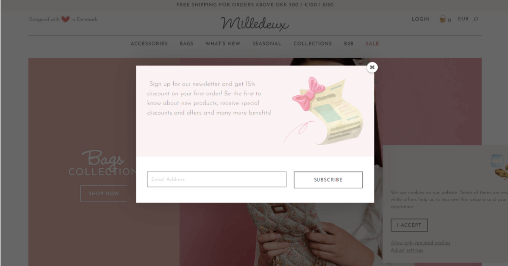
Exit Intent Pop-ups
This is the last effort to entice a leaving customer. You can make them with some clever copy and discounts. You can add limited-time promo codes to encourage leaving customers back to make a purchase. If they want to leave the page anyway, give them an option to create an account for updates and newsletters.

5. Test the Checkout Flow
To ensure that your eCommerce checkout flow is working perfectly, you need to test everything from the CTA to rearranging the images. By using platforms such as WatchThemLive that provide features like heatmaps, you will gain access to heatmaps and user’s session recordings. which helps you can to find the best placement for your CTAsa and important buttons. Heatmaps show where the users have clicked on the most through warm and cold colors. This data tells you that placing your CTAs in cold areas is a big mistake. Instead, put them in warm areas and see the results for yourself. Sign up here and get started with heatmaps now!
6. Build Trust in Your eCommerce Checkout Flow
Some customers will leave because they are in doubt about a product, customer support, and more important the security of the transaction. To decrease this kind to abandonment, you can build trust in the following ways:
Add Customers Testimonials
This is a great way to reassure customers who are unsure about your business. The testimonials with positive reviews will ensure them and decrease the risk of cart abandonment.
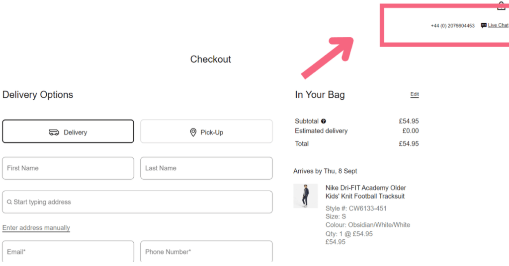
Support Your Customers if They Need
The second way to reassure your customers is by enabling a live chat option at checkout. By doing so, the customers are convinced that help is available whenever they need it. For example, take a look at Nike’s checkout. It provides live chat support and phone number to reassure customers.

7. Make Your Checkout Flow Flexible and Convenient
You have to prevent the customers from leaving your online store. By making your checkout process more convenient and flexible, you can reduce abandonments. Use the following ways to do it:
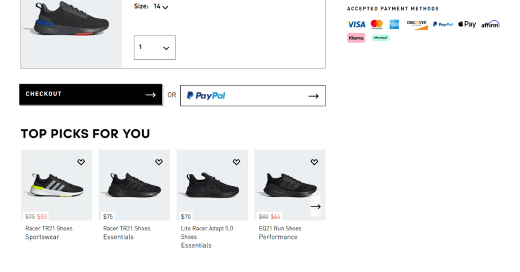
Add Multiple Payment Options
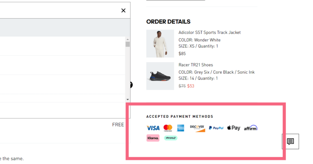
The lack of preferred payment methods is one of the most documented reasons for customers to leave your online store. You can nudge customers to follow through with the purchase by adding all payment options, such as credit cards, PayPal, Amazon Pay, or Apple Pay.
In the following, we have Adidas checkout flow in which there are multiple payment options for customers. It supports 9 payment methods for different countries.

Offer One-time Purchases and Subscriptions Checkout for Your eCommerce
By adding subscriptions for your eCommerce business, you can offer both one-time purchases and subscriptions. By doing so, your potential customers find the flexibility to choose.
8. Apply Security and Privacy Certifications in Checkout
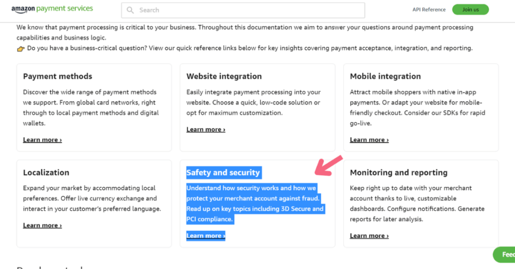
Applying security certifications will show customers that your eCommerce business is safe. Some online customers pay a lot of attention to the security of transactions. Displaying security certifications at the checkout flow ensures concerned customers. Applying security and privacy rules is essential in certain regions with specific guidelines.
As you see in this example, displaying security certifications at the checkout page will boost confidence in concerned customers.

Here are examples of some of these regulations:
Apply Security Guidelines Like SSL and PCI
SSL (Secure Sockets Layer) certificate your online shop to provide a secure connection and encrypt information. PCI DSS (Payment Card Industry Data Security Standard) is also essential to protect card information and secure payments.
Apply CCPA, GDPR, and MFA Standards
California Consumer Privacy Act (CCPA) and General Data Privacy Regulation (GDPR) are data privacy guidelines. Complying with these rules prevents the disclosure of customers’ private data, such as their credit card information, shipping address, phone number, etc. The other guideline is MFA (Multi-Factor Authentication) which adds additional security over customers’ login passwords.
Conclusion
The checkout process is the most essential step of the buying process, so continually optimizing the checkout flow will be worth it. Making a seamless eCommerce checkout experience is a long and ongoing process, and these 8 best practices will help you design it more efficiently.
One of the best tools to analyze and record user interaction on your website to provide an excellent checkout flow is the WatchThemLive tool. Sign up now and snag your free plan!

