Page Contents
If the effort and money you invested in making your Shopify store look perfect is paying off, you’ve optimized your conversion rate successfully. You need to check over the home page, collection pages, and product pages to ensure nothing is missing. There should be nothing that discourages a potential customer from making a purchase. And the most crucial piece of this process is your Shopify checkout page.
That’s where the magic happens, and you shouldn’t overlook it. The Shopify checkout page is where all of your work should pay off. That’s where your customers will pay you and complete their journey. So, what will happen if you don’t have a perfect checkout page? You’ll lose revenue—that simple.
The default checkout page, as you can see in the image below, is quite plain. It lacks a logo, and the color of the button and highlighted text box does not match the brand colors. This checkout page does not appear to be very trustworthy.
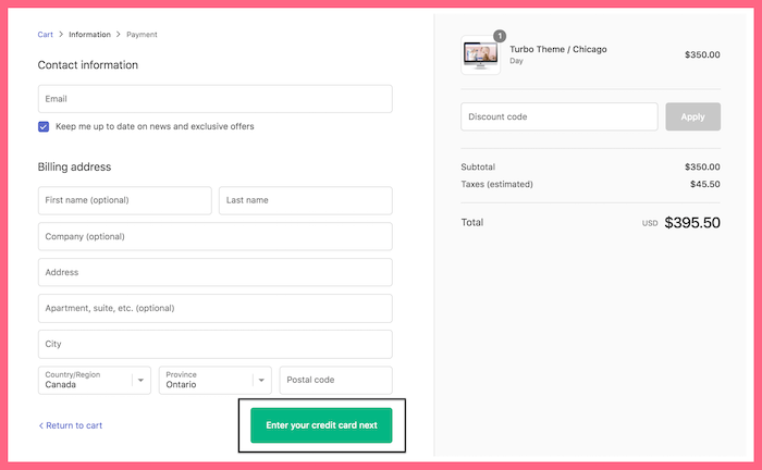

If you have purchased from Shopify sites before, you may have taken a look at it and decided that the website does not appear safe when you reach the checkout. This may have led you to leave the website and shop from other sites.
Here in this article, we will teach you how to optimize your checkout page process to prevent these tragic outcomes. Stay with us until the end to find out even more.
11 Strategies for Optimizing Your Shopify Checkout Page
Here are 11 checkout optimization tactics you can use to give your consumers a smooth checkout experience and increase your sales.
1. Make a Great First Impression
As we all know, the first impression is something that can affect all of the other aspects of the shopping process. It’s so important to consider it and improve it.
WatchThemLive behavior analytics tool is the way to go in this matter. Our session replay service will gather crucial information about customers’ behaviors. You can see how they behave when they are on your website and what their pain points are. This way, you can make decisions according to facts, not only hypotheses.
Want to try out our session replay to make your first impression great? Sign up now and use the features we offer you.
2. Scarcity Marketing
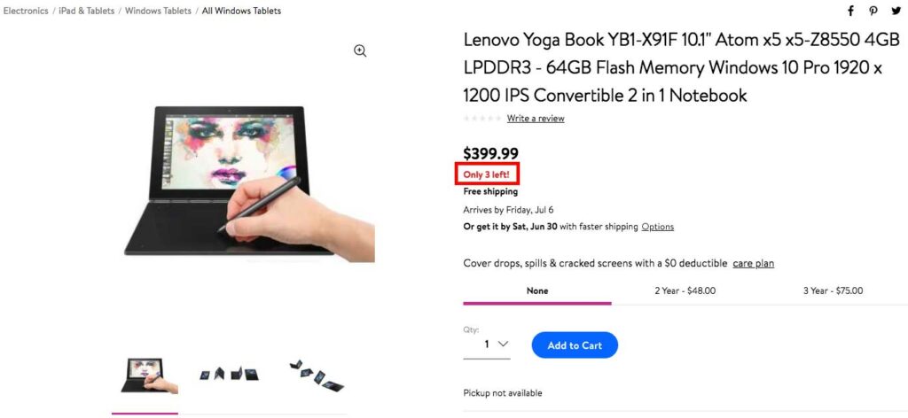
Scarcity messages can influence product selection in the last stages. In reality, scarcity impacts the final decision consumers make when making a purchase. As a result, if you inform your users that there is a very limited quantity of these goods in stock, they are more likely to finish their checkout.
As you can see, Walmart has done a great job in showing the items left in their store. This will make an urgent need in customers and lead them to finish their payment even faster.

3. Speed Up the Process
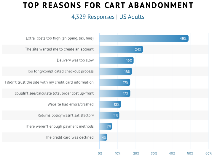
Consider including all of your checkout steps on one page. This includes account creation, shipment information, and total cart amount, and etc. The checkout experience is streamlined with fewer steps and clicks, which reduces shopping cart abandonment.

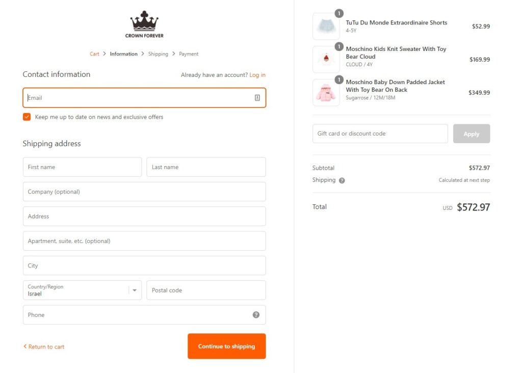
4. Use Your Logo
Unfortunately, Shopify does not provide many customization choices for the checkout page. However, you can easily upload your logo to make the colors match your brand. This will greatly improve the appearance of your Shopify checkout page and boost your authority between customers.
Simply by following this strategy, you can make your checkout page appear more trustworthy and legitimate.

5. Include Guest Checkout
Customers want to easily make a purchase when they arrive at the checkout page. Forcing them to register in order to move forward may annoy them and cause them to abandon the process. Offer a guest checkout option as a solution to reduce the abandonment of the payment process.
If it’s absolutely necessary, give them the option of logging in using their Facebook or Google accounts. This is much easier than creating a brand new account.
6. Multiple Payment Methods
Allowing potential customers to see what types of credit cards and other payment methods you accept will help build trust. If you provide a variety of payment methods, it demonstrates that you have a valid payment gateway in place. It also allows customers to know straight away if they will be able to pay using the method they prefer the most.


7. Increase Your Page Speed
You can improve your checkout page loading speed by compressing pictures or removing unwanted ones. These are the most common causes of page load time delays.
To minimize the size of your images, use any of the free compressor applications available online, such as TinyPNG and Compressor.io. You need a complete analysis of your website to understand how to implement this strategy.
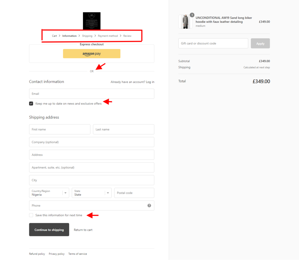
8. Full Guidance at Each Step
When visitors are unsure about how your checkout process works, they are more likely to leave and go to a store that has an easier one. However, if you give them a direction that informs them how many steps are remaining and what these steps are, they are more likely to make a purchase. Helping is always beneficial, even in the digital world.

9. Make Your CTA Stands Out
Imagine that your customers should look around your page to figure out what they should do next. This is certainly not an optimized page. Your CTAs play an important role here. You should use proper shape and color for each one of them. Also, remember to use contrast to make it easier for customers to find your CTA button.
10. Mobile Optimization
Nowadays, customers are more likely to interact with your website on a mobile or tablet than on a desktop. This is why it’s critical to make your Shopify checkout page mobile-friendly. Make sure it’s mobile responsive to a variety of touch gestures, screen sizes, and finger sizes. You don’t want to lose the huge potential that lies in mobile devices.
11. Use Reviews to Show Them Why Customers Buy from You
Customers appreciate hearing what others have to say about your product. Reviews help to demonstrate how genuine and high-quality your product is. It’s almost as though it’s a recommendation. As a result, including reviews and comments on your Shopify checkout page assist you to improve your reputation.
To help reinforce trust, you can also add security badges. Customers are more likely to pay for a product that they believe is trustworthy. Moreover, social proof from previous and current customers should be displayed on your checkout page’s initial step as well.
Conclusion
As the customer moves toward the last stage of shopping, the Shopify checkout page will become super valuable in convincing them to finish their purchase. In this article, we mentioned some of the best tips and strategies you can employ to give life to your checkout page. These strategies make it easier for customers to complete their processes.

