Page Contents
Every company wants to convert visitors into leads and ultimately, sales, and that’s what conversion rate optimization is all about. You may want to attract new attendants to sign up for a newsletter (micro conversion), or you may like to focus on converting more visitors into buyers (macro conversion.) So, understanding how effectively visitors are converted to the next step is important.
Are you ready for your online business’s conversion rate optimization? Conversion rate optimization can seem like a maze that you don’t know where to start and where to go next. We make it easy for you to follow eight steps and complete your CRO process in an organized manner. Let’s discuss it in more detail and follow a conversion rate optimization checklist of the required steps to do CRO in 2022.
Some of these steps are general, i.e. for most of the websites, and some are only for eCommerce websites. Though it’s not a list of simple tips, it’s a checklist of crucial steps that make big changes.
Note: Are you also looking for a CRO tool to boost conversions? WatchThemLive can help you increase your conversion rate by giving you actionable data about your visitors. Keep reading to learn how.
Before Stepping into CRO
There are three things you should know that impact CRO before starting its process:
1- Drivers
The things that direct visitors to a website are called drivers.
2- Barriers
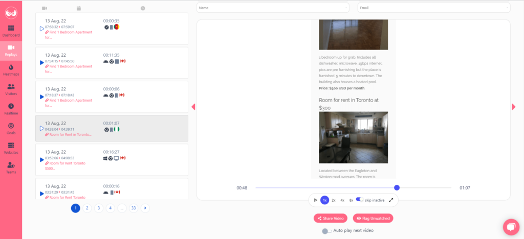
The things that make visitors leave a website or stop them from converting are called barriers. The best and most accessible tool to understand what gets in visitors’ way session replay software like WatchThemLive’s session recording tool. Session replays record visitors interaction with your website from the moment they enter your website until they leave. There won’t be a single unseen movement. You can watch their replays using enhanced filtering system and identify and fix any problem they encounter. You can see their last interaction right before they leave, so you can understand what is making them frustrated. Sign up and start using WatchThemLive’s session replays now!

3- Hooks
Anything that compels visitors to do the conversion goal is called a hook.
Having these three things in mind when optimizing your conversion rate helps you better understand why you’re doing each step. Now, let’s start the revolutionary change on your website
Conversion Rate Optimization Checklist
Here’s the conversion rate optimization checklist you need to increase your conversion rate. Read until the end.
1. Home Page Optimization
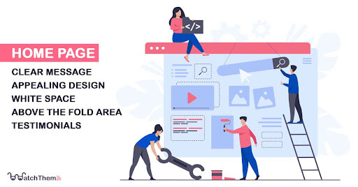

The first element on our conversion rate optimization checklist is your homepage. For your visitors, your homepage outlines the whole customer journey. No matter how good your product is, if you offer them a poor homepage experience, your visitors won’t convert.
Consider your homepage similar to a product or service page. This does not imply that you should design your homepage like an eCommerce landing page. Rather than that, your homepage should have a clear purpose and call to action, as any effective home page should. Let’s find out what you can do to turn your home page into a conversion machine:
• Clear Message
Try making your design simple and clear to understand. Your homepage should convey what you do and why visitors should purchase from you or use your service. A great way to do that is by explicitly explaining your unique selling proposition. Many businesses employ a complex homepage that is frequently brand-driven and requires visitors to know and understand your jargon.
• Appealing Design
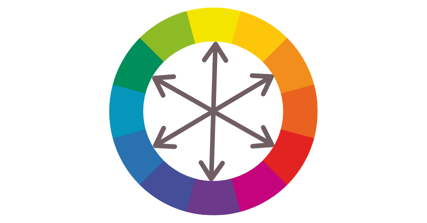
Pay attention to the colors you use on your website’s homepage. Using contrasting colors for background and fonts, as well as banners and buttons, has a great impact on the conversion.
The color wheel can help you find contrasting colors easily. The complementary colors are placed opposite to each other and you can use them together for conversion rate optimization.

• White Space
Similar to colors, white spaces are important for designing a decent website. The essential components should be surrounded by enough white space to keep them in focus. Also, using white space improves readability, which enhances user experience and can result in conversion rate optimization.
• Above the Fold Area
The area on your website that is visible without scrolling is called ‘above the fold.’ To make sure visitors won’t miss your forms and call to action buttons, place them above the fold. Placing any form ‘above the fold’ on your website is more successful. Because your offer catches user attention before they even scroll down.
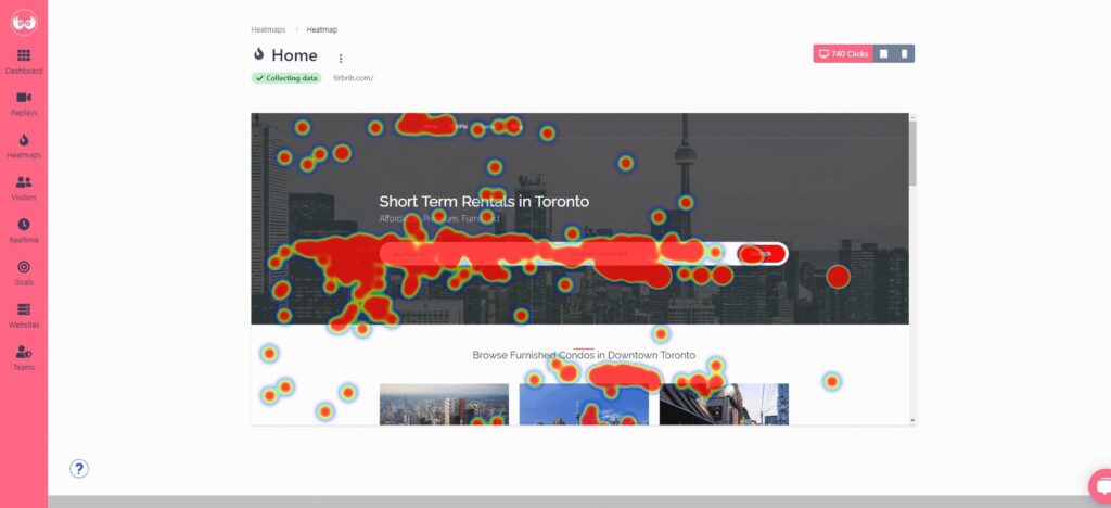
Heatmaps are visualization of data which are very easy to understand. They give you valuable information about how your visitors perceive your web pages. You can see where they click the most and the least through warm and cold colors. You can put your important buttons and CTAs in the warm areas and increase your conversion rate. With heatmaps you can understand if your users are paying attention to your above the fold or not and get inspired with redesigning ideas.
WatchThemLive offers the best heatmap solutions which allows you to create heatmaps for any web page on your website. Sign up here and get started with WatchThemLive’s heatmaps.

• Testimonials
Your homepage has the potential to be a strong asset at the beginning of your sales funnel. Placing social proof on your homepage is very effective in making that happen. People want to trust brands before they purchase anything from them. By including success stories and testimonials from satisfied customers you assure them of their buying decision. Testimonials work like an approval stamp, making it easier for customers to trust in you.
2. Landing Page Optimization

A landing page is the first page users visit when clicking on your ad or your link in their email. Unlike other web pages, which usually have many objectives, landing pages have a single goal, and a call to action (CTA).
Landing page optimization is an important step in conversion rate optimization. Because it’s the first page your visitors view after clicking on your advertisement.
For landing page optimization, you should know who is visiting it and why. So, you can study your web analytics to find out who is visiting a website. Another more direct approach is conducting a survey and asking visitors who they are and why they’re here.
Here’s what you can do to optimize your landing page:
• Landing Page Design
Any landing page should include these three elements:
- Headline
- Body
- CTA
You can improve the design of these three elements to increase conversion. As landing page visitors have arrived there after viewing an ad, you can elaborate more on the ad message. Highlighting the key benefits you’re offering increases the chance of getting converted.
For example, you can use clear short headlines and include only one CTA button on your landing page.
• CTA Button
The call to action is the most essential element on a landing page. Your landing page’s primary objective is to attract visitors’ attention to the CTA and boost conversions. Any mistake in your CTA button makes your landing page useless. So, follow these tips to improve the CTA button on your landing page:
- Ensure the CTA button is easy to spot.
- Make the CTA copy engaging and catchy.
- Ensure that visitors can guess what happens if they click on it.
- Find the most popular areas of your page using heatmaps to put your CTAs there.
3. Navigation Optimization

Maintaining logical navigation is a fundamental step in conversion rate optimization. Ensure the navigation flow is clear and users can easily find what they’re searching for.
• Navigation Flow
The flow of your navigation menu is defined by your menu categories. Before you begin, it is critical to establish your menu categories. But, how should you choose them to enhance conversion rate optimization? Here’s how:
- Choose the easiest method for arranging your inventory and your basic inventory into easy-to-understand categories.
- Make a list of them as main categories and see how you can further subdivide them.
- Keep the most popular and frequently searched categories at the top of the list.
• Responsive Navigation
Another important thing about menus is if they’re responsive in different screen sizes. So, you should optimize your website menu across various devices. A website analytics tool can help you figure out your visitors’ devices and screen resolutions. WatchThemLive has the best web analytics in the market.
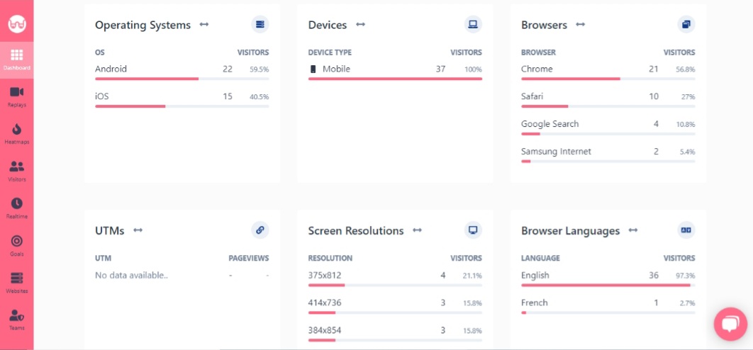

You can improve the mobile navigation using the following tips, which helps the conversion rate optimization:
- Incorporate a hamburger menu for mobile devices.
- Employ simple and comprehensible filters.
- Don’t clog up the mobile menu with unimportant options.
4. Information Page Optimization


Usually, when visitors find your homepage engaging, they visit your information pages. They want to know more about you, and you shouldn’t let them down. Evaluate the following pages before moving on to the next step on your conversion rate optimization checklist:
• About Us
Businesses invest a significant amount of time crafting the ideal about us page. The following elements can help you improve your this page:
- Share your story, mission, and vision
- Make it visually appealing.
- Introduce your team, including their names and photos.
- Inform others about your company’s news and statistics.
• Contact Us
When a visitor views your contact us page, it’s a good sign because they are close to conversion, or trying to know you better and make a connection.
To improve your conversion rate, create an effective contact page based on your company strategy. Some companies employ live chat to provide quick assistance to their prospects online while others may prefer to place a “contact us” form or their email.
• FAQ Page
A page for the frequently asked questions is essential for reducing user concerns and addressing their issues. An FAQ page has two main advantages:
- It saves you time by addressing frequently asked questions.
- It also assists your client in making an educated buying decision.
5. Blog CTAs Optimization

Blogs should be a crucial part of any website’s conversion rate optimization checklist. They have assisted companies in improving their SEO, visibility, and conversions. According to Monster Insights, blogs are capable of generating 3 times more leads than paid search ads.
The most effective CRO elements on blog posts are the CTA buttons. If your call to action is boring and uninspiring, it won’t attract visitors enough to click it and convert.
In the previous section, we highlighted the significance of CTA buttons on landing pages. Now it’s time to focus on utilizing CTAs effectively in your blog articles and increase the conversion rate. That’s because even if you have the most captivating headlines and informative content, blog posts don’t make conversions without good CTA. Including effective CTA buttons in your blog articles can help you boost your conversion rate and optimize it.
Including social sharing buttons on your blog is a practical way to increase your reach and thus, your conversions.
Also, it’s good to employ user-generated material from your social media profiles on your blogs. Generally, people are more inclined to purchase a product if it appears in user-generated content.
6. Product Page (eCommerce) Optimization


Another essential component of a conversion rate optimization checklist is optimizing your product pages. If you have a large inventory, make sure your filters are perfect and your products are easy to find.
Another reason why product pages should be optimized is that they contain pricing, shipping, and delivery information. The majority of people shop based on delivery time and shipping cost, while many others shop based on product offers.
So, here’s what matters most on a product page:
• Product Details
Definitely, on product pages, you should never share inaccurate product details, however, it is harder than it sounds. Many companies provide incorrect information about product size, color, etc. Such error results in negative feedback. Consequently, this will lower your conversion rate.
Before posting product details, have your team double-check all of the product information. This is a critical stage in the CRO of your product pages.
• Product Price
Price is another important element on your product pages. Ensure that the currency is stated with the price. Give your international visitors the ability to change currencies.
Also, explicitly state any price offer and its conditions so that there is no room for confusion.
• Product Images
It takes time to create high-quality images, but they are a one-time investment. These may be very beneficial to your conversion rate optimization.
• Shipping Details
Make sure the shipping methods, fees, and criteria for free shipping are clearly explained on your product pages. If you have same-day delivery, state its conditions and fees so that your customers can decide easily. Also, elaborate on any shipping insurance you may have.
• Product Review
Before making their first online purchase, 93% of customers check online reviews before their purchase. Product reviews are critical for increasing product page conversions. People who read reviews can make better and more educated decisions.
As buyers trust reviews, you can include them on your product pages. Make sure your reviews are easily accessible. Provide the number of reviews, names, countries, and the number of stars for your customers to easily review. Users should be able to quickly navigate among them without much effort on their side.
7. Checkout Page (eCommerce) Optimization

The checkout page is where a macro conversion goal happens. If you want to increase the conversion rate, you must improve your checkout page. You don’t want your client to leave at the last possible moment. Simply optimizing the checkout process to boost conversion.
One research in 2021 well-highlighted the major barriers customers face on a check out page that makes them leave:
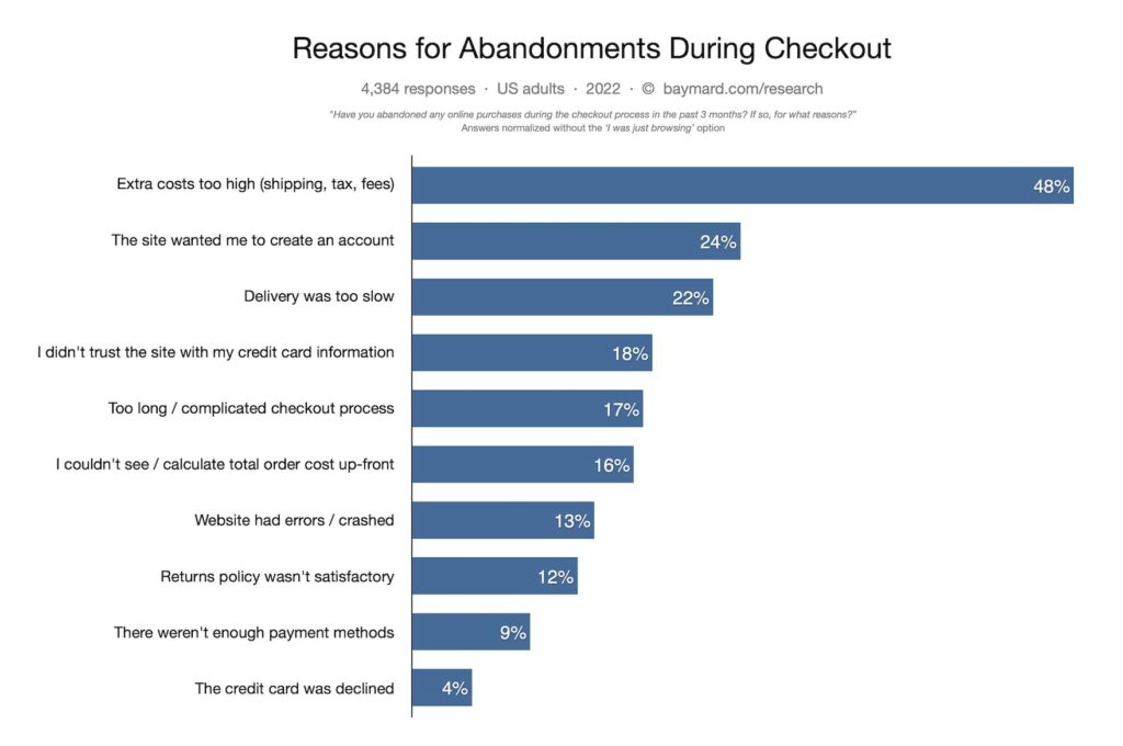

Image source: baymard.com
So, to optimize the checkout page, it’s best to follow these simple tips:
- Make it easy for your users to register on your eCommerce website or even allow guest checkouts.
- Try making the checkout process fast and easy by avoiding long forms and unnecessary fields.
- Provide multi payment options so that your users can choose from them.
8. Visitor Retargeting

The conversion rate can increase to up to 150% when businesses employ retargeting strategies. This means that if you are not retargeting your visitors you are missing out on potential buyers. This is why retargeting is an important part of our conversion rate optimization checklist.
There are many methods for retargeting your clients. For example, you can use display ads on other websites to retarget them. Also, you can do this using social media platforms. The advantage of retargeting them on your website is that you may be able to convert them right away. Moreover, you save money on retargeting ads.
Conclusion
Through this CRO checklist, we discussed different ways to optimize your website conversion rate and the priorities of these steps. It’s good to start from your homepage, as it’s the main page of your website. Then, move forward to the landing pages, information pages, CTA buttons, and eCommerce-specific pages like checkout and product pages. At the end of your CRO process, try retargeting your visitors to maximize conversion.
You can also use a behavior analytics tool like WatchThemLive to get to know your audience better, give them what they want, and increase your conversion rate. Sign up here and snag your free plan.

