Page Contents
User experience, or UX, covers many aspects of a business, from SEO to customer service. When you run an online store, you need to track what users are doing on your website to design a better conversion funnel; on top of that, you won’t rely on guesswork. A good user experience leads users through every interaction they have with your business.
Since user experience can cover any marketing aspect, it greatly impacts your conversion rate, and you can use it to improve conversions. If you want to learn UX strategies for optimizing conversion rate, keep reading this article.
Note: WatchThemLive is a behavior analytics tool that helps you track users’ behavior and see everything from their perspectives. If you want to learn how, stay with me.
What Is User Experience?
User experience is a term that refers to the whole experience a user has with a business’s products, services, and applications. It contains any interaction users have with a brand, including how they navigate the website and how easy and pleasant it is to use their products. Basically, UX is the overall experience and impression of your brand from the users’ point of view.
Several factors affect UX, such as content, website design, navigation, the design of elements, images, etc., and your UX can greatly affect your conversion rate. For this reason, optimizing your UX design is critical if you want a good funnel conversion rate.
How to Increase Your Conversions Using User Experience Strategies
Now that you know what user experience is and its importance, it’s time to learn user experience strategies you can use to drive more conversions.
1. Understand How Users Navigate Your Website
Your business is all about your customers! It’s like a singer that is nothing without her fans! Before implementing any marketing strategy, first, you need to know your customers’ wants, needs, and expectations. When you understand how customers navigate your website, you open a new world of sales and conversions! Let’s see how you can track your website’s visitors using a behavior analytics tool like WatchThemLive.
Heatmapping
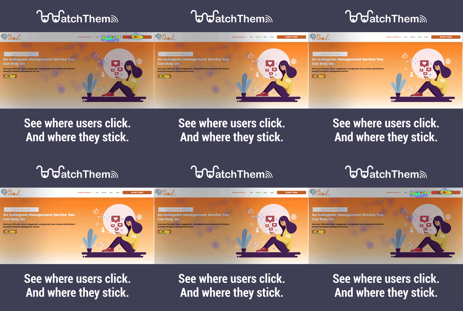
Heatmaps are visual data representations that help you understand where users click the most. For example, you can understand if users are clicking on certain areas of your page, thinking it’s clickable when it’s actually not! We all have experienced this, and know how annoying it is!
You are also able to understand if something is distracting users from your CTAs so you can eliminate it. On top of that, you can see this data for different devices such as mobile, tablet, and desktop and ensure that everyone is having a good experience. The good thing about heatmaps is that understanding the data is very simple, and you don’t need extra knowledge. After you collect and analyze this data, you can come up with strategies to fix the issues.

Session Recordings
Session replay software is a recording tool that tracks visitors’ interactions with your website or web app. Using session replays is the easiest way to figure out how users interact with your forms and other elements.
For example, if they abandon your website after seeing how many fields your form has, this indicates that you have too many form fields. Do users abandon your shopping carts after seeing your shipping price? That shows that your shipping price is too high!
Basically, you can follow users as they go through each stage of the sales funnel, find and fix potential issues, and increase your conversions easily! Watch this video to see for yourself:
Web Analytics
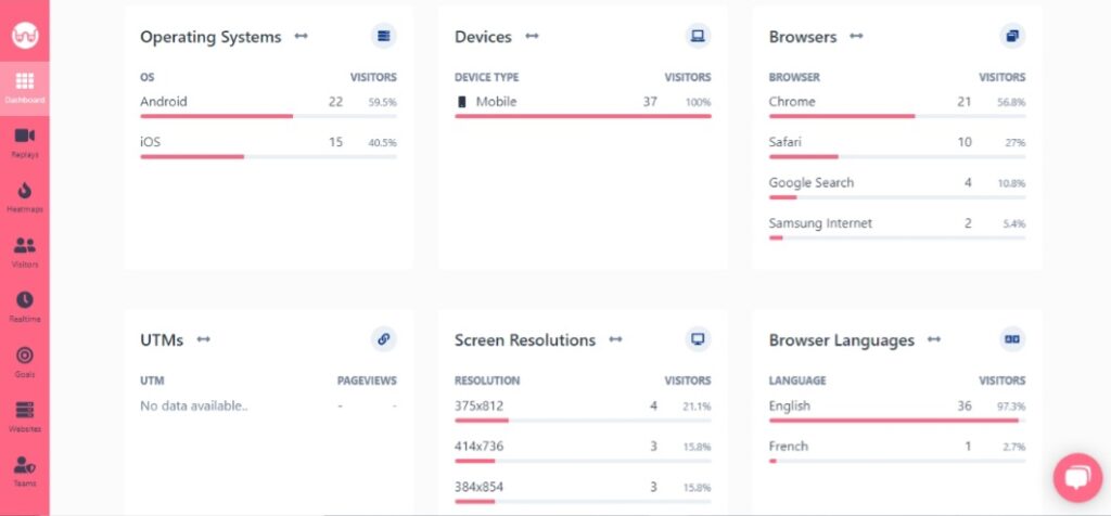
It’s not the end! WatchThemLive allows you to see users’ information, such as the pages they viewed, their language, country, device type, and the source from which they entered your website. You can also understand which source is driving the highest quality users, and you can focus on those sources to increase your revenue.

A good user experience is impossible to achieve without tracking users’ behavior. Don’t waste any time; sign up and snag your free plan now!
2. Improve Your Website’s Speed
Did you know that %40 of users leave a website that takes more than three seconds to load? This means if your website takes three and half a second to load, you’re going to lose many potential customers. Believe me; I’m not exaggerating! That’s how important website speed is these days!
You can improve your speed using the following strategies:
- Always optimize your images before uploading.
- Minimize HTTP requests.
- Defer JavaScript loading.
Whatever you do, don’t postpone working on your site’s speed!
3. Don’t Forget About Free Shipping
I’ve witnessed this many times that when a business offers free shipping for a short time, their conversion rate drastically increases during that period. Doing this, you can also create a sense of emergency, and trust me, people do not like to miss on stuff!
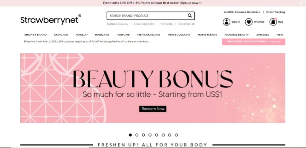
You can also implement a “free shipping” button on your landing page or important pages, so people can see it the moment they enter your website. Do this for a while and see the changes for yourself! Take a look at Strawberrynet which offers free worldwide shipping.

4. Optimize Your Website Navigation
Your website navigation is the path users take to find your content and the information they need to complete a task and reach their goal. Bombarding users with too much information and displaying a cluttered navigation lead to decreased conversion rate since users can’t easily find what they came for.
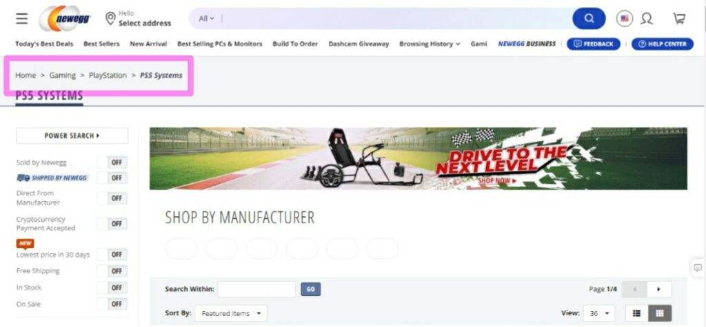
You can use different navigation designs to see which suits your business the best. For example, you can naked use the breadcrumb trail design. The key is conducting A/B testing to see which converts the most customers. Here’s an example of the breadcrumb trail design.

5. Be Wary of Your CTA Buttons’ Placement
Placing your CTAs in the right place is an important step in conversion funnel optimization. The best placement for CTA buttons is in the above-the-fold area where users can see them easily. Keep in mind that you shouldn’t use two CTAs next to each other because users will get confused and don’t know what they should do. However, you can use more than one CTA if you’re a business that attracts users by creating blog posts. One in the above-the-fold area and another in the below-the-fold area (or more) to increase conversions.
You can use an analytics tool like WatchThemLive to track goal conversions to see which CTAs are getting the most clicks in different places. You can also track any goal conversion you want with this tool.
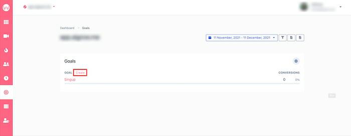

By using WatchThemLive, you have everything you need to improve user experience and increase conversion rates. Sign up here and see what’s next!
6. Use Videos on Your Landing Pages
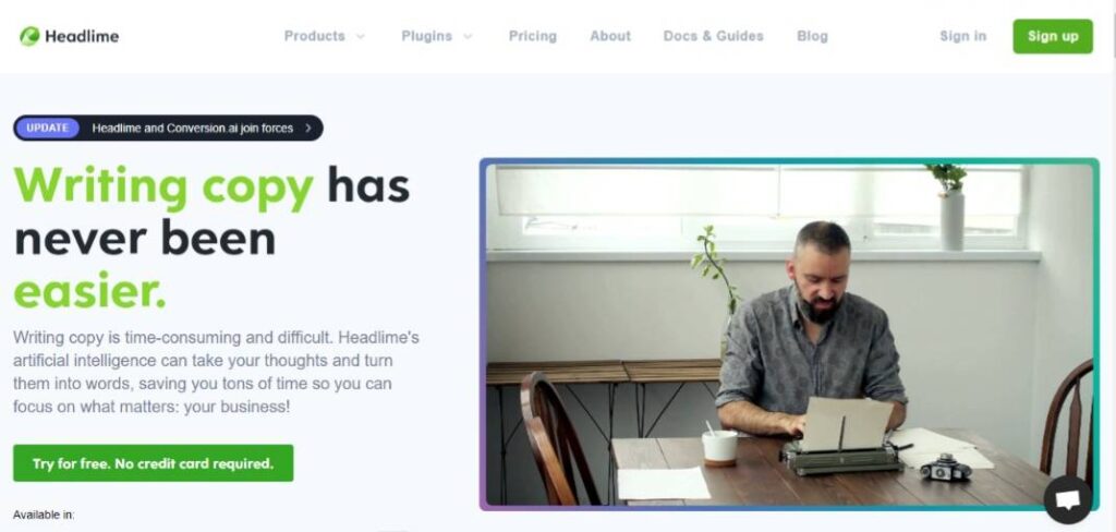
Using visual cues on your landing pages is one of the best user experience optimization strategies. And the best type of visual cue is videos. Videos are the best option to communicate the value proposition of your business instead of lots of text that no one bothers to read. This way, you can convey to users what your business is about effortlessly, resulting in a higher conversion rate. Here is an example by Headlime:

7. Optimize Your Above-the-Fold Area
If you want users to scroll down your page, first, you need to design a compelling above-the-fold section. You can do this by using visual cues such as small arrows pointing downwards, showing there’s more content below the fold, and encouraging users to scroll down.
8. Use Logical and Familiar Patterns in your Website Design
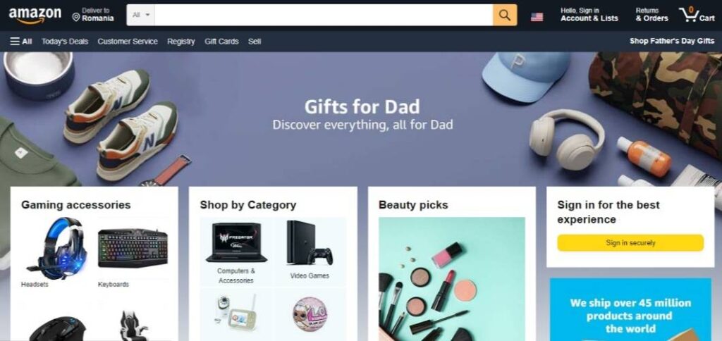
To optimize user experience, you must follow a familiar pattern while designing a website. For example, we all expect a shopping cart to be at the top of a page, with its known icon, and visible. If you put it somewhere else and force users to learn to work with your system, you’re going to lose many potential customers. Even if you want to be innovative and design something new, make sure it’s easily accessible, and learning to work with it is easy. Take a look at Amazon’s button placement for inspiration:

9. Try to Use Different Colors to Draw the Attention to a Specific Area
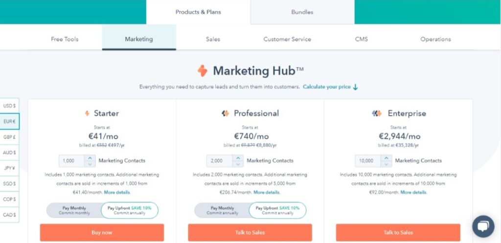
Any website has areas that need more attention, like CTA buttons, a special offer, or a specific package on your pricing page. One of the best ways to attract that attention is by using high-contrasting colors in a design. For example, you can use white text on a dark background or combine bright colors with darker ones to convey more emotions and draw attraction. You can also pay attention to color psychology for a more significant impact. For example, takes look at the HubSpot pricing page, they use different colors for their “buy now” button.

10. Optimize the Most Important Pages on Your Website
Depending on your business, the most important pages of your website differ; for example, it can be your about page, sales page, or contact us page. After you prioritize the most important pages of your website, you should start optimizing them. You can do this by conducting A/B testing and user behavior reports.
Conclusion
There are many ways to improve user experience and increase conversions. Apart from the strategies we explained in this article, adding a live chat to your conversion funnel can optimize conversion rates drastically.
It’s a general rule that you will receive more revenue and conversions when you have an excellent user experience, so don’t underestimate the power of UX in the number of sales.
In this article, we explained ten ways you can improve conversion rates by optimizing your user experience. However, to improve UX, you need to track user behavior first. To do that, you can use WatchThemLive and profit from its many features. If you’re interested, sign up for FREE, or talk to our experts and learn more.
Wish you lots of conversions:)

