
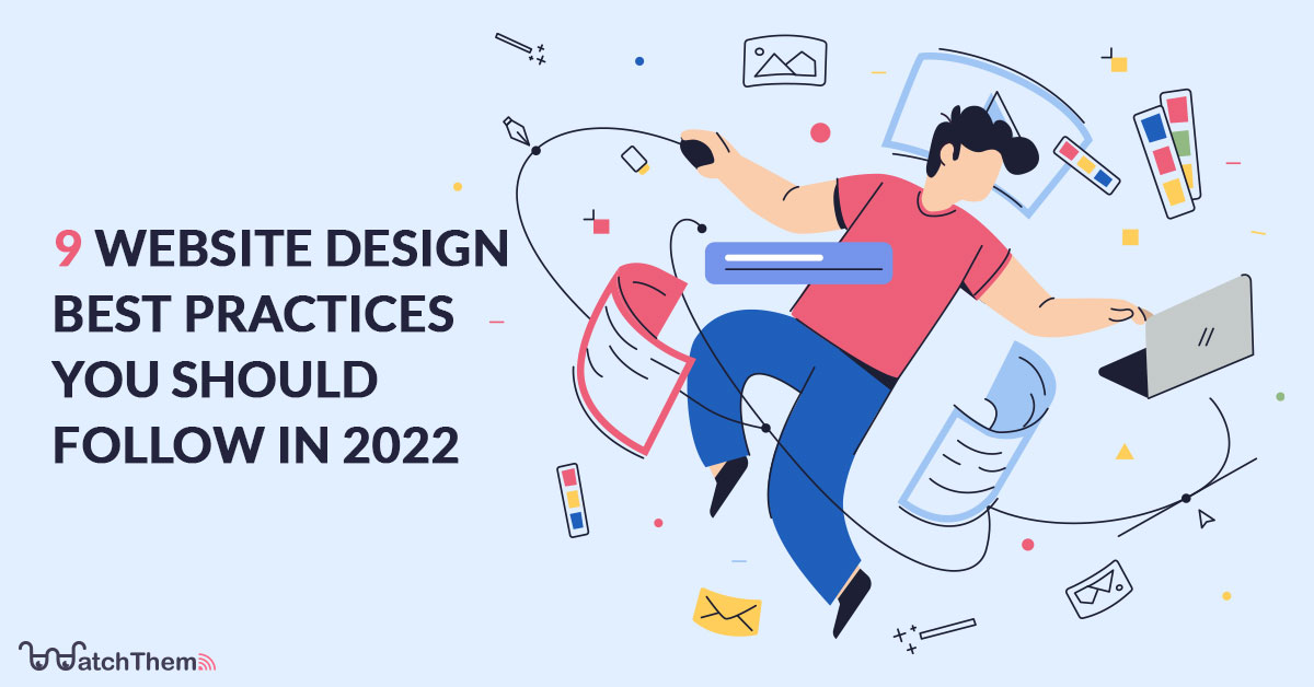
Page Contents
When someone views your website, it only takes them 50 milliseconds to establish their first impression of it. Regardless of how much work you put into writing amazing content, providing the best products, and having excellent customer service, so many of your visitors judge your credibility based on your design. In this article, we will talk about nine website design best practices that will help you meet users’ expectations in 2022.
WatchThemLive gives you great data to improve your web design and increase your conversion rate. Sign up for FREE right now and get started.
Why Should You Improve Your Website Design?
Like everything else, design has evolved through the years. Every year we come across new trends, some of which stay with us and become the new standards, and some of them fade away as they fail to stand the test of time. By updating your website design, you get rid of the elements that did not work as they were supposed to or have simply become old and lost their shine. By following web design best practices, you will be able to optimize your website to have the most efficiency and the best look.
Website Design Best Practices Checklist
Below is a list of the best practices for website design that will give your website a fresh look and enhance your user experience in 2022.
1. Simple Is Beautiful
You may have so many things that you want to show your visitors, but be careful there. Your customers are not as familiar with your website as you are. So they won’t be able to navigate through it easily if you don’t have a neat and clear look on your web page. It will eventually lead to them getting confused and leaving your website. Simple designs will not only make everything simple for the users, but they also look so elegant and beautiful.
Take a look at this example. Notice the simple design and the irony and cleverness in the choice of colors.

2. It’s All About Colors
Colors are powerful. You can transfer feelings with the strategical use of colors. You can make brand recognition using colors. The effect that your website’s color palette has on the visitors is on a subconscious level. It’s not only about the good look but also the message you convey with your colors. By studying color theory and the psychology behind each color and their mixture, you can choose the best possible colors for your design based on your type of business and the effect you want to have on your customers.

3. CTA Is Important
A CTA (call-to-action) is a button or text that encourages the user to do a specific action (e.g., “Add to Cart” or “Sign Up.”) CTAs lead the users on an ideal path through the sales funnel. They tell them what to do at the moment so that they won’t get confused at any stage of the customer journey.
CTAs are important, but their placement is even more impactful and challenging. Using the heatmap feature from WatchThemLive, you can see the density of clicks and taps on different parts of your website so that you can choose the best position for your important buttons and CTAs.
Sign up now and try WatchThemLive heatmaps!

4. Have Easy and Smooth Navigation
Imagine this scenario: you decide to buy a keyboard piano, so you open the first online store that comes to your mind, and in the search bar, you type “keyboard piano” and hit the search button. The results come up, but you see a number of acoustic pianos (which you can’t afford, don’t have enough space for, or just don’t want to buy) and tons of pictures of computer keyboards. No matter how much you look, you can’t find an option to let you choose the correct category in which you want the results to be.
I don’t know about you, but I would leave this website immediately and never come back again. As an online retailer, you should make navigation as easy as possible and have a design that lets the customers find whatever they want fast and smoothly. Otherwise, they are most likely to bounce.
Read More: eCommerce Navigation: 7 Best Practices You Must Know
5. Use Appropriate High-Quality Pictures
I don’t know about you, but I cringe every time I see one of those stock photos with unrealistically happy people in suits, with their thumbs up, jumping in the air, etc. These types of pictures were trending until a few years ago, but now they’ve become stale, and staying updated is all about avoiding cliches.
It’s totally okay to use stock photos. That’s why they exist, but be careful about your choice. Instead, try to find elegant photos that look legitimate and realistic.
It’s also necessary to use high-quality pictures since a great percentage of people are visual learners. If they find what they see on your website distasteful, they might question your credibility. For example, if you own a platform where people can book vacation rentals in Toronto, it’s essential to showcase high-quality images of the properties to attract potential guests.
6. Designing for Smartphone Users Is Essential
Throughout the last decade, we’ve witnessed an increase in the popularity of smartphones. Although smartphones are on their way to replacing computers, there are still a lot of things a laptop or a desktop computer can do that a smartphone can’t, but exploring the internet is not one of them! Based on research done in the last quarter of 2021, about 54.4% of worldwide internet traffic comes from mobile devices. This is too big of a number to be ignored. In 2022 having a mobile-friendly design is a must, and you should have a responsive design at all costs if you don’t want to lose your customers.

7. Readability Matters
You should pay attention to the way you present your text on a web page. Even if you have the most well-written text, if you present it poorly, there is a high chance that your visitors will get bored just by its looks and ignore it or have a hard time reading it. Some details that affect your website readability are the font, spacing, colors, etc. Readability is also critical for your website to be classified as accessible. Approximately 10% of the world’s population has some form of disability. Yet, only 3% of websites are configured in a way that will allow said users to access them fully. For assistive technology (such as screen readers) to effectively relay information to users with visual impairments, it must be highly readable. You can use this free web accessibility checker tool to check whether your site is currently accessible. By improving the readability, you have a better chance of converting your visitors. Here is a small checklist for you to consider when writing content for your website:
- Use contrast in colors to enhance readability
- Use fonts that are easy to read
- Utilize proper spacing to avoid clutter
- Make sure that most sentences are less than 20 words
- Use short words as much as possible
- Avoid using jargon (unless you have a specific target audience)
- Use headings to split up content
You can also use CRAP design principles to improve the readability and other aspects of your website design.
8. Be Creative About Your 404 Page
A 404 Page shows up when a visitor tries to open a page that doesn’t exist. There can be several reasons for a 404 page to pop up. The link might have been changed or deleted, your user could have typed the URL wrong, or there could be a problem with your website. Whatever the reason, you should try your best to reduce the chances of your users getting 404 errors.
It’s good to be creative about your 404 pages. Clever and stylish error pages retain your visitors, convince them to give your website another chance, and lead them to an existing page. Take a look at some examples of well-designed 404 pages:

Even though I probably would never look for a page with an animation of a taco tripping and literally spilling the beans, finding one on a 404 page on the taco bell website made my day! You won’t get mad at taco bell for their missing page with this creative design for their 404 page!

Bluepath is a navigation service, and on their 404 page, they play around with the fact that the page you’re looking for is literally and figuratively “off the map.” Get it?

The 404 page on Spotify is minimalistic and stylish with a record labeled 404 and the title “404s and heartbreaks” as a pun referring to Kanye West’s album “808s & Heartbreak.”
9. Be Careful Where You Put Your Social Media Links
It’s 2022, and the popularity of social media has never been this high. So you must be present on various social media, stay in touch with your current customers, and gain more exposure to potential ones. This way, you send visitors to your web pages, but it’s also important to put your social links on your website and encourage your visitors to check your social media pages as well.
But be careful: You don’t want to distract them and make them leave your website to check your Instagram page! That’s why you should pay attention to your social link placement. For example, it’s better not to put your social link on top of the page.
Conclusion
We can’t put enough emphasis on how much design is vital to web design or to any other field for that matter! That is why you, as a web designer, should be aware of website design best practices and stay updated on design trends. In this article, we mentioned some of the recent practices that can help you improve your website design, including the importance of simplicity, choice of colors, CTA buttons, smooth navigation, high-quality pictures, responsive design, readability, creative 404 pages, and social media link placement.
These nine tips will help you to have a website with the most efficiency and your users to have the best experience possible in 2022.
WatchThemLive gives you tools and data to improve your web design and increase your conversion rate. Sign up for FREE right now and get started.

