Page Contents
The navigation of an eCommerce website is a sure indicator of its success. Your products should be easy to find and searchable. Your eCommerce navigation will help visitors find what they are looking for more easily.
In this article, we’re going to discuss some of the eCommerce navigation best practices that will help you optimize your eCommerce website.
Want to optimize your eCommerce navigation? Sign up to WatchThemLive to track visitors’ interactions with your website navigation and find out how to improve it.
How Can I Improve My eCommerce Navigation?
You have to follow some strategies to maintain a successful eCommerce navigation. Let’s take a look at some of these strategies:
1. Use Breadcrumb Trail Navigation
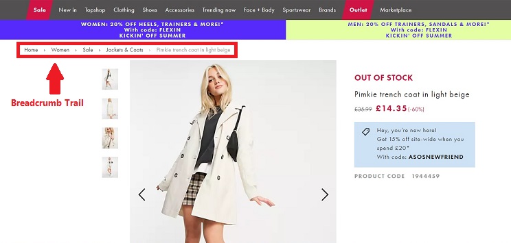
Breadcrumb trail is a type of navigation that shows the visitor the path they have taken to reach the current page. Breadcrumbs help visitors easily understand their location on the website. Using this type of navigation allows visitors to find their way around and not get lost.

2. Make the Parent Categories Stand Out
Make sure that customers can see your navigation bar with the parent categories close to the top of the page after entering your eCommerce website. You can use a keyword tool to help you use search terms as your categories. This will improve your website’s chances of appearing in Google’s top ten searches.
The keywords will help you label your navigation bar based on the business you have and your customers’ needs. So it will direct your customers exactly where they want to be.
Do not use complex and long keywords and keep the number of categories limited. Instead, you can use the dropdown feature which is an excellent way to show that there’s more to see without cramming your homepage.
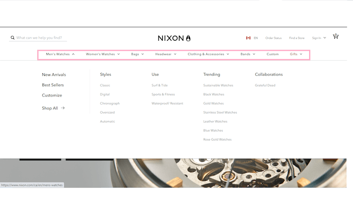
In this example, you can see Nixon’s navigation bar with 6 primary categories and it also has clean and eye-catching dropdown menu options which list subcategories that customers are looking for. That’s where your subcategories are helpful. It helps your customers to narrow down their shopping options even more.

3. Present Your Subcategories
The parent categories give the customer a general idea of the products you’re offering. For being more specific, you can use subcategories with filter options, so not only you’re saving more space on your homepage but you’re also creating the chance for visitors to spend more time on your site. An excellent way to do this is to program the hover method to your site.
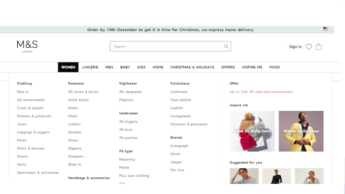
For instance, let’s take a look at M & S, a major multinational retailer. One of its parent categories is Women that leads to a dropdown menu showing subcategories: clothing, nightwear, footwear, accessories, fit type, brands trending, and then offers. The subcategories can be seen in the navigation bar as well as the dropdown menu.
When you click on the Women category in the toolbar and then clothing, you can see an expanded menu showing the different kinds of products relating to clothing such as New in, Coats and jackets, Jeans, Pants, and so on.
So, when you hover your mouse over the subcategory of clothing, you’re saving a great amount of space on your homepage and at the same time presenting your products in an organized way.

4. Keep a Close Eye On User Behavior
Do not assume that your design is flawless. Keep checking your site data for a few months after you started your eCommerce business.
Tracking your user behavior plays an important role in eCommerce navigation. You can understand how users interact with your navigation elements to optimize it. To track user behavior you need a behavior analytics tool such as WatchThemLive. Using this tool, you can watch visitors’ session recordings to see how they navigate through your website. This way, you can find out if they have any problem finding what they are looking to improve your website navigation.
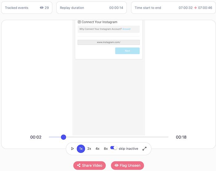

Looking for a tool to track customer behavior? Sign up to WatchThemLive and get started.
5. Make a Separate Category for New Arrivals
Let’s say you have customers that have taken a liking to your website and check it on a regular basis. Having a ‘’New Arrival’’ section as a part of the navigation bar lets your customers know that you are updating your goods continuously.
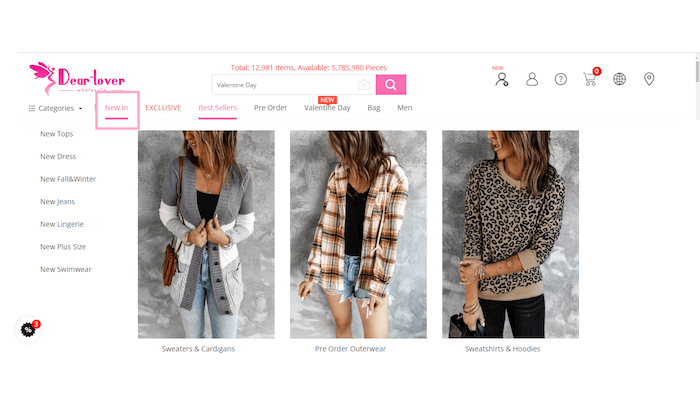

For instance, if you look at Dear lover’s site, you see the “New in” option at the top left of the main navigation bar which makes site navigation easier for the customers.
On top of that, a “New Arrival” section helps brands with seasonal sales such as Halloween or Valentine’s items.
To increase your conversion, even more, you can also add categories for discounts, sales, and specials. This will help give your customers easier access to your offers and deals.
6. Add a Noticeable Search Bar
Adding a visible search bar on your homepage is one of the most efficient ways to improve eCommerce navigation.
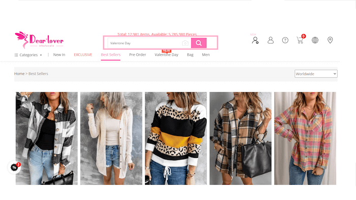

Looking at Dear Lover’s website, you can clearly see the search bar with a CTA (call to action) that invites the customers to see the offers for Valentines’ day. This is so much better than just including an empty search bar.
There’s one thing you have to pay attention to: do not add the search bar as a part of the navigation menu. Also, do not surround it with any other elements and let it be prominent.
It’s also a great idea to use autocomplete. It will help your customers save time and help them if they’re not sure about the spelling of a product’s name. It will be more convenient for your customers and increase your eCommerce conversion rate.
7. Maintain a Conventional Navigation Design
It’s fine to use a distinctive color scheme or background design on your landing pages as long as you stick to an e-commerce navigation system that the majority of customers are already familiar with. This way, you can avoid customer uncertainty that could arise from not being able to find your product.
Normally, there are two types of navigation when you come across an eCommerce site.
The first type: The site navigation is located just beneath the search bar, and the company logo is at the top of the page.
The second type: The left rail, which is also known as the site navigation on the side of the page.
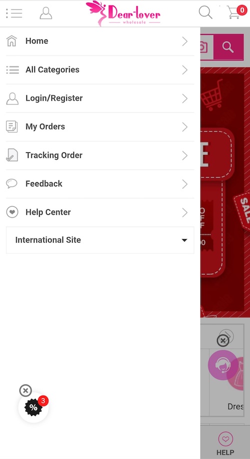
Some eCommerce platforms use the hamburger menu when it comes to responsive design, which is mostly known by three horizontal lines.
You can see an example of Dear Lover’s navigation on mobile devices:
Hamburger menus are designed to open and reveal a bunch of hidden menu options so the page is less crammed and is easier to read on mobile devices. Once you open the menu, you will see the options you’re looking for:

Creating a professional website will show your customers how invested you are in your business. The more pleasant it looks, the more customers it draws in.
Conclusion
In this article, we discussed the seven best ways you can improve your eCommerce navigation.
First, we talked about how we should make parent categories prominent. Then we introduced subcategories and how useful they can be. And we talked about adding a “New Arrivals” section and a search bar. In the end, we showed you the way you should design your website to make it more convenient.
Hope this is helpful for you and your eCommerce store!

