Page Contents
Form analysis is a must if you use web forms on your website or app to collect user data. Understanding how users interact with your forms through website visitor tracking tools helps you optimize them to increase conversions.
In this blog post, we will discuss what form analysis is, why it’s important, and how to conduct it. Furthermore, we will give you some tips for optimizing your forms as well as some great tools to analyze your forms.
Note: Looking for an easy-to-use and cost-effective form analysis tool? Sign up for WatchThemLive to be provided with all the features you need to improve your form performance.
What Is Form Analysis?
Form analysis is the process of measuring and analyzing website forms’ performance and effectiveness. The process involves collecting user behavior data to understand how users interact with forms. Therefore, you can easily identify the issues with your forms, including:
- Is there anything confusing users?
- What makes users abandon your form?
- Which form fields do users skip?
- Are there any technical issues?
- Is the form too long?
Fixing these issues will help you reduce your form bounce rate to increase conversions and provide a better user experience.
Why Is Form Analysis Important?
Form analysis helps you understand users’ interactions with your website forms. This way, you can optimize your forms for a higher conversion rate as you exactly know the users’ pain points.
Now, let’s take a look at the benefits of analyzing your web forms:
1- Reducing Form Abandonment
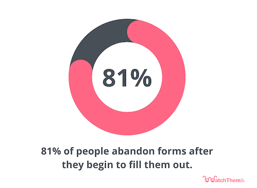
81% of people abandon forms after they begin to fill them out. This data underlines the importance of analyzing website forms.
By analyzing your forms, you can find out the reasons behind form abandonment, which include:
- Security concerns
- Long forms
- Unnecessary questions

2- Identifying Areas of Improvement
Through analyzing your web forms, you can gain insights into how users fill the forms. You can understand:
- Which fields do users leave empty
- Which fields make users abandon the form
- How long it takes to fill out a form and how to reduce the time
- How to design your form to minimize user frustration and effort
Moreover, tracking how users engage with forms helps you better understand your target audience to improve the user experience. For example, if many users leave your checkout form at the payment stage, it might mean you are not offering the payment options users prefer.
3- Improving Form Design
Understanding user behavior on your forms will help you design better forms. Maybe the CTAs and instructions are confusing. The process might be lengthy, or you might be asking for too much personal information.
Analyzing interactions with your website forms will give valuable information about improving your form design.
4- Removing User Pain Points
Form analysis reveals the pain points users face when filling out your form. These pain points include:
- Asking for too much information
- Confusing field labels
- Not marking required fields
- Showing unclear error messages
- Providing pre-fill or auto-fill on your forms
The analysis process allows you to detect and fix these problems easily.
How to Conduct Form Analysis?
Now, let’s take a look at the form analysis process:
1- Collect User Behavior Data
To analyze your web form performance, it’s necessary to collect user behavior data to avoid guesswork. This way, you are able to understand important information about how visitors interact with your fields and what needs to be changed.
To gather this type of data, you need a behavior analytics tool like WatchThemLive. This tool visualizes users’ interactions with your forms so you can find out how to optimize them. We will discuss these tools in more detail further below.
We provide the best customer tracking tools. Sign up here to see why!
2- Track Form Metrics
You need to measure different metrics to see how well your form performs or answers to changes. Here are the most important form metrics to track:
1- The Starter Rate of the Form
This stage is when visitors see your form. If they start filling it out, well, great! But if you have lots of visitors who are ignoring your form, there might be something wrong with it, such as:
- They might not be your target audience and are not interested in your form
- Your form is too long and complex and scares people off
- Your incentives are not clear, and people don’t know what’s in it for them for completing your form
- A technical problem like the form is not loading on mobile devices
Try to solve these problems, and you will see growth in your form completions.
2- Starter to Completion Rate of the Form
This metric shows the number of people who started the form and completed it. Not all the people who start the form will finish it. In most cases, users who start but don’t finish the form are faced with something that disappointed them.
3- View to Completion Rate of the Form
This includes the number of people who convert after entering your form page.
4- The Time Spent on Completing the Form
There isn’t a specific average time for completing a form, but check your competitors’ forms to see how long yours should be. A long uninteresting form puts off people.
5- The Returns to the Field
The returns to the field metric shows how many people completed a form but came back later to make a change in their answers. This might indicate that your options were misleading, and when they find out what is really going on, they come back to change it.
3- Set a Benchmark
Before comparing yourself to anyone, you need to compare your form to its previous stage and see if it is getting better attention than before.
Next, compare your forms to competitors in your niche and see if you can change something positively.
4- Analyze Form Fields
Here are the most important metrics you need to measure for analyzing your form fields:
- Field abandonments: This shows the fields with the highest number of dropouts and if the field was the last thing visitors interacted with before leaving your website. By doing this, you will have a general idea of what causes people to abandon your fields.
- Error messages: You can find any usability issues with your fields by tracking error messages.
- Returns to the field: Tracking returns to the field metric allows you to help visitors with their questions to have a more smooth process. Also, don’t forget about the time spent here as well.
5- Segment the Data You Have Collected
Before making any changes, you have to know if the data you gathered applies to all of your customers or just a segment of them. For this purpose, first, you should segment your data.
There are two ways of segmenting data:
- Completed vs. abandoned session: Compare the people who completed the form with those who abandoned their session, and you will find what’s really causing them problems.
- The source of traffic: Visitors that comes from different sources have different behavior. For example, someone who finds your form via searching a keyword is more likely to finish your form rather than someone who came to your website via paid ads. You can monitor user behavior with a tool like WatchThemLive.With this analysis, you understand that maybe your low conversion rate is not because of an issue in your form, but because of the wrong traffic.
How to Optimize Web Forms?
There are many ways to improve your web forms. Here we review some of form optimization techniques:
1- Make Them As Short As Possible
Usually, forms with fewer questions have the highest conversion rates. However, if you’re going to offer more value at the end, you can ask more questions.
2- Don’t Make People Type
Typing is hard and time-consuming, and sometimes it doesn’t work really well on mobile. You can use an autotype to make typing easier.
3- Be Careful with the Optional Fields
Tell people what fields are optional so they won’t become frustrated by filling too many areas. You can do this by adding an asterisk, writing the word optional beside the field’s name, or using different colors.
4- Captcha Boxes Kill Your Conversion
Don’t ask whether people are human or not! If you’re worried about spambots, you can use a spam-blocking tool.
5- Forget About Asking for Useless Information
You really don’t need information such as middle name, username (you can ask for their email instead), or country.
Best Form Analysis Tools
You can’t just analyze your forms by observing; besides, you need to know your traffic source. That’s why you need form analysis tools for this purpose. We introduce the top 3 tools you can use.
1- WatchThemLive


WatchThemLive is one of the best analytics tools that records user behavior. It does this by session replay software that captures every visitor’s action. You can see how many people started filling out your form, how many finished it, and how many abandoned it. You can also understand how much time it takes users to complete a form. On top of that, you are able to see what fields are causing them problems and make them abandon the form. Watch this video to see how they actually work:
With WatchThemLive’s web analytics feature, You can also see the exact source of your traffic. Knowing your website’s traffic source lets you understand whether the problem lies within your form structure or the traffic. Then you can take action and make the right decision.
But that’s not all there is to WatchThemLive! It has many other great features like heatmaps that turn data understandable through visual representation.
Pricing: They have a free plan with 5,000 session replays and unlimited heatmaps per month. Their paid plans start from $19 per month.
What more are you asking for? Sign up and snag our free plan now!
2- Formisimo

Formisimo (now called Zuko) is an analytics tool that provides eight reports for you. These reports include form overview, form abandon rate, completion time, problematic fields, etc. The reporting is good, but you might miss stuff without a comprehensive session replay feature.
Pricing: Each of their plans has a free trial. Their pricing starts from $140 per month.
3- Mouseflow

Mouseflow is an analytics tool that records user sessions and provides form analytics. With the form analytics feature, you are able to see form completions, form abandonments, form completion time, etc. However, their heatmapping feature is not very advanced. You can’t see where your visitors are coming from or their clicks and movements. Also, it doesn’t include a reporting feature.
Pricing: They have a free forever plan with only 1 form analysis per month. Their paid plans with 3 form analyses start from $29 per month.
Conclusion
Forms are great ways to increase conversion rates and get user information. However, it can backfire and cause a decrease in conversion if not desiged properly. Everything has a reliable way to be done, and form analysis is not an exception.
This article taught you the right ways to create your forms. We explained what form analysis is, its importance, and the steps to conduct form analysis. In the end, we introduced some ways to optimize your forms and the tools you need.
One of the best tools to analyze your form performance is WatchThemLive, as it has the best session replays software. It captures every interaction users have with your forms. You can also see the source of your traffic. Don’t waste any more time. Sign up here and see what’s next!

