Page Contents
Have you ever seen any mind-blowing examples of UX design?
An impeccable UX design might be the winning factor you need for your business. A UX-friendly website layout goes a long way. As awkward as it might seem at first, UX designs have been deciding factors when it comes to business success. “Why is that?” you might ask. Well, in the digital world, UX has turned into an undeniable part of our lives.
We use so many products, and we visit so many websites every day. Businesses strive to provide their users with the best user experience possible by either developing an optimal UX strategy or conforming to different design approaches, such as data-driven design. Moreover, you cannot design your UX based solely on the examples you see. There is way more to it than that. You should consider key website UX metrics and track them smartly.
That’s precisely why we are going to go over UX design examples in this article. Stay with us till the end to find out more.
What Exactly Is UX Design?
You might look at some UX design examples and think user experience design is similar to user interface design. However, UX designers do way more than UI design. Usability and UI design are vital parts of UX design. UX design covers various subsets, including the entire procedure of obtaining and integrating a product. It is the process of creating products that provide innovative and relevant experiences to users.
The inventor of the term User Experience, Don Norman, says, “No product is an island. A product is more than the product. It is a cohesive, integrated set of experiences. Think through all of the stages of a product or service – from initial intentions through final reflections, from first usage to help, service, and maintenance. Make them all work together seamlessly.”
The entire process of acquiring, owning, and troubleshooting must be in mind when designing a product that offers fantastic UX. Furthermore, usability is not the only matter UX designers have in mind; pleasure and efficiency are parts of the thought process as well. Sometimes, you even need to redesign your product to match users who use your product on different devices. As a result, defining a good UX is not the simplest thing to do. A good user experience meets users’ needs in the particular context where they use the product.
Now it is high time we get into some good UX design examples.
Related Article: Top 7 Tips on Website Redesign for the Best Mobile User Experience
UX Design Examples
There is a theory that says that we do not create art from scratch. There are certain ingredients we need to make it happen. The mixture of what we have seen, read, or listened to is the required ingredient. So, let’s see some brilliant design examples.
1. Airbnb’s Booking
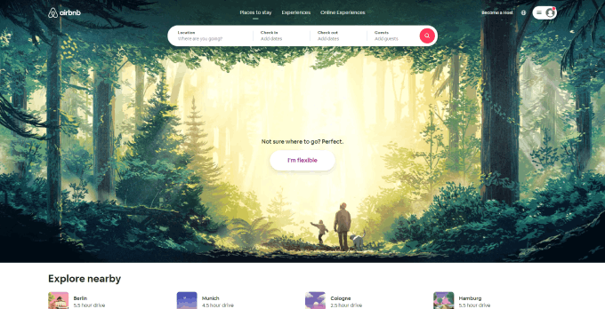

The first item of our UX design examples list is Airbnb. Airbnb leads the world in creating booking experiences. Airbnb’s homepage’s design solves the pain points travelers run into when searching for accommodation. The homepage of this UX design example also offers popular destinations nearby and a mixture of what everybody loves. Booking is relatively straightforward, done from the top of the fold.
The moral of the story is that it is best to research what users need and figure out the problems in your design procedure. Additionally, implement the analyzed data to find out what matters most. Then, you will be able to provide them with the best experience they have ever had.
A behavior analytics tool such as WatchThemLive can help you figure out your design problems. WTL offers you all the tools you need to find out your strong and weak points and improve your UX design. Heatmaps, session replays, web analytics, and many other services only are a part of the services it provides to you.
Sign up for FREE and use WatchThemLive to improve your UX!


2. Duolingo’s Visual Hierarchy
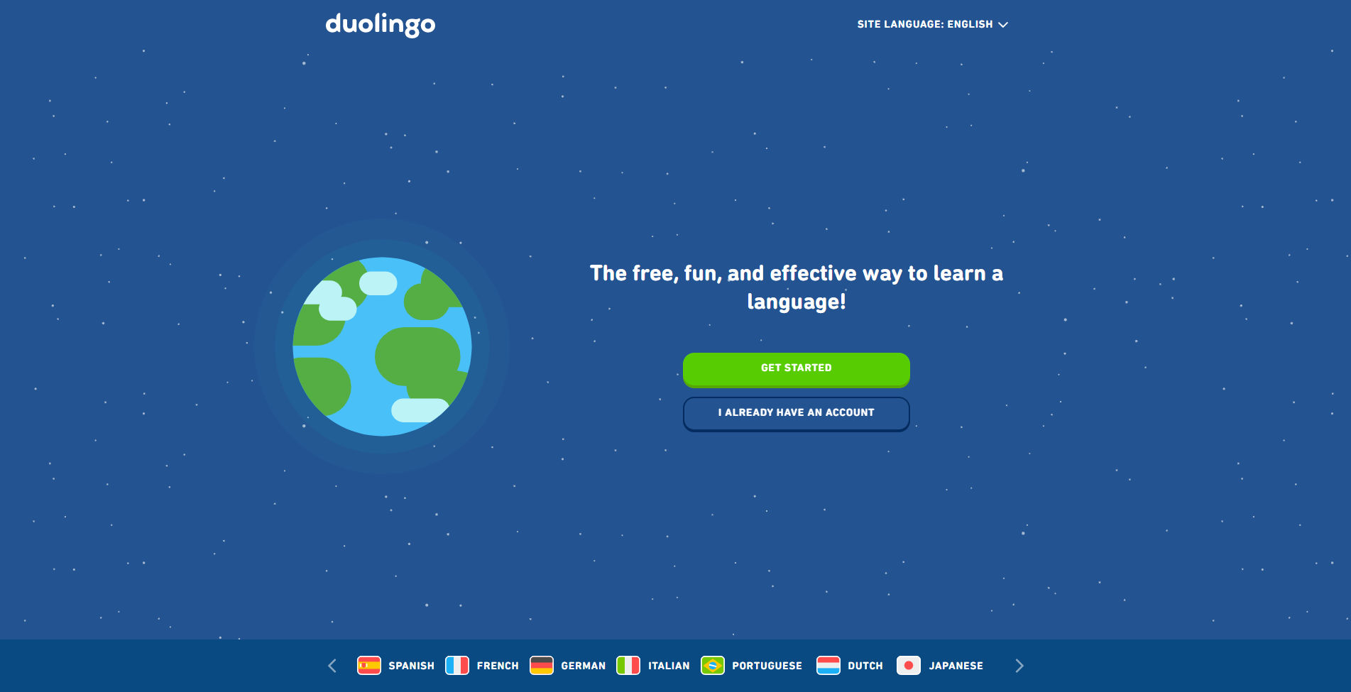

Our UX design examples list would not have made much sense without Duolingo. Duolingo has been a life-saver for many people. It has provided for what many people need these days, learning new languages. The ability to practice a language on your own, whenever you want, made it one of the most used apps in the world. Of course, its brilliant UX design was what helped it grow to be so popular.
Breaking complex topics into smaller pieces and simplifying the process of learning, Duolingo made it to our list. Visual hierarchy, maintaining clarity, and reducing the cognitive load made for a simple yet effective UX design. Duolingo’s UI design was an addition to this fantastic collection.
The moral of the story is that it is best to go for a simple design that guides the users’ eyes throughout the process without overcomplicating things. When you reduce the load on the users, they will enjoy the flow more; therefore, they will stay on your product longer.
3. Headspace’s Retention Strategy
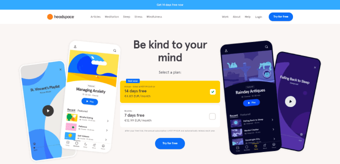

For our third item of the UX design examples list, we will discuss Headspace. Headspace is the most renowned app in the online meditation market. It focuses on overcoming stress, coping with anxiety, improving sleep quality, and living a healthier life mentally. Therefore, the app experience must be as smooth as silk.
Similar to Duolingo, Headspace manages to provide a competitive edge in the world of meditation. Building user retention through gamification, offering goals, and keeping users’ usage streak in the app, Headspace has achieved the needed success metrics. However, if it were not for its fantastic UX and app performance, it would not have been where it is now, a 4.8-star rating app with over 13K reviews.
The moral of the story is that you can use different strategies, such as gamification, to improve the retention gained from a product. This is one of the best practices out there.
4. Spotify’s Visual and Behavioral Consistency
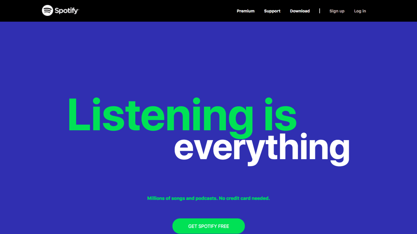

Another item of the UX design examples list is the famous Spotify. Although some people believe that there is so much room for improvement in its UX design, others love its well-planned flow and how it helps users explore new music.
The consistency of the details in behavior and appearance is one of the most beloved aspects of Spotify’s UX design. As a result, the cognitive effort a new user needs to put into learning Spotify is low, making for a shorter learning curve.
The moral of the story is that consistency shortens the learning curve, making your app more versatile. New users can enjoy your app the same way your loyal customers do.
5. Uber’s Mental Models


Last but not least, we must discuss Uber in our list of UX design examples. Needing to cater to two sides of the same coin (riders and drivers), Uber has done a fantastic job designing the UX for two fundamentally different kinds of users.
We, as marketers, know that understanding one persona’s mental model is complicated. Uber does this perfectly, with two! It delivers effective and practical results for both users.
The moral of the story is that if applied perfectly, mental models can bring you great results. You can target different personas and make them enjoy your product all the same.
Conclusion
These UX design examples were curated so that you can come up with yours in a more creative way. We hope that going through this list can help you flourish your ideas to create a UX design that your users love.

