Page Contents
A UX-friendly website layout not only helps you strengthen your customer relationship but also develops trust and attracts new customers. As customers are the core of any business, customer-oriented marketing approaches are effective.
Thus, creating a great experience for your customers and prospects can bring conversion and lead to your business’s success.
Designing a great website layout necessitates an investment in web development. So, it’s better to use the best practices of web design to get the best results.
5 Tips for Designing a UX Friendly Website Layout
Optimizing website layouts for customers is based on conversion science. Meaning, they are made to increase leads, subscribers, and sales. Here are the 5 design tips for a UX-friendly website that boosts conversion:
1- Simple
Your website shouldn’t be confusing for the visitors and make them feel they are solving a puzzle while on your website. On the contrary, they should navigate through your website to find their required information quickly and easily.
Web development refers to the creating, building, and maintaining of websites. It includes aspects such as web design, web publishing, web programming, and database management. It is the creation of an application that works over the internet i.e. websites. That’s why you have to reach out for some web development services which will help you in the realization of your tasks.
2- Above the Fold
Above-the-fold design means putting the crucial elements above the border of a site when it loads on a visitor’s browser. Great layouts provide the most important information without much effort on the user side.
As Hubspot survey on several consumers confirms, 76% of consumers prefer websites where they can find what they need easily.
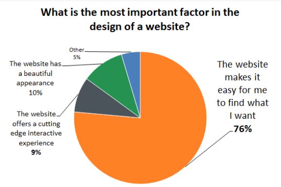

Hubspot.com
So, to design “above the fold,” you should put the most critical content or element immediately accessible. Interestingly, the “above the fold” design converts visitors fast as they land and see what they need right away.
3- Goal-Oriented
A balanced, simple, and ordered website layout is desirable. Most importantly, great layouts make it obvious to visitors what is expected of them on the website. This may be accomplished through the use of whitespace and clear CTA that cannot be overlooked easily.
4- Responsive
Although responsive design is an obvious website layout tip, there are still websites that don’t use it. Optimizing your design for various devices helps users have a better experience and minimizes bounce rate and exit rate.
5- Intuitive
An intuitive design makes it possible for visitors to predict where they can find the information they need. It’s when visitors find it easy to use the design and find their way through your website without thinking consciously. For a design to be intuitive, it depends on who your target audience is. Meaning, for instance, the intuitive web layout of a website for adults may not be as intuitive for a kids’ website.
7 Top UX Friendly Website Layouts
Knowing website layout tips is a good start for making UX-friendly designs, but it’s not enough. You should see them in practice in successful website designs. Here are the top seven UX-friendly web layouts to check out and learn from:
1- Asana
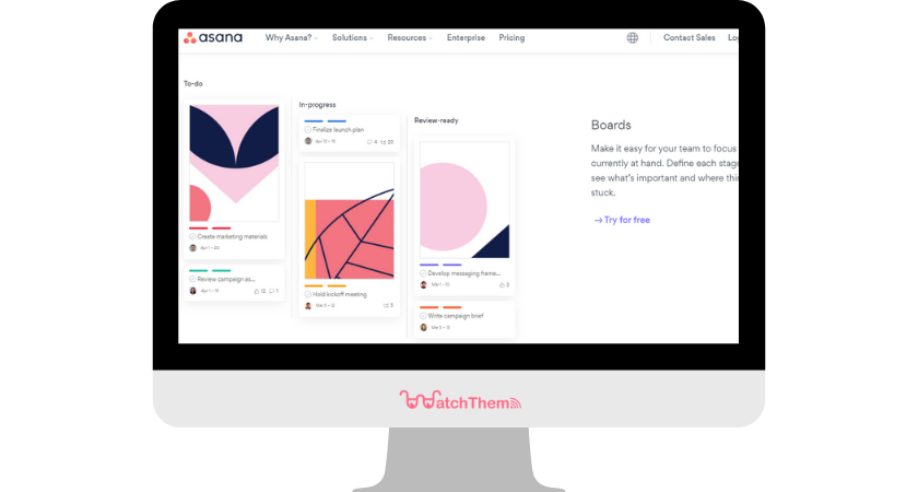
Asana’s web layout makes it pleasant to be on this site. It has a good proportion of whitespace and makes it simple for visitors to navigate. Asana’s website layout is interactive and engaging. As it simply offers the part you asked for, you should interact more with it to explore further information.

2- Airbnb
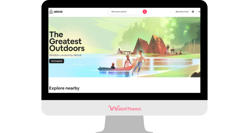
Airbnb is a platform providing homestays and vacation rentals around the world. Airbnb’s website has a clean layout and has simplified elements with its brand color scheme. The search box is available to use right away so that visitors can find what they need pretty easily.

3- Paypal
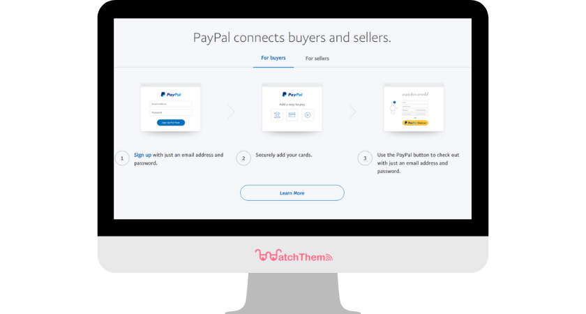
Paypal had a complex web layout before 2014 and redesigned it to a simple, more attractive version afterward. The good use of whitespace, organizing elements, and putting forward the most important elements made its UX great.

4- Duolingo
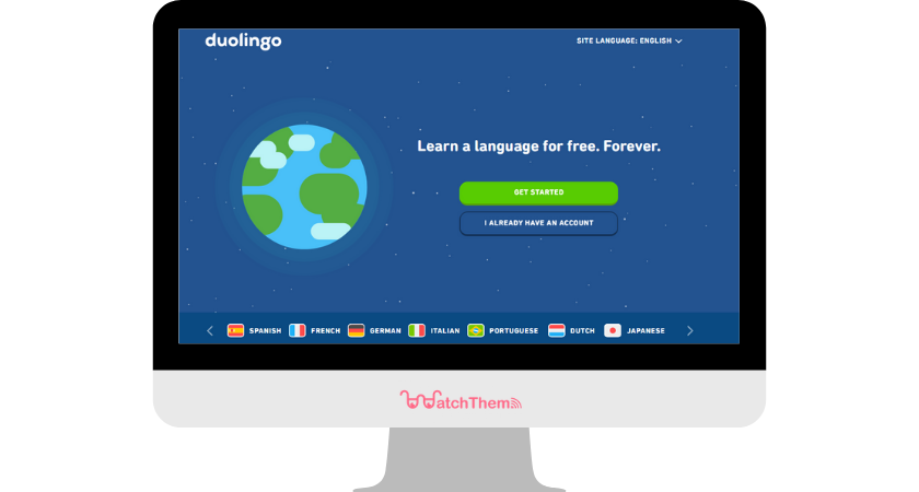
Duolingo educates people and helps with language learning, which may be a difficult and stressful process. Duolingo’s layout makes it easy for users by setting a goal for their learning by asking three simple questions. The interactive and gamified layout of Duolingo is one of its success factors.

5- Dropbox
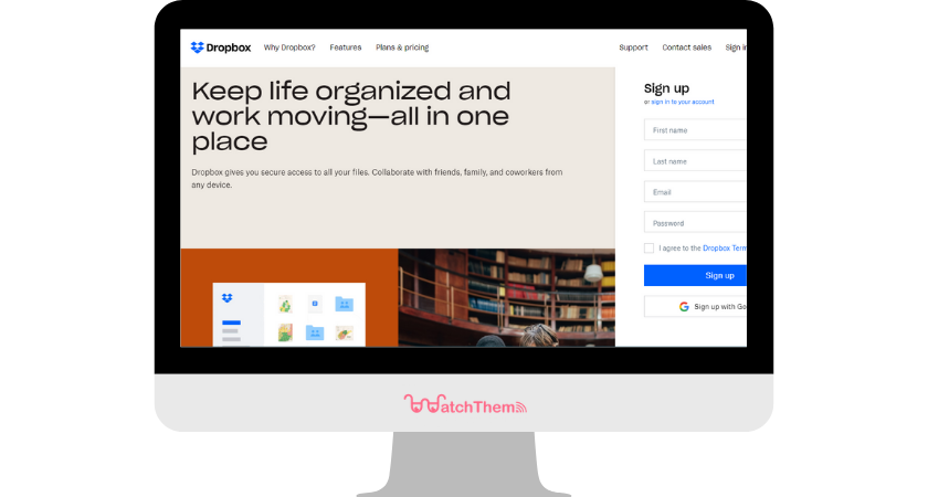
Dropbox provides an intuitive layout for its visitors. There are several important elements placed above the fold, making conversion fast and easy. Moreover, Dropbox facilitates navigation with its simplified menu.

6- WealthSimple
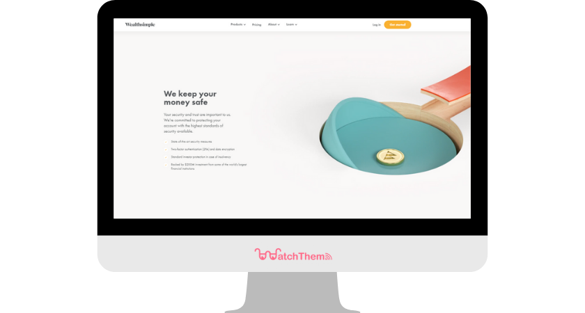
WealthSimple provides an exciting experience for visitors with an innovative web layout. Navigating through and finding different sections on this website is incredibly easy. Two key design tips to learn from this website are the liberal use of whitespace and creative GIFs.

7- Toggl
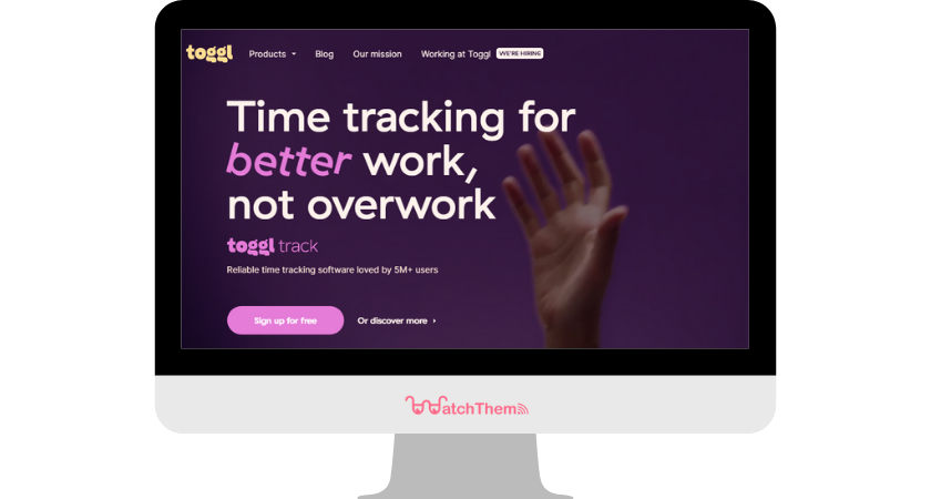
Toggl makes use of creative animations on its homepage to increase visitors’ engagement and sense of curiosity to interact more. The organization of content boxes and combining them beautifully with great images lead to a great user experience in Toggl.

Test Your Website Layout
There are tools for testing your website layout. Because designing your web layout based on principles such as CRAP design principles and best practices is good, you shouldn’t stop there. Always test UX design on real customers and see how much they enjoy your website layout.
Session replay is a great tool for this purpose, as it shows the real-time interaction of users on your website. For example, session recordings may show that your visitors are getting confused to find their way on your website. That’s a sign that you need to make navigation easier and simpler for them.
Website heatmap is another UX tool that helps you understand which part of your pages is getting the most attention. This way you know where to put the most important information or call-to-action.
The good news is when you sign up you get the chance to test these tools for free for up to 3 months!
Conclusion
Here we discussed why a website layout matters to a business. We also learned how to make the best out of web design investment with tips and best practices. Building an above-the-fold layout where people can find what they look for easily is the key to increasing conversion.
Moreover, we introduced session recordings and website heatmaps as tools to ensure the maximum effectiveness of your web layout.

