
Page Contents
Nearly half of us prefer to go shopping in person, but everything is changed since the WHO announced the COVID-19 Coronavirus as a pandemic on March 11, 2020. During the COVID-19 pandemic, most people were terrified and preferred to stay home. The situation allowed them to do online shopping anywhere, anytime, without ever leaving their houses. Therefore, the increasing popularity of online shopping paved the way for more business opportunities.
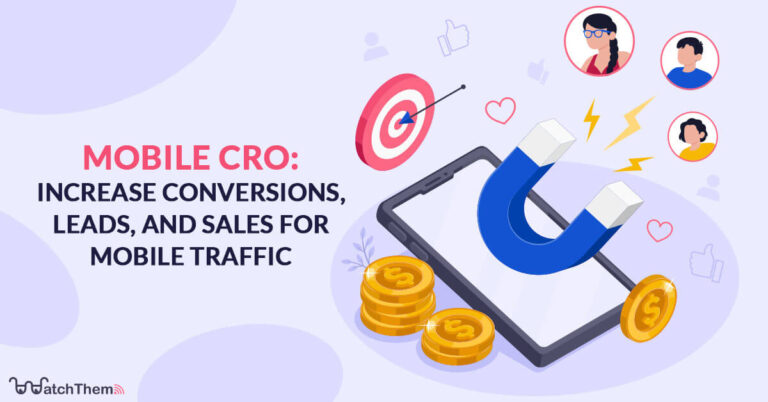
The problem is that the mobile conversion rate is lower than desktop. There can be multiple reasons; maybe customers prefer the big screen for shopping to see the whole items! Here, we will discuss how to do conversion rate optimization for mobile devices, and show you the ropes.
Note: Mobile Conversion rate optimization is important for a successful business. Using a behavior analytics tool such as WatchThemLive is an excellent way to find out how to boost conversions.
What Is CRO?
CRO stands for conversion rate optimization, a process for boosting the percentage of visitors to a website that converts them into customers, or more generally, visitors that take any desired action on a webpage.
Tips For Mobile Conversion Rate Optimization
You have the power to increase your site’s conversion by focusing on your mobile traffic. More than 50 percent of all traffic to major websites comes from mobile phones. Therefore, it’s crucial to leverage your mobile traffic to increase conversions.
So, let’s take a look at some tips for CRO mobile optimization:
1. Fewer the Better
When you think about mobile CRO, repeatedly tell yourself less is more. Everything goes back to how you design your landing pages. A minimal landing page design can help you ensure that whatever is on the page is absolutely necessary.
Here’s how you can design a minimal landing page:
1) Reduce Your Headline And Content
The design of your mobile website is a key conversion rate optimization factor. Pay attention to your headline, which explains exactly what your solution is and what the visitors will get. It is better to reduce headlines to 3 to 4 words because if you use too many words, your headline either runs off the page or the user only sees a couple of the words, and they might not see any of the other important content below. So they have to scroll down, and it takes more time. Instead, try to use more image content.
If you have a page with a lot of content, use the ‘read more’ functionality. The point is to display important content above the fold first and then load the rest below the fold.
2) Remove Pop-Ups
Pop-ups can be annoying for all users, especially mobile users because it takes up the entire screen. So if they haven’t been optimized for mobile phones, there is no way to close them. As a result, the users can’t browse the site, and they will just leave quickly.
2. Using A Behavior Analytics Platform
Want to follow your visitor’s journey on your website or app to improve your conversion rate? A behavior analytics tool such as WatchThemLive can help you.
WatchThemLive is a user tracking tool that helps optimize the user experience to increase conversions with heatmaps, session recordings, and web analytics.
1) Heatmaps
WatchThemLive’s heatmaps will determine the spots on your website where users interact and engage with your site. You can create heatmaps for any page on your website. So you can track the clicks on your CTAs to improve your clickthrough rate.

2) Session Recordings
Session recordings help you see your product or website through your users’ eyes. If you want to track every activity of your visitors on your website and identify any conversion or UX issues that need to be resolved, session recordings will help you.

3) Web Analytics
You need deep insights to track and analyze your website’s conversion rate and performance. WatchThemLive provides data that enables you to review valuable analytics in real-time and maintain leads. It collects all data which is available for you in the form of PDF or CSV.

Get your mind off your conversion rate optimization worries. Sign up to WatchThemLive now!
3. Speed and Efficiency
Speed and efficiency are essential elements for mobile users. Most users will abandon the site if their page does not load within two or three seconds. They are very impatient and expect a good load speed. Now, how can we decrease the page’s load time?
The website design should have the ability to change based on device type, which is called mobile responsiveness. You’d better create different designs for mobile and desktop users. If you haven’t created different designs, we suggest starting with the mobile design first.
Here are a few tips to improve your website’s speed and efficiency:
1) Decrease Page Load Time
The functionality of desktop computers is better than mobile phones. Moreover, desktop computers may have better internet connections. Therefore, page loading times on mobile devices generally take longer than on a desktop, regardless of mobile optimization.
You can improve page load speed by optimizing your images for smaller pixel sizes. Although visual designs improve your content’s readability, large images decrease the load times speed. Compressing images is one of the best practices for optimizing website speed. This is especially great for blogs and helps your Google ranking.
Removing unnecessary files can also reduce page-loading problems, especially if you have a lot of JavaScript attached to each page. The last point that can help you is using browser caching. It allows recent web pages to be kept in web browsers; therefore, the page will load faster when users revisit it.
2) Limitations on Landing Pages’ Fields
Limitations on mobile phones are essential as well. You don’t need to collect too much information about your users. It is not necessary to know everything about them. The user’s name and email can be enough. 65% of online shoppers stop buying from brands because they feel insecure, and asking for too much information is one way to lose trust. Customers expect you to respect their data.
The next point is designing a landing page to fit in the viewport without scrolling; it can be annoying for users to unlock the portrait orientation on mobile devices whenever they want to see the whole screen. Therefore, anything else except your heading, form, and CTA is unnecessary.
4. Focus on User’s Experience
Creating an effortless user experience is necessary, but how can you do this? You’d better design scaleable pages for both landscape and portrait. So you should think about that functionality.
The last point is asking for feedback from mobile users. Feedback helps you understand their problems and frustration in the buying process. So, focus on collecting feedback from users who visit your website on their mobile. Remember that the ideal feedback survey is one that fits your goal.
1) Use Buttons Over Link Text
Using buttons positively impacts your website’s conversion rate, while a link is better for navigation purposes. Link text is harder to click, so using buttons enables users to convert more easily.
2) Search Option
Putting a search option on the top of all pages for mobile users is a great strategy to help them with shopping. The reason is to prevent them from navigating through a bunch of menu options on pages or finding things in the footer which is a lot more difficult on smaller screen sizes. So if you include a search function, all they have to do is to type and search for whatever they want.
3) Providing Key Information Above the Fold
All you need to do is keep your call to action above the fold because users may not scroll down. Moreover, allow your content to be instantly emailed if it is too large to be seen on mobile. If you have a brochure or a PDF or some other kind of content that can’t really fit in the mobile version, add an email subscription so users can receive content in their inbox.
Conclusion
In a nutshell, you must consider creating engaging content and only include necessary information. The purpose is to attract your customers that visit your website on their smartphones to boost your conversion rate. So pay attention to all the points mentioned here and try to apply them to your site.
Hope that these tips will help you do better CRO for mobile devices. You can also use a visitor tracking tool like WatchThemLive to better understand your visitors and discover how to increase conversions.
Ready to increase your mobile conversion rate? Try WatchThemLive now!
