Page Contents
Remember Hansel and Gretel’s breadcrumb trail? Well, I know the breadcrumbs didn’t help the kids find their way back home in the fairy tale, but it won’t be like that for your website visitors. A breadcrumb trail lets users track their path through your website from their current location to the beginning point, helping them better find their way through your website.
In this blog post, you’ll find out:
- What breadcrumb navigation is
- Advantages of implementing breadcrumb navigation
- Types of breadcrumbs
- When you should use the breadcrumb trail
- The best practices for breadcrumb navigation
Let’s get started.
What Is a Breadcrumb Trail on a Website?
Breadcrumb trail is a type of secondary navigation that aids visitors in identifying their location within the website’s hierarchy. This UX feature enables users to better navigate across your website and find the web pages they are looking for more easily.
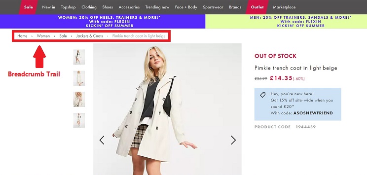
To better understand how the breadcrumb trail works, let’s take a look at an example from the ASOS website. Below you can see how breadcrumbs show the hierarchy of pages and allow the user to go easily to a higher-level page. In this example, imagine you are not interested in this coat and want to browse more products; you only need to click “Jackets and Coats” to see more items.

Benefits of Breadcrumb Trail
Many webmasters use breadcrumb trail as a strategy to improve their website’s user experience; therefore, it can offer many advantages. Here are some of the benefits of this website navigation type:
1- Reducing the Bounce Rate
Imagine a user reaches one of your product pages through a Google search or a social media post. What would they do if the product is not what they wanted? They would either leave your website without taking any action or visit the category page to find similar products.
If you add breadcrumb navigation to your website, more visitors would be encouraged to go to the category page and view related products, reducing the bounce rate. Remember your bounce rate is one of the key website performance metrics you always need to keep an eye on.
2- Improving Website Findability
Findability is one of the most important factors that influence user experience, especially in eCommerce websites. If customers can’t find the products they’re searching for, they won’t be able to buy them, thus affecting your conversion rate negatively.
Breadcrumb trail improves your website’s findability by helping users find the web pages they are looking for.
3- Reducing the Number of User Actions
Breadcrumbs allow website visitors to reach a higher-level page with fewer clicks. Let’s go back to our example of the ASOS website. For instance, you might have visited multiple product pages consecutively, and now you want to return to the category page to view more. Instead of repeatedly clicking on your browser’s “Back” button to go back to the jackets and coats section, you can get there with one click using the breadcrumb trail.
4- Reducing User Frustration
Did you know that 94% of people say easy navigation is the most important user experience feature? And poor website navigation is one of the main factors that leads to user frustration.
Using breadcrumbs, you can prevent users from getting lost in your website and becoming frustrated because they can’t find what they are looking for. As a result, your website’s abandonment rate will also decrease.
Check out this blog post if you are wondering how to reduce shopping cart abandonment on your website: Shopping Carts Design: Best Practical Tips for eCommerce Websites
Types of Breadcrumb Trail
These are the three types of breadcrumb trail:
1- Location
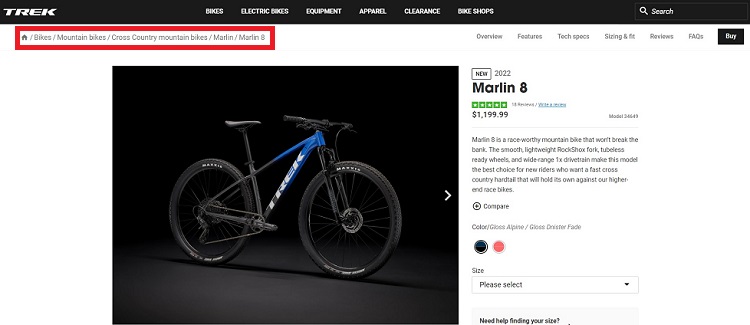
This type of breadcrumb navigation indicates the user’s location in the website’s hierarchy. Location-based breadcrumb is more suitable for websites with multi-level navigation. It helps users go to a higher-level page from their current location. Therefore, This type of navigation is very useful when users land on deeper-level pages like product pages from search results or other sources.
Below you can see how Trek uses a location-based breadcrumb trail.

2- Attribute
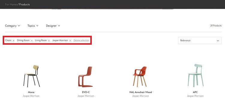
Attribute breadcrumbs show the attributes of the web page the user is viewing. You can see these breadcrumbs mostly on eCommerce websites when you choose product attributes to filter the search results.
Vitra is one of the websites that uses attribute-based breadcrumb trail. Below you can see the selected attributes for the chairs category.

3- Path
Path breadcrumbs display all the pages the user has visited in order, from the beginning to the current page they are viewing. This way, the user can jump back to any previous page on their path rather than clicking the back button multiple times.
When to Use Breadcrumb Trail?
If your website has a deep hierarchy, using a breadcrumb trail can be a good idea. This type of navigation also works great for eCommerce websites in which products are categorized.
Breadcrumbs might not be suitable for websites with a flat hierarchy as each page is only one or two clicks away from the home page. Furthermore, they are not the right choice for websites in which web pages belong to multiple categories since including all the categories to the breadcrumb trail can be confusing.


Image source: uxdesign.cc
Drawing a diagram of your website’s navigation structure is a great way to figure out if breadcrumb trail can improve the user experience or not. Remember that this feature is a type of secondary navigation and shouldn’t replace primary ones.
Want to know how else you can improve user experience? Read more articles about UX.
Breadcrumb Trail Best Practices
Consider these things while designing a breadcrumb trail for your website:
1- Use separators between the links. The “greater than” symbol (>) is generally used to separate the links in breadcrumb trails as it indicates hierarchy. You can use other symbols such as right-pointing double angle quotation mark, slash, or colon. The symbol you choose depends on the breadcrumb type and visual appeal of your website.
2- Don’t make them too big. The breadcrumb trail shouldn’t be more prominent than the primary navigation.
3- Place them at the top of the page. The best place for a breadcrumb trail is below the primary navigation menu.
4- Don’t hyperlink the last page. There’s no reason to hyperlinks the last item on the breadcrumb trail because it’s the same page the user is viewing.
5- Make sure they are visible enough. As breadcrumb trails are less prominent than the main navigation, users can easily overlook them. To make them stand out, you can use some contrast which is one of the CRAP design principles that help you design a better user experience.
6- Display the last item in bold. This will clearly show the user their current location.
Besides all the above, remember to start the breadcrumb with your homepage and always include the user’s whole path. Also, there’s no need to use it on your home page; it doesn’t make any sense.
Want to Know How Users Interact with Your Breadcrumb Trail?
After designing your breadcrumb trail, you need to measure its effectiveness. One of the best ways to do this is by tracking your website visitors’ interactions.
Watch Them Live is a behavior analysis tool that helps you monitor user behavior on your website. This tool offers a heat mapping service that provides a visual representation of your visitors’ clicking activity.
You can use this feature to figure out how they are interacting with your breadcrumbs. If the heatmap shows you that few users are using the breadcrumb trail, it might mean you need to redesign it to make it more visible. Or maybe it’s better to remove it and use the space for other elements. Try to test different ideas and track the changes in user behavior with heat maps to optimize your website’s navigation.
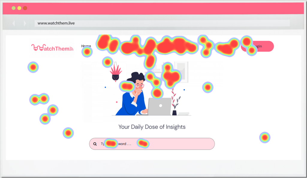

Want to try out Watch Them Live heat maps to optimize your website navigation? Sign up now and get your free trial!
Conclusion
Implementing a breadcrumb trail can be an excellent strategy to improve your website’s user experience by facilitating navigation. Although breadcrumbs have many advantages, they are not useful for all websites. So, if you want to use breadcrumbs, first make sure it adds value to your website.

