Page Contents
Before we start talking about below the fold, let’s talk about the origin of this phrase. The folding phrase goes back in time to the first days of paper journalism. Newspapers were – and still are – printed on big sheets and had to be folded once they hit the news-stands. Thus we had above the fold or where people could see and below the fold that was hidden from eyes. This term still remains in the digital era and means somehow the same. If it needs to be scrolled, then it’s below the fold.
Throughout this article, we try to mention the importance of below the fold and the ways to improve your website accordingly.
Note: One of the best below the fold practices is to find out its placement to avoid putting your important content and CTAs there. However, it’s not so easy since it varies for each device. One thing you can do is monitor your visitors to understand their screen resolution, device type, and browser so you can come to a conclusion. WatchThemLive is an analytics tool that will give you the exact information you’re looking for.
For more articles about UX/UI click here
What Does Below the Fold Mean in Web Design?
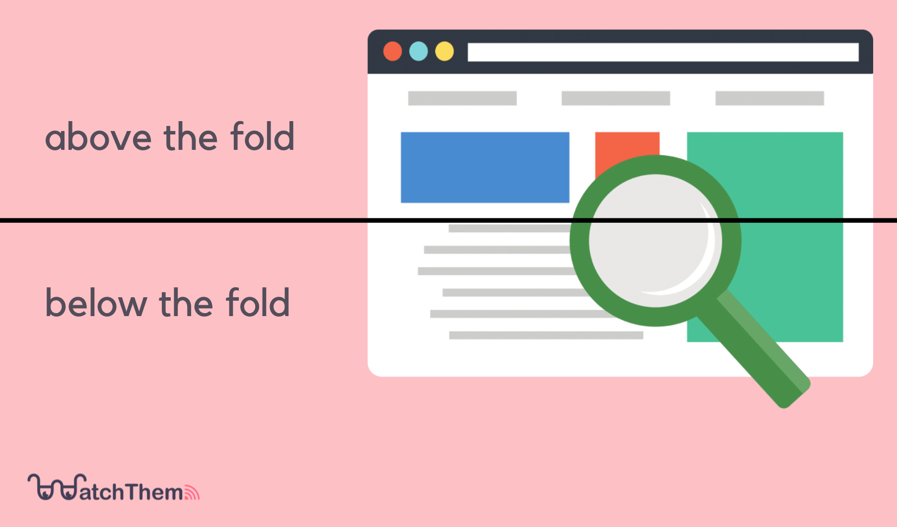

The section of a web page that is only visible after scrolling down is called below the fold. Usually, in the digital marketing world, above the fold is more important than below the fold since it gets more attention.
How to Calculate Below the Fold?
Many people use different devices such as mobile, laptop, and tablet to interact with your website while using different browsers. Also, all of these devices have different screen resolutions and screen sizes. For these reasons, it’s impossible to find the exact place of below the fold on your webpage.
Most of the web designers have came to the conclusion that the average fold line placement is at 1,000 pixels wide and 600 pixels tall. This is the best placement for most of the visitors with a monitor/browser combination of 1024*786 pixels. Of course, this works when their browser window is maximized, and they have no toolbar installed.
However, in order to find what’s the most common screen dimensions for your websites’ visitors, you need visitor analytics. WatchThemLive is an analytics tool that gives you the exact screen dimensions of your visitors so you can find the proper placement for your webpage’s below the fold. You can also see their deceive type, operating system, and browser. Well, theres’ no need to say more; sign up for FREE and get started.


Why Is Below the Fold More Relevant Today?
If I had to write this article 10 years ago, I would probably never include this part. But everything has changed since then so it’s inevitable now. Back then it was obvious that above the fold is important and no one considered putting any important content in the below the fold section. They thought people wouldn’t read them at all just like big newspapers.
They used to put all of their content and advertisements above the fold and nothing would be left for the rest of the page.
This method has been changed in the past years, and if you ask why here are some reasons for that:
1. Scrolling Is Second Nature to Today’s Users
Scrolling isn’t as weird as it was before. You, as a reader of this article, would guess, today it’s something normal to do.
Huge, a creative agency, ran an interesting user test where they tested four different versions of a design. The versions included:
- A blank control image
- An arrow for giving visitors the cue to scroll down
- A short image that contains below the fold information
- An animated image that directs visitors to below the fold
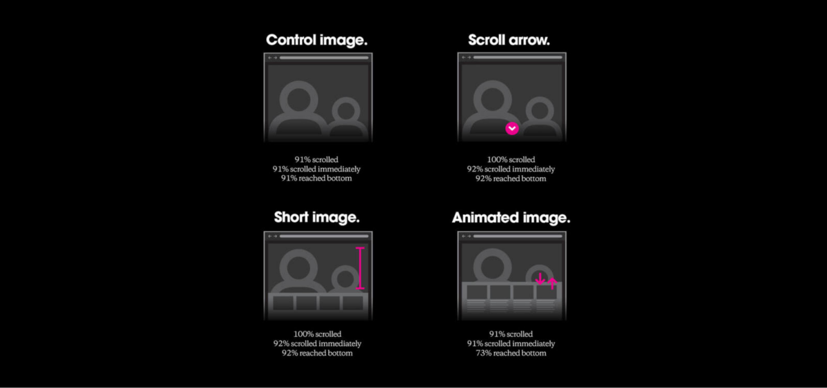

The results showed that almost all of the participants scrolled regardless of each variation.
The stats are even more startling on mobile. One study found that, on mobile, half of the users start scrolling within 10 seconds and 90% within 14 seconds.
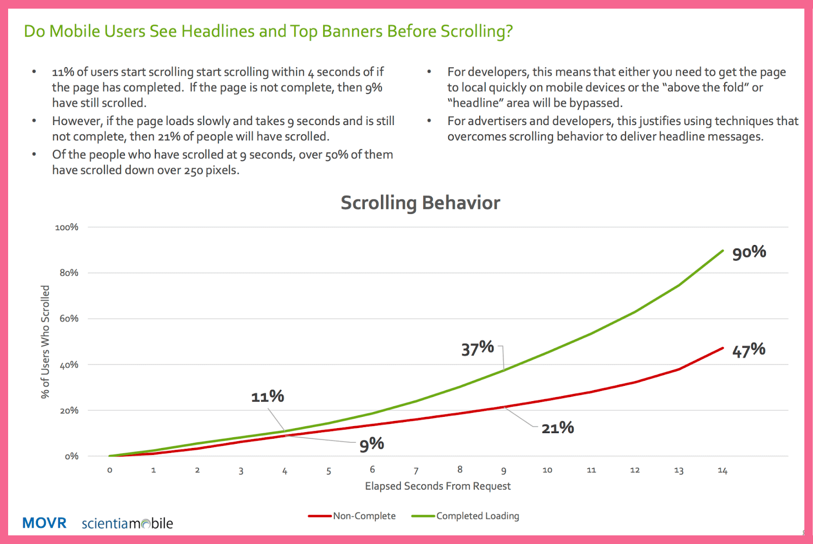

These researches show us that we are used to scrolling, and it’s not a weird thing anymore.
2. There Are Too Many Different Screen Sizes to Accurately Predict “The Fold”
Smartphones, tablets, pcs, smart TVs, and so on. And, of course, all of them can have different screen sizes and even different viewing orientations. With this much variety out there, it’s too difficult to determine the exact fold area for each of them.
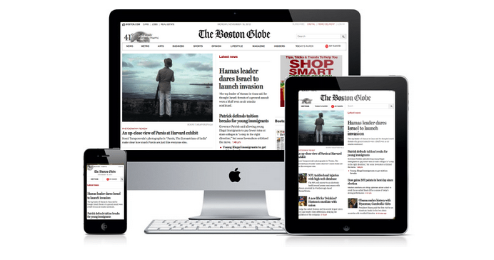

There are some ways to manage the landing page to be comparable with all these screens. Responsive pages are one of them. They will match themselves to the screen they are represented but even in these solutions, predicting the fold is hard. This makes the boundary between above and below the fold thinner.
3. The Way People Buy Has Changed
It’s not exaggerated if we say people try their best to avoid talking to salesman nowadays. They prefer knowing about their purchases and researching them. This is important because it will cause the content below the fold to be more readable and relevant.
You can and probably should redesign your website layouts according to these facts to stay in the game. If you want more help on this topic here is a great start.
How Can Below the Fold Help You Increase Revenue?
Below the fold enables you to present more information. Imagine being an eCommerce. Where is the best place to put your best products? Of course, above the fold area. But, you can use below the fold to provide more detailed information. The same applies to editorial pages. Below the fold, you can link to similar articles or further information. Here are some other benefits:
- Increasing average session duration
- Increasing click-through-rate
- Improving customer loyalty
- Helping with Conversion rate optimization
Do Calls-to-Action (CTA) Belong Below the Fold?
This topic is much more important to be considered as a tip so I will open it up here separately.
Where should you put your CTAs? Above the fold or below? This might be a tricky question because there isn’t an absolute answer for that. However, putting the customer at the center of our design will help you decide better:
1. Pre-sold Customers: They know what they want, So making your CTAs up on the page will be more effective in this case.
2. Interested Customers: You should make your offer clear as possible and explain how it provides them value.
3. Uncertain Customers: They need more information and time. If you ask them to sign up or buy quickly, it will repel them.
Even with these grouping and considering different kinds of customers, it’s not as accurate as we want.
We need to track and know our customers better. We should know where are their pain points or which part of our site is designed better for them. These and a lot more information can be achieved by using tools that are specified for these matters.
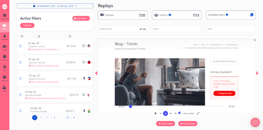
WatchThemLive user tracking and analytics tools can be helpful here. Session replay is one of the services that can gather information about your site viewers. How do they react to your website? Where do they see the most? How far do they scroll down? Or even what their problem is and in which part. These and many more questions are part of the data that session replay can answer and gather.

What are you waiting for? Sign up and snag their free plan now.
Design Tips for Having Better Below the Fold
We covered every detail about below the fold and its importance according to the past. Now it’s time for some tips to improve your business website design:
1. Not too Much Information for Below the Fold
If you put too much content on an eCommerce web page’s below the fold section, the Search Engines’ algorithm can confuse in terms of the primary focus of the web page. So make it clear and simple so nothing could backfire on you.
2. Avoid “False Bottom”
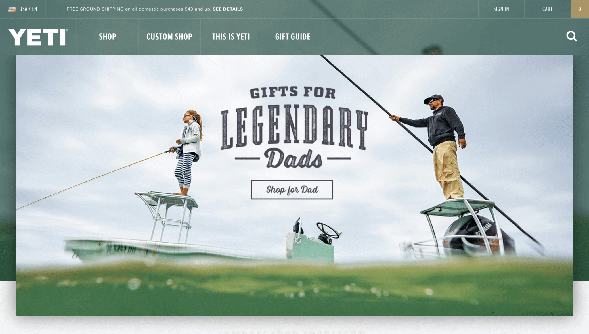
A false bottom is when the website has some more content below the fold but won’t tell the customer. So most of the customers will miss that information and obviously, it will hurt conversion so much. In this example, you see that there is no hint for telling customers about more information that lays down below.

3. Put Hint for Below the Fold
As a continuous for hint number two, if you want your customers to find out that there is below the fold part, tell them. You can simply do this with a small arrow or be more creative and do it with your design.


Here we see a shattered picture and it will lead us to exploration and fixing it.
4. Be Minimalist
The art of transferring your thoughts in the simplest way is very important. Nowadays people don’t want to spend much time on any subject. They want everything to be fast, So they open your website and scroll down. That’s your last chance to attract them; grasp on to that.
Examples of Great Below the Fold Web Design
I can write and write about this topic but until we see some examples we won’t see the difference between good and bad. So here is some beautiful web design that will encourage you to explore theirs below the fold.
1. LIFE BELOW 600PX
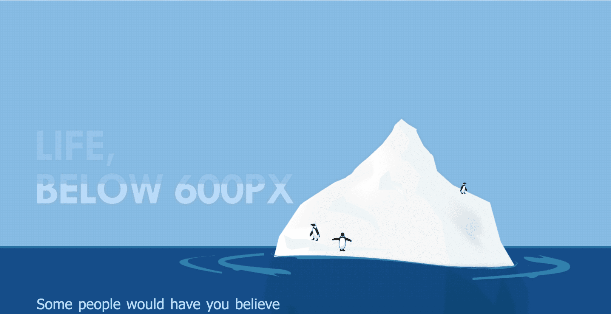

The icebergs are famous for having more than half of their size below the water. This simply can transfer the idea that there is more information below the fold. This will make the customer curious about below the fold content without any words.
2. CRITICAL MASS
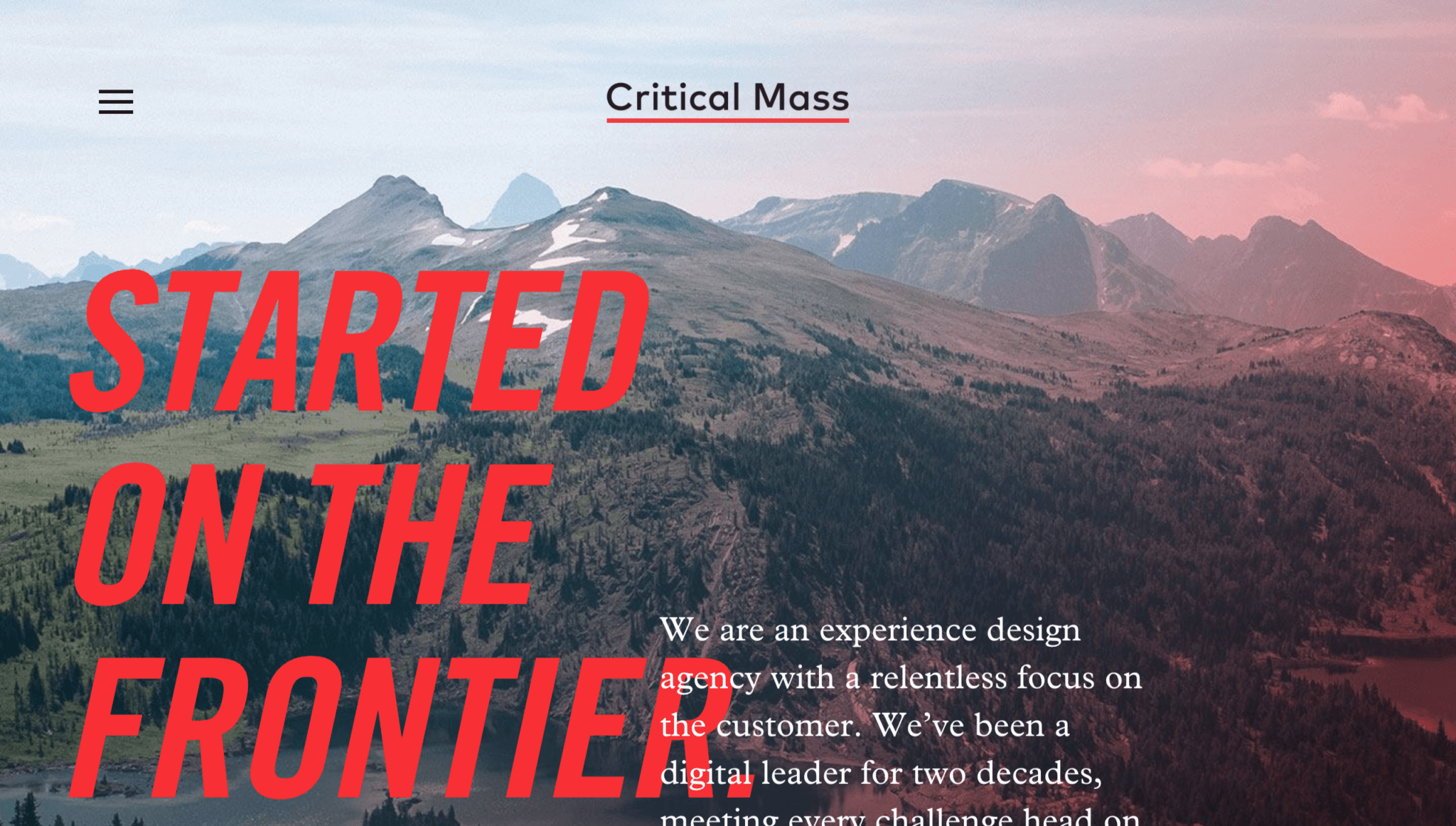

The bold headline paired with paragraph text creates an editorial feeling that gives this site an epic quality. This is an example of a beautifully designed page using text as a visual cue for users to keep scrolling down the page.
3.WHAT GOES UP


Lines usually make our eyes follow them. This is true with this vertical line. It will cause your eye to follow the line and look for more. The opening is a superb job, too. It lays out the page in a tantalizing way that draws readers deeper into the narrative.
In Conclusion
Being able to tell your story to your customers is very important. Nowadays, below the fold area is more relevant and can be seen more than before. This is a great opportunity to be used for sharing your information with your customers and speaking with them. Not just yelling for sale.
In the end, we offer you an excellent tool that can help you improve your website design. With WatchThemLive web analytics, you are able to obtain useful information about your visitors, such as their device type, screen resolution, and browser. You can also see how users interact with your website and below the fold with their session replays. Session recordings enable you to see which part of your website is getting more attention and how far users scroll down.
Don’t waste any more time; sign up now and see what’s next!

