

Page Contents

Last updated: October 2026
Design trends come and go, but the rules that make a product easy to use change slowly. UX design principles are those lasting rules: ideas about people, attention and behavior that help you decide what to build and how it should work. They will not tell you what color a button should be, but they will help you decide whether a screen is clear, helpful and fair to the person using it.
This guide covers nine essential UX design principles, four well-known UX laws that explain them, how to apply them in practice and how to measure whether they work. Where definitions come from secondary summaries, we say so.
What Are the Main UX Design Principles?
UX design principles are general guidelines for creating experiences that are useful, usable and pleasant. They are rules of thumb, not strict laws: they guide judgment and always need testing with real users. The nine below cover most situations.
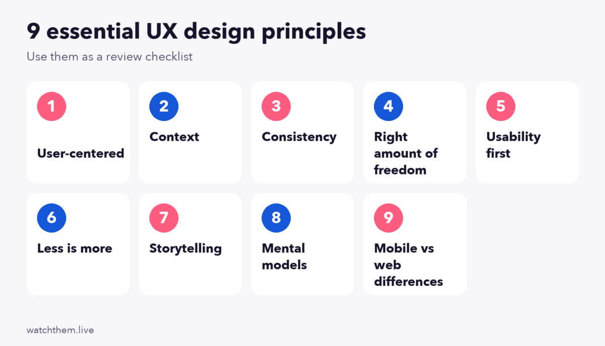
1. User-Centered Design
Start with people, not features. Learn who your users are, what they are trying to do and what gets in their way, then design for those needs. Methods include interviews, surveys, usability tests and behavior data such as session recordings. A user-centered approach also supports your business goals; see UX strategy.
2. Context
The same screen can be used in very different situations: on a phone in bright sunlight, on a laptop at work, with one hand or with a screen reader. Design for the real context of use: device, environment, connection speed, attention and ability. Mobile is roughly 60% to 63% of global web traffic according to Statcounter data for 2025, so mobile context is often the main one.
3. Consistency
Use the same patterns for the same things. Buttons, labels, icons and navigation should look and behave the same everywhere, and follow platform and industry conventions. Consistency lowers the effort of learning and builds trust. It is one of Nielsen’s ten usability heuristics (consistency and standards) and ties to the repetition in CRAP design principles.
4. The Right Amount of Freedom
People need control, but too many options overwhelm them. Offer clear choices, sensible defaults, and a way to undo or go back. Hick’s law says that decision time grows with the number and complexity of choices, so cut options at key moments, such as a checkout or a sign-up, and hide advanced settings until they are needed.
5. Put Usability First
A beautiful design that is hard to use fails. Make the main tasks obvious, quick and error-free. Check usability early with prototypes. Testing with five to ten users often reveals most major problems, based on Nielsen and Landauer’s model as summarized in secondary sources, although such small samples cannot give reliable rates.
6. Less Is More
Every extra element competes for attention. Remove what does not help users reach their goals: extra fields, decorative clutter, repeated links. The eighth Nielsen heuristic, aesthetic and minimalist design, makes the same point: irrelevant information reduces the visibility of what matters. Baymard’s 2024 benchmark reported about 11.3 form fields in an average checkout, which shows how easily forms grow.
7. Storytelling in Design
People understand stories better than lists of features. Use a clear sequence: problem, solution, proof and next step. Illustrations, microcopy and layout can guide users through a journey, so they always know where they are and why it matters. See our guide to the buyer journey.
8. Mental Models
Users bring expectations from other products. Jakob’s law says that people spend most of their time on other sites and prefer yours to work the same way. Use familiar patterns for basic actions, such as a cart icon for the cart and a logo that links home, and use research to check what your users expect.
9. Understand the Gap Between Mobile Apps and the Web
Apps and websites follow different norms. Apps can use gestures, push notifications and device features, and users expect fast, smooth performance. Websites rely on links, search and shareable URLs. Avoid copying one pattern onto the other without testing. Keep tap targets large (WCAG 2.2 sets a minimum of 24 by 24 CSS pixels) and design navigation for thumbs.
Four UX Laws That Explain the Principles
The site and book Laws of UX by Jon Yablonski collect psychology principles that apply to design. Four are especially useful:
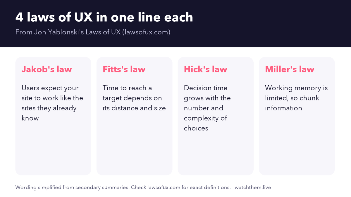
- Jakob’s law: users expect your site to work like the sites they already know.
- Fitts’s law: the time to reach a target depends on its distance and size. Make important buttons large and close to where the user is.
- Hick’s law: decision time increases with the number and complexity of choices.
- Miller’s law: working memory is limited, so present information in small chunks. Later research suggests that the limit may be closer to four items, plus or minus one, than the older figure of seven.
Use these as aids for reasoning, not as proof. Test your own design to see what works.
How to Apply UX Design Principles
- Pick the right principle for the problem. If users miss the main button, look at hierarchy and contrast. If they abandon a form, look at freedom, fields and error handling.
- Audit your pages. Walk through your key journeys with the Nielsen heuristics as a checklist. See UX metrics and our CRO audit guide.
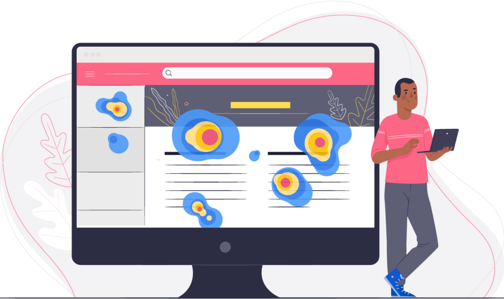
- Watch real behavior. Heatmaps show clicks and scrolling, and recordings show hesitation and errors.
- Make small changes and test them. Compare versions with A/B tests where you have traffic.
- Document what you learn, so the team builds shared rules over time.
Measuring Whether Your UX Principles Work
- Task success rate: MeasuringU’s analysis of almost 1,200 usability tasks found an average completion rate of about 78%, a reference point, not a target.
- Time on task and error rate show friction.
- System Usability Scale (SUS): the average score is about 68 on a 0 to 100 scale, based on MeasuringU’s data from roughly 500 studies.
- Conversion and engagement: compare before and after changes. See conversion rate.
- Performance: Core Web Vitals targets of a Largest Contentful Paint of 2.5 seconds or less, an Interaction to Next Paint of 200 milliseconds or less and a Cumulative Layout Shift of 0.1 or less.
7 UX Best Practices for Designing a Product
Principles describe what good UX looks like. These seven habits describe how teams get there:
- Stay informed about UX trends, but adopt them only when they solve a real problem. See UX design trends.
- Test usability continuously, from early prototypes to the live product, to track your progress. See usability testing methods.
- Do not reinvent the basics. Use familiar patterns for navigation, search and checkout, and save novelty for what makes your product different.
- Base decisions on your audience, not on personal taste. Use research and feedback. See user feedback.
- Aim for responsive, practical design that works on every device and connection.
- Use visualization to tell users apart from one another, such as personas and journey maps that make different needs visible to the whole team.
- Aim for consistency in components, language and behavior across the product.
Combine these habits with the process in our guide to the UX design process.
UX Principles for Accessibility and Inclusion
Good UX works for everyone, including people with disabilities, older users and people on slow connections. Four habits help most:
- Do not rely on color alone. Pair color with text or icons, for example in error messages and charts.
- Support keyboard and screen readers. Use real headings, labels and alt text, and keep a visible focus outline.
- Allow text to grow. Layouts should still work when people enlarge text.
- Keep targets large and well spaced. WCAG 2.2 sets a minimum of 24 by 24 CSS pixels for many controls.
These practices overlap with the principles above: clear, consistent, simple design is usually accessible design too. They also widen your audience, which helps results.
How UX Principles Affect Conversions
Every principle has a business effect. Clarity and hierarchy help visitors find the main action. Consistency and familiar patterns lower hesitation. Fewer choices and fields reduce abandonment, and good feedback and error handling prevent lost sales. Roundups that cite Baymard Institute research put average cart abandonment near 70%, with unexpected costs, forced account creation and a long, complicated checkout among the leading reasons, all of which are UX problems. Linking principles to numbers such as conversion rate, task success and abandonment also makes it easier to get support for design work. See CRO and UX for more.
Common Mistakes When Applying UX Principles
- Treating principles as laws. Context matters, so test.
- Following trends instead of needs.
- Adding features to solve problems, when removing something would work better.
- Ignoring accessibility. Contrast ratios of at least 4.5:1 for normal text help everyone.
- Designing for yourself instead of for the people who will use the product.
- Not measuring, so you cannot tell if changes helped.
Frequently Asked Questions About UX Design Principles
What are UX design principles?
They are general guidelines for creating products that are useful, usable and pleasant, such as consistency, simplicity, context and user-centered design.
What is the difference between UX principles and UX laws?
Principles are broad guidelines for design decisions. UX laws, such as Hick’s law and Fitts’s law, are specific findings from psychology that explain why people behave as they do.
How many UX principles are there?
There is no official number. Lists range from a handful to dozens. Nielsen’s ten usability heuristics are among the most widely used.
How do I know if my design follows UX principles?
Review it against a checklist such as Nielsen’s heuristics, watch real users and check metrics such as task success, conversion and satisfaction.
Do UX principles apply to mobile apps and websites?
Yes, but the details differ. Test patterns on each platform, and design for the context and device people actually use.
Conclusion
Good UX design principles keep your attention on people: design for their needs and context, keep things consistent and simple, give the right amount of freedom, put usability first and use familiar patterns. Back them with UX laws and test everything with real users. When principles, research and measurement work together, you build products that people find easy and want to use again.
