Page Contents
A landing page, like an elevator pitch, provides a brief overview of your company, its products or services, and the problems it can solve. Landing pages, like the rest of your website’s pages, have the same purpose in mind: to convert visitors into customers. These factors make landing page checklist testing of critical importance.
A landing page is used in the most vulnerable stage in the funnel of any campaign. This means it can be very beneficial. However, if you make any of the mistakes we will discuss below, it can be destructive.
So, if you are already aware of the importance of the landing page, let’s dive into the details.
How to Test a Landing Page?
To begin, it’s crucial to discuss the process of testing. Of course, testing everything is preferable to testing nothing. Therefore, a planned program for landing page testing, rather than sporadic successes, can increase your website’s conversion rate.
Regardless of the testing approach used, such as A/B, Multivariate, or Split, a comprehensive landing page testing process might look something like this:
- A well-known and data-driven goal
- A set of well-designed tests such as A/B, Split, etc.
- Using different types and variations of data for the test
- Quality check for the results in hand
- Analyzing the outcome
- Deploying the best outcome scenario and removing others
- Making documents of the test for further usage
Senior testing teams continuously analyze their test data across numerous segments to find situations where the losing variant outperforms the winner.
Let’s take a closer look at how landing page testing might assist you in achieving your specific conversion goals.
Why is Landing Page Testing So Important?
Your website landing page is the one page that has the most potential whether to convert or to dismiss your visitors, making them your future loyal customers, or making them abandon your website quickly. It’s like a window that opens to your whole brand and showcases it. We can keep talking about its importance for days, but here we mention the four major roles it plays in your business and conversion rate:
- The period that you have to capture the visitors’ attention is 4 seconds at its peak.
- As we mentioned before, the landing page is the most vulnerable step in your campaign’s funnel.
- It will play a huge part in your rate of investment increase or decrease.
- Landing page testing will increase your conversion rate and make it consistent.
Top 8 Worst Mistakes in Landing Page Testing
Let’s dive into the discussion about mistakes that will cost you conversion and revenue over time:
1. Foggy Headlines
Headlines are the most important parts of your landing page.
They are the first things visitors will notice when they arrive at your website. As a result, they will either convey that they are in the correct location or that they are not.
The brutal truth is that a first-time visitor to your landing page isn’t interested in who you are or how creative your title is – they are interested in what you can do for them.
Some creative companies make this mistake a lot. Headlines will be inventive, but so vague that it would be impossible to figure out what they mean without scrolling below the fold. Therefore, the chance of grabbing the visitors’ attention will decrease a lot.
So, in your landing page testing process, make sure to address your headlines more directly.
2. Terrible Call-to-Action Placement
One of the most critical elements of any landing page is the call to action or CTA.
Whether your CTA is a button, a sign-up form, or something else, it should always be visible above the fold with a good UX design.
If your form is at the bottom of the page, you might include a button below your headline and tagline that brings readers to the bottom. Page anchors can be used to do this. Make sure you are aware of this issue in your landing page testing.
3. Image-polluted Landing Page
Images should clarify rather than confuse. Pictures of specific things or items that are irrelevant to your business should be removed.
If you are going to use images, make sure they are remarkable. This is why people’s pictures are so popular. Photographs with people looking in the direction of your CTA can help you convert more individuals.
So, use visuals strategically to lead people to the action you want them to do.
4. Ending Your Landing Page Testing Unfinished
This is a typical error. Many marketers will start an A/B test, become impatient, declare victory, and then terminate the tests. When they see that one of the versions has outperformed the original, they will pop the cork and toast their new “successful” test.
However, there is a significant issue with leaving your testing unfinished. False positives might occur if tests are stopped too soon. What appears to be a winner early in your tests may turn out to be a loser in the long run. So, if you push the variant because it raises conversions by 10%, your progress may revert in a few months and settle at a lower conversion rate than before.
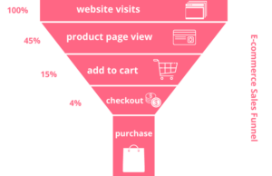
5. Unnecessary Funnel Stages
As a marketer, you need your visitors to have as many aha moments as possible. It is great if customers can get from taking a glance at your homepage to discovering the value in your product as quickly as possible. The longer you wait, the more likely they will lose interest, resulting in cold leads for you.
However, many websites add needless hurdles to the registration procedure. They will include a landing page, signup gimmicks, and email signup hacks. This will probably cost them their potential leads and must be checked in the landing page testing process beforehand.

6. Testing for Unnecessary objects
Marketers will frequently test minor details such as button colors. These are minor tweaks that will enhance conversions over time but are unlikely to result in large changes. Because you have optimized the insignificant aspects that most users do not care about, your site will be pretty dull and lack movement.
7. Wrong Conversion Rate Metric
To improve conversion rate metrics, we execute tests. However, marketers frequently mismatch the analytics with the test. They will do a homepage test to determine if tweaking the title will drive more traffic to the price page.
You must understand your website and figure out what pages or aspects lead to what metrics (e.g. your email list is linked to your email signup form, the signups metric is (presumably) linked to your homepage headline, and so on).
Know which one is important for you and test that for better results.
8. Overkilling Optimization
Many marketers will go overboard with testing to the point that they lose sight of the bigger picture: they are running a business with a brand that must be maintained.
You will end up with a robotic website with no flow if you test everything on a webpage. It could be unattractive, ineffective, and inconsistent. Because you run an A/B test and get different results for different pages, a button color on one page can be different than on another.
How to Prevent Landing Page Testing Mistakes?
After naming the top worst mistakes in landing page testing, it is high time to give solutions for them.
For the most part, you can find out how to prevent them by not doing the mistakes we mentioned above. What about the others, though? Well, you need an experienced optimization platform to help you with your analyses and behavior targeting.
The Watch Them Live analysis is one of the best tools out there. This platform can help you better understand and enhance your website’s visitors’ behavior. Session replays, heat mapping, website analytics, and real-time statistics are among the services available in WTL. These tools make landing page testing and optimization much easier, and also provide useful knowledge about how to improve your website.


Final Thoughts
Patience, big-picture thinking, knowing your business on a deeper level, and a great testing framework are all required for efficient testing. Most importantly, testing entails avoiding common and easily avoidable errors. We hope the 8 blunders we have explained in this essay can aid you in your landing page testing processes in the future.

