Page Contents
Why do you need a landing page checklist?
There is no doubt that the internet has created many opportunities for businesses. These days, many companies make every effort to take advantage of these opportunities and create websites that are well organized, easy to use, and attractive.
One of the key parts of a website is the landing page. The more effective your landing page, the more leads you would capture, resulting in more conversions. A landing page checklist is what you need to make sure you have included all the essential components to grow your revenue.
Keep reading to discover what are the essential elements of a landing page and how to optimize it. We will also show you how to audit your landing page by visual representation at the end of the article.
What Should a Landing Page Have?
Using a landing page checklist you will ensure you have all the key elements for an effective landing page. The main purpose of a landing page is to encourage visitors to become leads and take action towards the conversion goal. Hence, remember to include the following elements on your landing page so that it can do its job.
1- Headline
Your headline is the first thing that captures users’ interest when they visit your landing page. It gives them a first impression of your brand. So, it’s crucial to write your headline carefully.
These are the things you should consider when writing a headline:
- Make sure it’s clear.
- Keep it short.
- It should tell visitors what your product or service does.
- It should be relevant to the ad that users’ have clicked.
- It should focus on the benefits of your product or service.
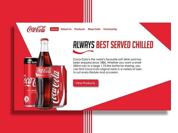

2- Subheadline
The second essential component on a landing page is a subheadline which encourages visitors to stay. Your subheadline should persuade visitors take action. It should also provide more details about your product or service.
Use subheads to show the value of your offer, and just like the headline, make it relevant to your ad.


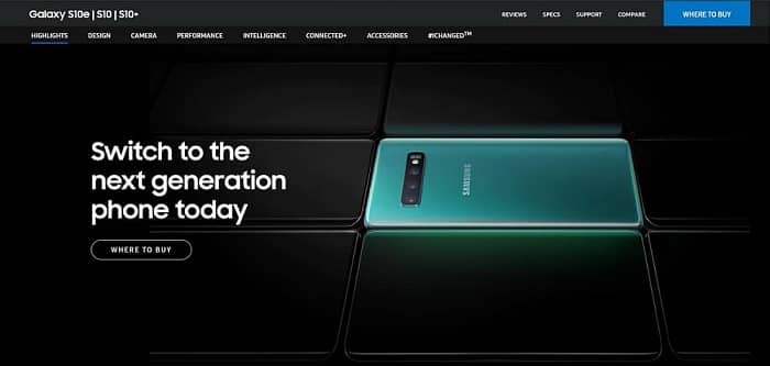
3- Hero Image
The hero image is probably the first visual visitors see on your landing page, and it’s usually placed at the top of the page in full width. The hero header highlights your offer to your website’s visitors.
Remember these things when you are choosing the image:
- It should be of high quality.
- Image sizes should be optimized to avoid affecting page load times.
- Choose an image that adds value to your landing page.

4- Benefits
Benefits are the next element on our landing page checklist. You need something more than the headline and subhead to encourage visitors to convert. This is why you should include your features and benefits on your landing page.
Give more information about your product and service to users and explain what it can do for them. Try to answer the questions that visitors might have about your offer.
5- Social Proof
Anyone who has ever made an online purchase understands the importance of customer reviews. Social proof is a powerful tool to persuade visitors to take action. Recommendations and user reviews can affect people’s purchasing decisions significantly. In fact, 72% of customers will trust a business more if they see positive reviews and testimonials.
Visitors are more likely to buy from you if they see satisfied customers who have done so before.
These are some types of social proof that are great for landing pages:
- Reviews
- Number of customers
- Trust seals
- Awards
- Testimonials
- Case studies


6- Call to Action
The most important component of a landing page checklist is the call to action. The main goal of your landing page is to draw visitors’ attention to the CTA and increase conversions.
For a more compelling call to action, keep these things in mind:
- Make sure it’s big enough to be easily visible.
- Write an engaging copy.
- Choose a contrasting color.
- Let visitors know what happens after they click the button.
7- Contact Information
Adding contact information is the last thing on our landing page checklist. You show visitors that you are reliable and trustworthy by including your contact information. A phone number and a physical address are necessary to assure you are a real company. But, it’s an excellent idea to add other contact methods, such as email address, contact form, and live chat, to let visitors get in touch with you conveniently.
Visitors are more likely to convert when they can easily contact you to ask their questions and express their concerns.
How Do You Audit a Landing Page?
After including all the essential elements on the landing page checklist, it’s time to see how your landing page performs and optimize it.
Landing page optimization is necessary for converting as many visitors as possible. Therefore, you need to perform landing page testing to determine how users interact with your landing page.
Website heat maps are a valuable tool that help you analyze your landing page.
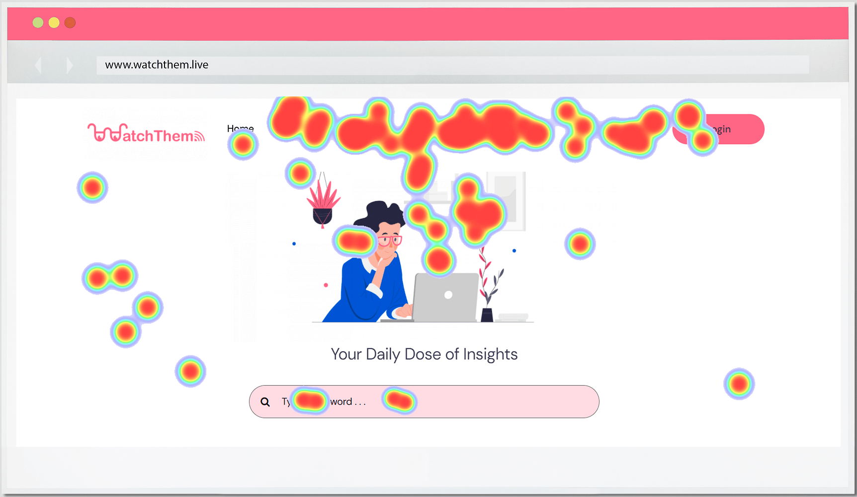

Heat mapping is an excellent way to find out how users interact with your landing page’s elements. To use heat maps, you need a behavior analytics tool that offers this service, such as WatchThemLive.
WatchThemLive heat maps allow you to track your visitors’ clicking activity on your landing page. For example, you can find out if they are paying enough attention to your CTA or not. Moreover, you can figure out if anything is distracting users from the landing page goal; maybe an unclickable element is confusing them.
This tool also offers other features, such as session replays and website analytics, that provide you with valuable information about your visitors.
Want to track your landing page with WatchThemLive heat maps? Sign up now and get started!
Conclusion
A landing page checklist helps achieve a higher conversion rate. The landing page is a crucial stage of a customer’s journey, so make sure to include the elements discussed in this blog post.
And don’t forget to evaluate your landing page after designing it. Then, use the right tools to find out how to improve its performance.

