What Is Heatmap Analysis?
Heatmap analysis is the process of analyzing heat maps to understand user behavior on a website. Marketers use the information to improve their website and develop strategies for reducing abandonment rates, increasing conversion rates, improving the marketing funnel, etc.
What should you be looking for?
- The problems users are facing when navigating through your website
- If people are noticing important content
- Click-through rate of key elements on your website
- What is distracting people on a web page
- What interests visitors on your website
How to Analyze a Heatmap?
Heatmap analysis will provide you with answers to some key questions about user behavior. Let’s see what these questions are and how you find the answers:
1- What Content Interests People?
Analyzing heatmaps, you can find out what content is more popular among your visitors. You can see what parts of the page people are engaging with the most. The content in these areas is what your audience cares about, so that’s what you should focus on.
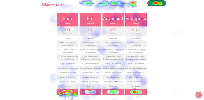
For example, look at WatchThemLive’s pricing page heatmap. You can see the order button for the free plan has more red spots than the others, indicating this is the most popular plan among the visitors.
2- Are People Paying Attention to Key Elements?
A heatmap shows you if visitors are interacting with important elements (essential links, buttons, CTAs, etc.) or not. These elements usually lead visitors toward the conversion goal by encouraging them to take actions such as signing up for a newsletter, creating an account, and adding a product to the cart. Optimizing these micro-conversions will increase your website’s conversion rate.
Therefore, it’s necessary to monitor users’ interactions with the important elements. Are visitors clicking or tapping on the call to actions? What elements are they ignoring?
If the results are not satisfying, maybe you should change your design. After making the improvements, you can analyze the heatmap once again to see how users are responding to the changes.
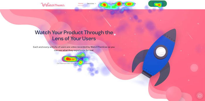
Here’s an example. On an older version of WatchThemLive’s homepage, the heatmap showed that the interactions with the CTA button are not as many as we expected.
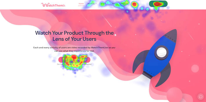
We made some improvements and used heatmap analysis to see how visitors’ interactions are changing with the CTA button. By changing the copy from “Try for Free” to “Start Converting Free” and using a bigger button, the click-through rate rose from 2.28 percent to 3.43 percent.
3- Are There Any Elements Confusing Visitors?
Heatmaps can reveal if people are clicking on unclickable elements. If an unclickable element is receiving too much attention, it means visitors are expecting it to be clickable. So, you should be careful about these unclickable elements as they can confuse and even frustrate visitors. Make some changes so users can differentiate them from clickable items.
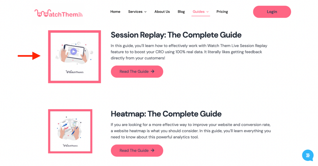
On our Guides page, the play button on the image we used for the session reply guide seemed to confuse some visitors as they might have thought it’s a real video. So, we used smaller images to avoid confusion.
4- Are There Any Distractions?
Users’ interactions should be focused on key areas on your web pages. If there are various elements attracting people’s attention, they will get distracted from the conversion goal.
Heatmap analysis will tell you how focused the visitors’ activities are. Try to remove or replace some elements to see how things work out.
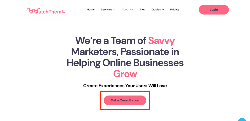
On the About Us page, we realized the image above the fold is taking visitors’ attention away from the CTA. By removing the image, the click-through rate increased from 1.16 percent to 2.03 percent.
5- How Do Users’ Experiences Differ Across Different Devices?
Analyzing and comparing the heatmaps of the desktop and mobile versions of your website enables you to provide a better experience for users.
As your website looks different on each device, you must make sure that key elements are visually prominent on both desktop and mobile devices. If these elements are getting less attention on one of the devices compared to the other, you might want to redesign the pages to see how users’ behavior changes.
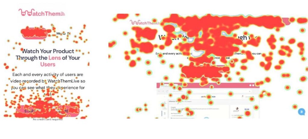
Below you can see the heatmap of both the mobile version and the desktop version of WatchThemLive’s homepage. See how the key elements on both versions are getting the most clicks.
