Page Contents
The Shopify order confirmation page is one of the last steps in the buyer’s journey map before payment. Imagine spending your time in a physical store and deciding to order some product. Then, finally, you decide to leave. The seller gives you a warm smile at the last second and thanks you for your time.. How do you feel at that moment? Surely it feels great to be thanked, and it will make you remember that shop forever.
We can deploy this to an online store. The order confirmation page is our last smile that can be very beneficial and satisfy our customers.
Here I will try to explain how to create that last smile. Yet, we all know a smile is not enough and you should at least have some marketing metrics fulfilled.
For more help on this matter, here are some articles for further reading.
When Do Customers See Order Confirmation Page?
There are two locations when your customers will encounter the order confirmation page:
- When they purchase for the first time
- When they come back to the order page for tracking their purchase.
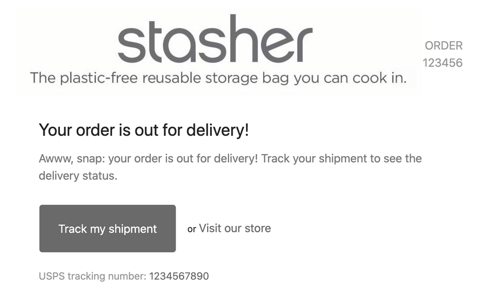
Shopify’s default Order Confirmation and Shipping Confirmation emails include a “Track my shipment” button that takes them back to the Order Confirmation page.

Why Is It Important to Modify Order Confirmation Page?
As I mentioned before, the order confirmation page is the customers’ last step on your website. Even so, that doesn’t mean that we can consider the conversion a success. It‘s customer retention that matters here. How many of your customers will come back and for what reason?
Here are some reasons why repeated purchasing is so important for a business:
- Exponential return rates – According to the guys at Smile.io, after one purchase, a customer is 24% more likely to return to your store. After two purchases, it’s 45% and after three, it’s 54%. Considering that an average conversion rate for a new customer is 1-3%, having customers with a rate of 54% is so valuable to your business.
- More and better referrals – How much more likely are you to check out a site because a friend who had a great experience recommended it? According to Zappos CEO, Tony Hsieh – fostering customer loyalty and word-of-mouth has been the main growth driver for his online shoe store.
Therefore, I hope you grasp the importance of a well-configured order confirmation page. Here you can find some information about Shopify Plug-ins that can help you through your configuration.
Scripts for Making Your Order Confirmation Page Effective
There are two very helpful scripts that can significantly improve things.
1. Fire Custom Conversion/Ad Pixels on the First Page Load
If the following custom code is not added, your conversion scripts/pixels will fire each time a customer visits to check the status of their order. Unfortunately, this can cause lots of confusion for fellow marketers, and there’s no easy way to turn things around once duplicate transaction data has been sent to external ad platforms.
For fixing this problem, wrap your conversion scripts/pixels in this official Shopify snippet.
{% if first_time_accessed %}
<– Scripts you only want to run on first checkout confirmation –>
<– Your tracking pixel />
{% else %}
<– Scripts you want to run on every visit to confirmation page –>
<– (like when a customer clicks the “View Order Status” button in their confirmation email) –>
{% endif %}
Shopify-first-visit-script-example.html
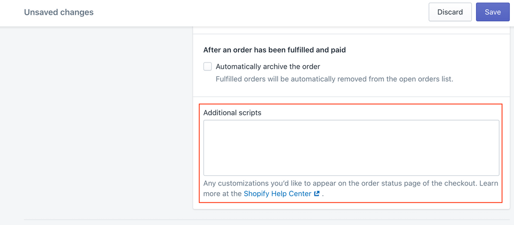
Add this content to the “Confirmation Scripts” section of Checkout Settings – yourstore.shopify.com/admin/settings/checkout

2. Add a Custom Message
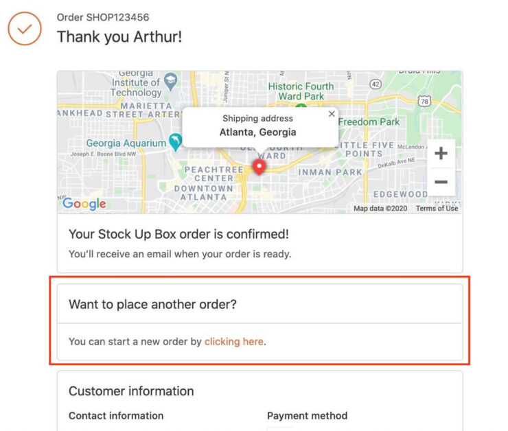

It’s important to customize the message on various pages of your eCommerce website. Whether it’s your order confirmation page, checkout page, or thank you page.
For adding your custom message, you just need to add the following script in the additional scripts section. But you must have this script popping up every time. Keep that in mind.
Shopify.Checkout.OrderStatus.addContentBox(‘
Pick-up in store
‘,
‘
We are open everyday from 9am to 5pm.
‘)
This field supports liquid so that you can use snippets like Thanks again, {{ customer.name | default: “customer” }}!
Key Elements to Customize a Shopify Order Confirmation Page
Now it’s time for customizing more aspects of the confirmation page to make this feeling in the customers that they matter to us. This leads to having loyal customers and repeated purchases.
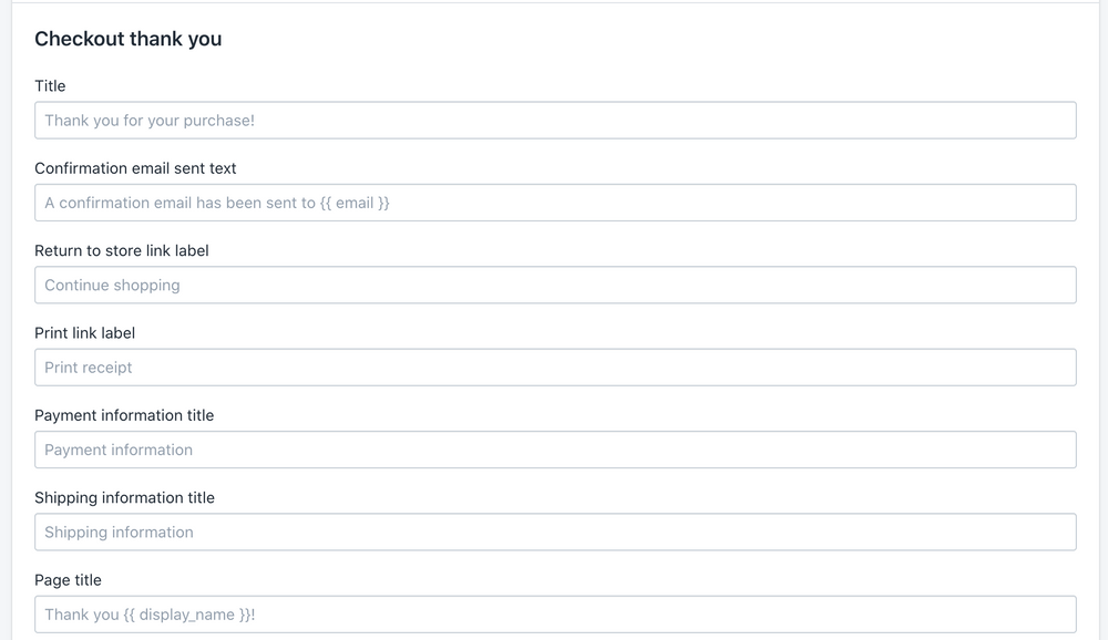
1. Customize the messages/placeholder text in the checkout
First things first. You are speaking to your customers through these placeholders. So it’s a wise move to change them in a way that makes them more warm and friendly. This is the psychological part of contacting the customers. For more info about this section visit this article.
2. Offer Valuable Discounts
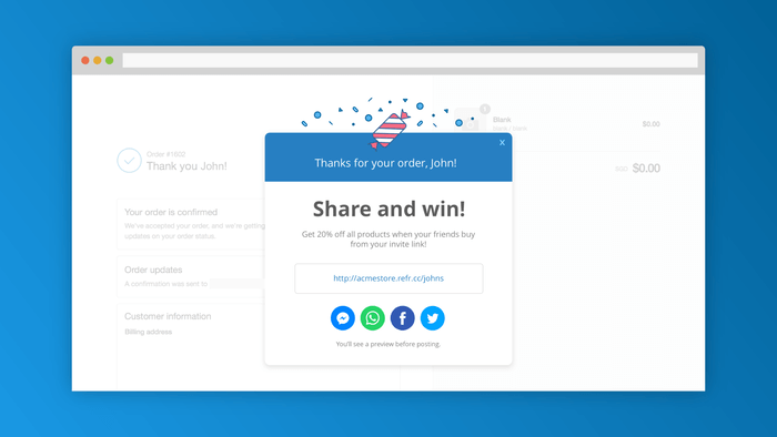
A decent discount code can make your customers come back for another purchase. In addition, you can offer them more discounts if they bring their friends to buy. This way, you are repeating the purchase and also promoting your brand. I think this is absolutely worth the discount you give.
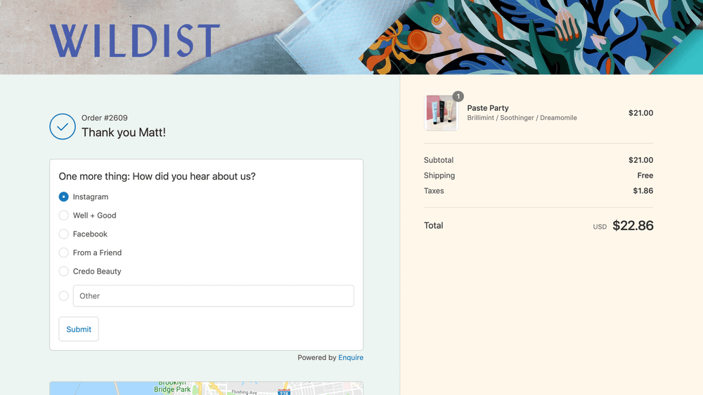
3. Add an Optional Question to The Order Confirmation Page
It’s the best opportunity for you to gather some information about your customers. Also, make that famous -being valued- feeling in them. For example, you can ask about their birthday or some questions about how they found your brand. It shouldn’t be like an exam, so make your question count.
4. Engage in Social Media
Shoppers who follow your social media platforms can receive updates on new products and promotions, which may encourage repeated purchases. In addition, encouraging a shopper to share their purchases is a highly cost-effective way to gain new customers through word of mouth.
Always keep the power of word of mouth in mind. Indeed, it is one of the most effective ways for spreading your brand and gaining new customers.
5. Offer Incentives For Referrals
You already know your customer loves your product enough to make a purchase. This makes them excellent advocates for your shop.
A referral program entices a shopper to invite more friends to purchase on your site in exchange for a discount. You get more sales. It is a win-win situation all around.
How to Test Your Shopify Order Confirmation Page Customizations?
If you want to know what your order confirmation page looks like, there is a built-in Shopify feature that will show you a preview. This way, you can make sure if the changes you’ve made are fine.
To use this feature, select an individual order. Then, on the “More actions” menu, click “View order status page.” Here you can see how the customer experiences the order confirmation page when clicking “Track my order.”
Additionally, it is wise to use analysis software to monitor your confirmation page operation. WatchThemLive analysis is an entirely free software that enables you every service you need to monitor your website. Heat maps and Session Replays are some of these services. They allow you to see how your customers react to your website. Therefore, you have important data for future decision-making.
If you are interested in increasing your revenue by using free software, sign up right now.
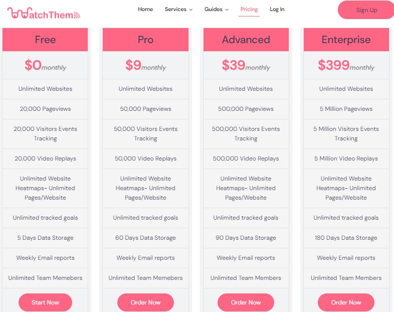
WatchThemLive Pricing Page
In Conclusion
Even though your order confirmation page feels like it is the end of the line, it can act as a new beginning for your customer and their potential links. You can get their email, make contact with them on social media platforms, and, more importantly, connect with them. Therefore, you should make good use of this opportunity.

