Page Contents
Creating a product is a task that should not be taken lightly. No matter what your product is, it is a lot of work to make it function and turn your idea into something real. But, as challenging as this is, it is only the first step. The next and more important step is to design the product and get it out there for people to use it.
According to WordPress, over 70 million blog posts are being published on the web every month. What does this mean for you? It means that it will take quite a lot of your time and skills to stand out from the crowd.
If you want to design your product in a way that is optimized for users and noticed by Google, you need the right tricks under your sleeve. Here are 7 useful UX design tips to help you get started.
Note: Want to improve your product’s UX Design? Use WatchThemLive’s behavior analytics to understand what your users want. Sign up now and get started!
1. Keep yourself informed on UX trends and strategies
It sounds like the most obvious thing, but you’d be amazed to learn how many UX designers stop their learning process when they feel like ‘they’ve figured it all out.’ The most important thing to know about design and user experience is that it can change in an instant. Being good at it is a work in progress, so your best practice is to stay on top of your reading list.
Learning through your mistakes can be useful, but it can also be costly and make you lose valuable time. When you need to design and promote an actual product, the earliest you find the way to do it, the better. That being said, you should brush up on your knowledge on this as often as possible. Start with the very insightful Maze’s UX design guide, which tells you all about experts in the field, their skills, as well as some amazing strategies to succeed in optimizing the user experience.
2. Perform usability testing to track your progress
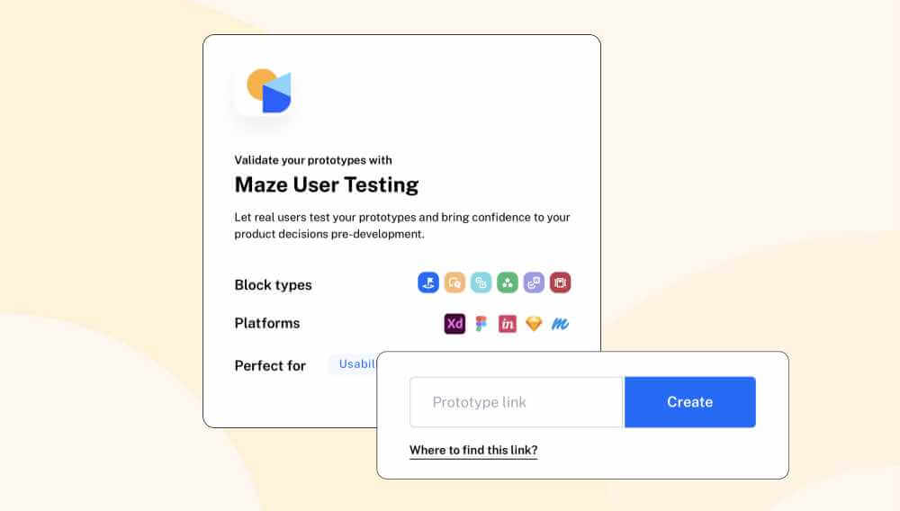
Speaking of Maze, which is one of the most used tools for usability testing, have you performed it on your product design yet? Any user-centric strategy for a product design requires knowing what your users and potential users need. What better way to figure this out than by actually asking them?
Usability testing is something that designers frequently perform in different stages of the process. You can use a variety of methods to obtain information at the beginning of the design process or at its very end. You can use it to discover what people think about your product design, therefore learning what you need to change to improve it.
Thanks to such tools, this type of testing is made easy and fast. Users don’t have to go through endless research sessions and calculate results for days. With the right testing tool, you get not only templates to create the tests, but also instant results that are accurate and actionable.
Another great way to understand users’ needs is using session recording software such as WatchThemLive. Session recordings show how users interact with your product and give you insight into improving its design to increase user satisfaction.
Sign up to get started with WatchThemLive’s session recording now!
3. Don’t try and reinvent UX design
Many people have done this and failed greatly. People love what they are familiar with. If you try to reinvent things and basically fix UX design, you’ll find that no one will respond to your new approach. UX design is not broken, and what most experts use works and is widely accepted.
Have you noticed how most apps, websites, and products are similar in terms of structure? They use similar combinations of colors and shades, a couple of good-looking fonts, and other features that you can find on all sorts of products.
The reason why experts don’t stray from the generally accepted design tricks is that people are used to them. They won’t like the idea of adapting to huge changes. So, forget about strange color schemes, freaky layouts, fonts placed in the wrong places, or a messy content hierarchy.
This doesn’t mean that you should copy the ideas of others or be afraid to get creative. You should still strive to create something unique and wonderful to attract more people, but carefully. When you intend to differentiate your creation from the rest, you can hurt the engagement levels in the process.
It’s yet another reason why you need to test your product prototype before you get it out there. How people respond to it will tell you whether or not you’ve gone overboard with your design ideas.
4. Base every decision on your target audience
Every decision you ever make in terms of UX product design should be based on your audience and users. User experience is all about your targeted user. So, your goal is to understand the demands and needs of the audience and create a product design that fits them.
There are many different ways to gather information about your target audience’s preferences and needs. Here are some of them:
· Use surveys and other types of testing to gather useful feedback
· Observe how your audience use similar products or the product in question
· Keep track of return rates
· Make sure to read the feedback customers leave for you online
All this can help you answer the main questions for your brand. It will show you who your users are (demographically speaking), what their needs are, and how you can use this in your product design.
5. Aim toward responsive and practical design
When you design a product, you’ll attempt to add many amazing elements to it in order to make it better. Very often, the UX designing process makes things more complicated than they should be.
This should be your rule of thumb – include only the necessary into your product design.
Too many elements and features are the main turn-offs for users. Even if it is evident that you tried a lot to make your product well-designed, users don’t like jam-packed and distracting things.
Your main goal should be to create something practical, responsive, and user-friendly. Just plain and simple – exclude everything that doesn’t have to be there. For example, when creating a website, each page should serve its purpose – not dozens of them. Your contact page should tell the user how to contact you, not provide useful tips or data about your company.
Hierarchy will help you a lot in this sense. The most important things go first, different ideas are separated throughout your content, and any inessential or less important information goes at the bottom.
6. Use visualization to differentiate between elements
To design for a better user experience, you need to optimize the visualization. A visually distinct page layout always works because it offers a simplified user journey.
When you have two different ideas or points that you should include in your product design, use visualization to differentiate between them. Here are some tips that can help you with this:
· The most important information about your product should be emphasized in different ways – use bigger fonts, bold them, use the boldest and most noticeable colors, etc.
· Navigational tools and action buttons should always be at reach for the user. They must know where to take action when they decide to do so. Decide on where you’ll put them, and make them easily noticeable.
· Make the search field distinct in your content. If people are looking for something specific, they should have access to this at any point.
7. Aim for consistency
Finally, there’s one principle of design that is very important when working on your product. This is consistency. It basically means that the functionality and the design remain the same across your site, in your logo, across different platforms, in your posts, etc.
Creating something similar to sites that users are familiar with is a good idea, but try not to replicate other websites, apps, and products. Basically, work to create something familiar for users but also unique to make your product recognizable. And most importantly, keep doing the same things to achieve consistency. You can’t really mix dozens of designs in a single product design if you want it to work.
In the process, you’ll surely be tempted to try something new. Your creative thoughts will guide the process, and you’ll think: “well, innovation is good for designing.” However, even though some creative touch is a great idea, it should not get in the way of usability.
Conclusion
Your product is intended to reach the target audience and convince them to take action. For this, you need an engaging design that screams a good user experience. There’s no written code as to how you can create a successful UX product design. However, everything boils down to providing the tools or information your target audience needs in a way that they understand it and find it appealing.
The process can be challenging, but with the right testing data in your hands, some creativity, and experience, you can make a product design that works wonders.


