Page Contents
There are various principles that, when applied to design, help designers and their work stand out. Understanding the people you’re designing for, for example, is a notion that should never be overlooked. Every excellent UX designer keeps all of these UX design principles in mind throughout the design process, sometimes without even realizing it.
I hope that after reading this article, you can see the principles you’ve been following and the ones you need to start implementing.
Follow these UX principles to ensure that your products and solutions remain user-centric, have perfect usability, and improve your users’ everyday lives.
Related Article: Key Website UX Metrics That Make You Stand Out in the Crowd
What Are the Main UX Design Principles?
So, what are the things that UX designers must consider while building a user experience? What are the rules of the game that distinguish a good product from a bad one?
We compiled this list of UX design principles to highlight what true designers do and what user experience principles they obey! Let’s start.
1. User-Centered
This is the most frequently referenced UX design principle. Indeed, when it comes to making design decisions on any product, it’s all about learning to employ empathy rather than our own opinions. Designers have high standards and always strive to give the best, yet this might make them decide based on their desires or preferences. Developing a UX strategy can be helpful in this matter.
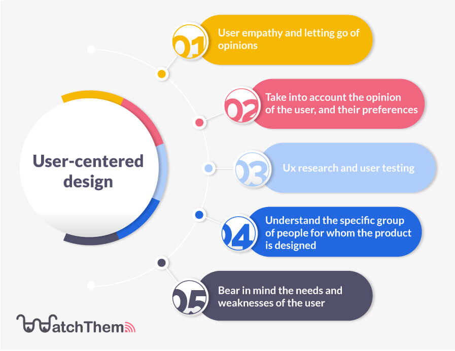

Good UX design is tailored to the user’s needs, which means the designer has to let go of their preferences as they are not the ones using the product. However, the user’s perspective, pain points, demands, preferences, and needs are all critical. It’s no surprise that design teams spend so much time and effort in the early stages of a project getting to know users.
2. Context
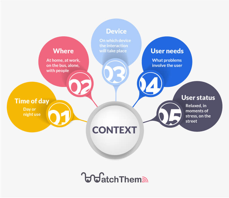
Context is crucial in the field of UX design. Designers can not be influential without context. People’s lives are fast-paced and very complicated nowadays. Therefore, because UX design is a human-centric industry, creating a context for everything is essential.
Most design teams would go out of their way to provide users with context that will help reduce any friction. Filling out forms is a simple but common example. Let’s be honest: no one enjoys filling out a form. Indeed, there’s a chance that the queries or UI elements will be misinterpreted, which will negatively affect the customer experience.

3. Consistency
The learnability of a product is aided by consistency in UX design. That is to say, products with a consistent design may be picked up by new consumers far more quickly. That’s mainly because users won’t have to learn new things all the time; instead, they’ll recollect what they have learned the first time and rely on their memory for direction.
4. Right Amount of Freedom
Actual design teams strive to provide users with freedom as much as possible. This is reflected in designs that allow users to undo actions, alter settings, customize the UI’s appearance, and create shortcuts, and so on. clearly, users want to be able to shape the product to match their own demands to have a truly unique experience. That singularity has a lot of power.
But too much freedom can be overwhelming in some situations. This is called the paradox of choice. You give your customers all the power that maybe they don’t even need or care about.
5. Put Usability First
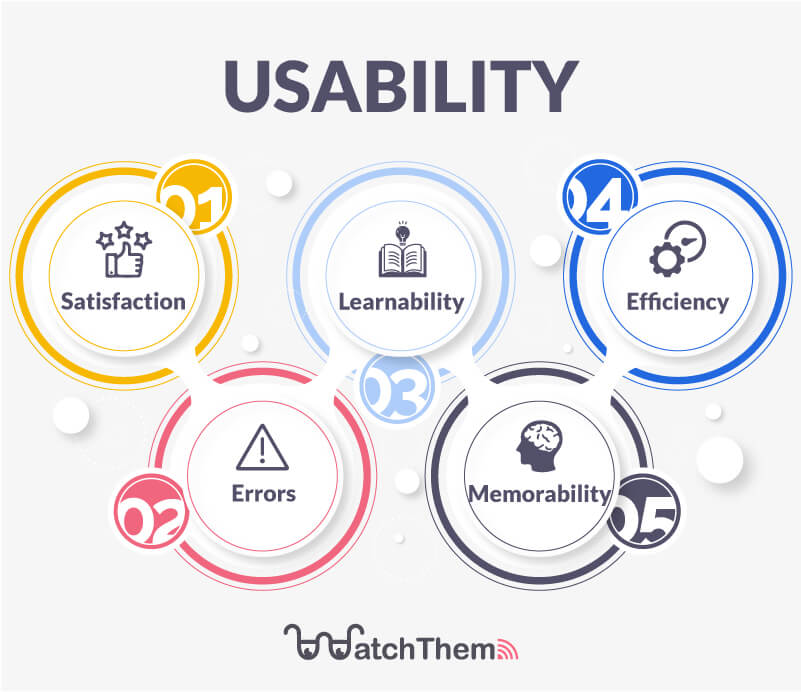
This is a well-known user-interface design principle. There are several reasons why designers take great care about the usability of their design — it’s practically a life or death situation. The usability of a product is a pillar.
In the grand scheme of things, the most acceptable thing you can do for your consumers is to establish a usable environment. This involves ensuring that users can do tasks conveniently, that the product functions properly, and your product accomplishes its goals. If the usability fails, it’s likely that the product will fail as well. In broad strokes, usability ensures that users can easily use the product.

6. Less Is More
This UX design approach may appear nonsense at first, but trust us when we say that understanding it is critical for rookie designers. Designers might create an overwhelming interface mistakenly. Indeed, this may happen because they want to show their creativity.
When UX design provides people with a simple experience, it shines brightest. Clearly, when a product has too many features, it loses its focus charm. Too many items on the screen become visually overwhelming, resulting in a bad user experience. It’s important for design teams to be ready and focus on the genuinely critical elements.
7. Storytelling in Design
As one of the principles of UX design, storytelling entails building a product that effectively connects with consumers. People enjoy tales, and marketers benefit from stories that help them sell products. In the field of user experience, the narrative is done in a more visual manner. Design teams can make the entire design speak to the user by using pictures, videos, animations, and text.
8. User’s Mental Models
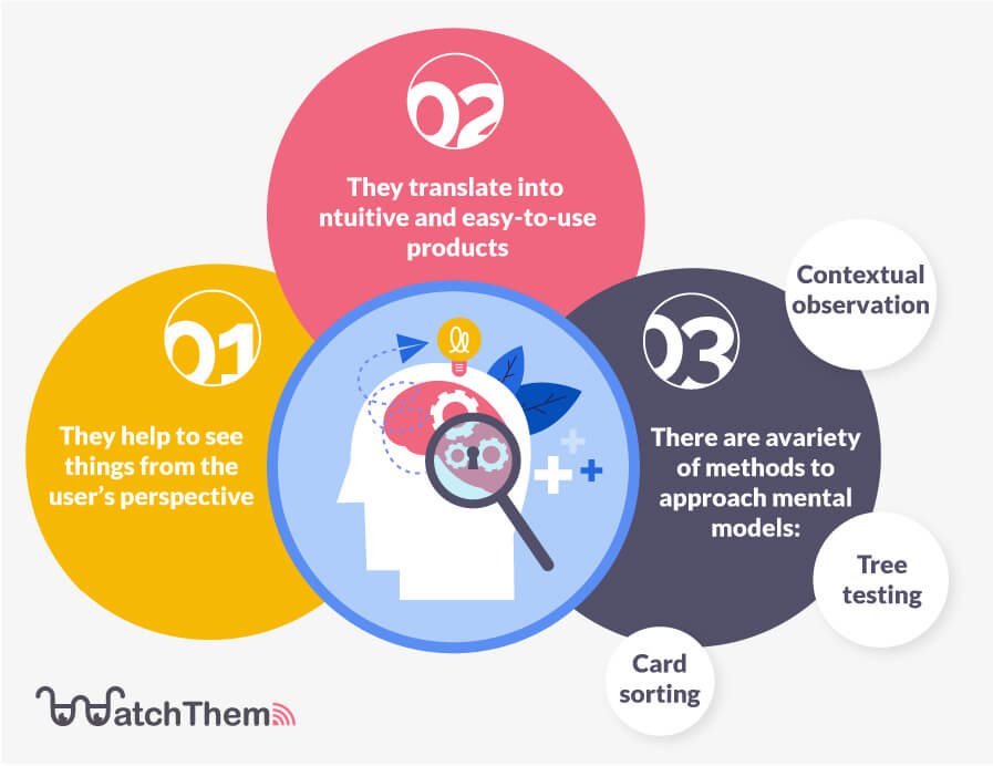
People will think and act in a certain way depending on the mental model they have about the world around them, which UX designers must take into account.
Design teams should exhibit empathy by aligning the design with users’ mental models. For this reason, they have to see things through the eyes of the user. Otherwise, it might confuse consumers who don’t comprehend the interface, making them abandon the product eventually. Designing properly means creating a user-friendly product that requires no effort on the part of the user.

9. Understand the Gap Between Mobile Apps and Web-Based Products
There is a significant difference between developing a website and designing a mobile app. Clearly, the screen size is the most obvious distinction, which means that the visual hierarchy and information architecture will alter from web to app. Therefore, mobile devices require a more straightforward design, as users are more likely to become confused by things like navigation and buttons.
The Best Tool to Put UX Design Principles into Practice More Effectively
We discussed the most important UX principles that you must consider. But in this process, you need some help to figure out what is best for your customers and your design accordingly. Therefore, Our recommendation for this matter is WatchThemLive analytics.
Our heatmap service is what your website needs for better design. By using this service, you can identify your website’s weaknesses and which parts are attractive to viewers. Therefore, your design team can make changes and fix the problems.


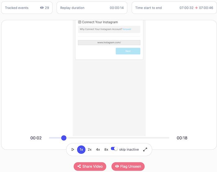
Another service that is useful for your design teams is session replay. This service will record every movement of your website users. This can show you where your websites’ weaknesses and strengths are.

Make your website beautiful and responsive by signing up for our free services.


Conclusion
In this article, we discussed nine main UX design principles that every designer must be aware of. We went through the consistency and usability of the environment you are designing. After that, the amount of freedom you should give to users was discussed. And the most important part was to put your users at the center of your design and build it around them.

