Page Contents
There are certain usability principles when it comes to web design. Usability testing helps you understand what users like and dislike in a design, but to save time, you need to follow some rules to create the best experience for your audience.
A perfect website usability is customer-centric, meaning it meets users’ expectations, needs, and goals.
In this article, we’re going to learn 12 usability heuristics and principles in order to offer your customers a smooth experience.
Note: One way to identify and fix usability issues is using analytics software like WatchThemLive. Keep reading to learn more.
Usability Heuristics
Heuristics are general rules of thumb (not usability guidelines) that are used for interaction design. Ten usability heuristics introduced by Jakob Nielson are among the most famous ones, and we’re going to review them here.
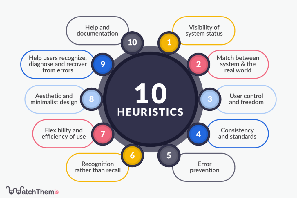

1. Visibility of System Status
One of the most important usability principles is the visibility of system status. The design of a system should always keep users informed about the current status through visual feedback within a reasonable amount of time. An example of visibility of system status is when a system tells a user that your message is sending or has been sent. This way, the system is helping the user to understand their next steps.


2. Match Between System and the Real World
A system should use words, phrases, images, and concepts that are familiar to users. The information should be given to the visitors in a way that they don’t feel the need to look up a word’s meaning. The order of your information should be logical and familiar to users. Keep in mind that some terms might make sense to you or your teammates, but be unfamiliar to readers, so don’t assume that users have the same amount of knowledge as you.
An example of the match between the system and the real world is Microsoft using the real-world garbage bin as their recycle bin icon. When the system matches the real world, you have an excellent customer experience design.


3. User Control and Freedom
While working with a system, users often make mistakes. For this kind of situation, there should be an “emergency exit” for users to undo their mistakes without having any trouble. That’ll give users a sense of freedom. An example of user control and freedom is when a user accidentally clicks on a button, and the system asks if you’re sure you want to do this action.


4. Consistency and Standards
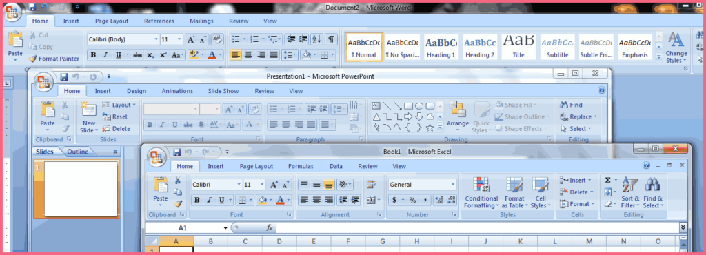
Your system design should follow the standard rules. “Consistency and standards” is one of the essential usability principles for any design. Users should not be guessing if the same actions, words, icons, etc., mean the same thing. An example of consistency and standards is when a user is directed to the website’s homepage by clicking on the brand’s logo. Another example is when Excel, PowerPoint, and Microsoft Word all use the same toolbar style.

5. Error Prevention
Creating good error messages comes after building a system that prevents errors in the first place. There are two ways to prevent errors. First, eliminate error-prone conditions. Second, check and identify errors and give users a confirmation option before they do the action. An example of error prevention is when a system tells the user that they need to use a capital word in their password; or when the system asks if you’re sure to do an action.


6. Recognition Rather than Recall
The information that is required for using an interface, such as field labels or menu items, should be easily retrievable when needed. Since humans have short-term memories, a system that supports recognition, helps users reduce the amount of cognitive effort. An example of recognition is when a system tells the user what a button does, like in the example below, rather than making them remember Its function.


7. Flexibility and Efficiency of Use
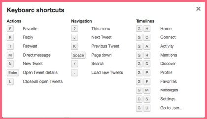
Systems use accelerators, such as shortcuts, to speed up expert users’ interactions so that the system can cater to both inexperienced and experienced users. Users should be able to tailor frequent actions. It means users can complete tasks in a variety of ways. An example of flexibility and efficiency of use is when a system allows users to use the Command + C and Command + V keyboard shortcuts to copy and paste elements.

8. Aesthetic and Minimalist Design
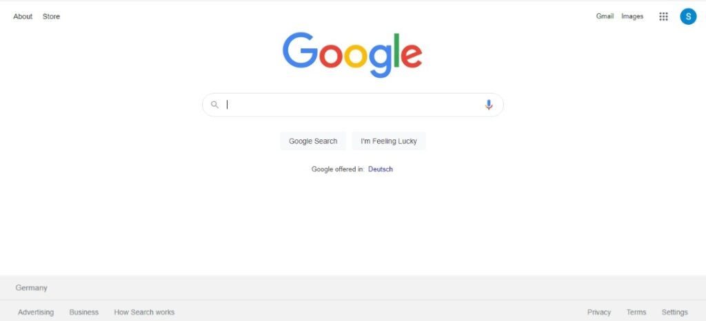
The information used in the interface should be relevant and concise. Any irrelevant information ruins relevant information in a design. For example, you shouldn’t use too many elements in your UI that are not necessary and will distract users from completing their tasks.

9. Help Users Recognize, Diagnose, and Recover from Errors
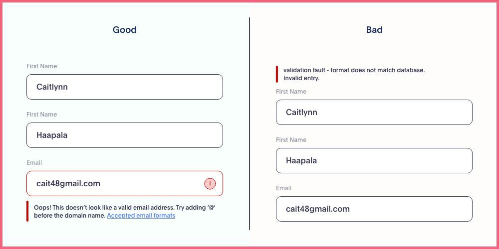
A good error message should be expressed in plain language (no error codes), explain the problem briefly, and offer a solution. Also, a good error message component is a visual representation of what’s going on. An example of a good error message is when the system tells users to enter their email address in a specific format instead of just telling them that their email address is not in the required format.

10. Help and Documentation
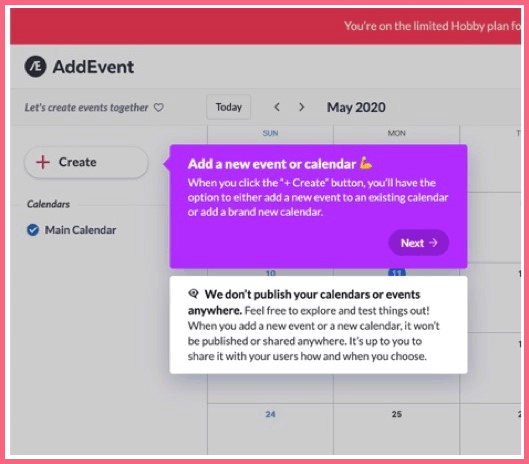
A system must not need additional explanation, but in case an explanation is needed, it should be concise and straight to the point. The documentation should help users complete their tasks, be easy to search, and list the steps users need to take.

Additional Web Usability Principles
Besides the 10 heuristics, there are some other principles that a good designer needs to consider.
11. Accessibility and Availability
Even if you build a perfect website but people can’t access it and it doesn’t work, it’s like it doesn’t exist. As a result, users become frustrated and you will also lose new customers. Examples of accessibility and availability are broken links, not being mobile-friendly, and server uptime.
12. Credibility
Trust is everything in business, making credibility one of the most important usability principles for a website. Even if you create the type of content that appeals to your target audience and they can find it easily, it will be of no use if they don’t trust you. Your content helps users trust you, so make sure it’s unique, concise, and mistake-free. Make sure to provide an “About Us” page along with details about your business such as the company’s number or a physical address if possible. On top of that, you can use testimonials from third parties or the number of your social platforms’ followers to build customer trust.
Find Usability Issues with WatchThemLive
WatchThemLive has excellent features such as session replay software to help you identify usability issues. This tool allows you to follow customer journeys as if you’re in their shoes. The session replays feature records their each and every interaction with your website, and by watching the replays, you can clearly see what satisfies or dissatisfies them. This helps you find any interface problem. Watch this video to learn how they work:
Interested? Sign up for FREE and see what’s next!
Conclusion
In the age of the internet and digital businesses, making a website that stands out and is also user-friendly is not an easy job. However, if you consider usability design principles, you’ll be able to build a website better than anyone!
Keep in mind that in order to find out what your website lacks or what your customers really need, you need to run usability testing multiple times. So don’t give up!
In this article, we explained 12 usability principles with examples to help you create the best customer journey ever!
Good luck:)

