Page Contents
As a web developer, a big part of your job is to create a smooth user experience. Understanding customers’ wants and needs and their thinking pattern is what you need for this purpose.
Knowing common usability issues will help you throughout the process because you might think your website is perfect, but you’re actually very wrong! Usability testing is what you need to understand your website or mobile application’s usability issues, but there are some common usability problems that we’re going to review here.
Note: One way to identify usability issues is using a tool that records visitors’ interaction with your website like WatchThemLive. Keep reading to learn how.
What Are Usability Issues?
Anything that leads users toward an undesirable destination is counted as a usability issue. Usability issues prevent users from task completion and reaching their goals.
How Do You Identify Usability Issues?
One of the best ways that web developers identify usability issues is by using session replay software. It records all of the visitors’ interactions with your website and web app. Later on, you can watch these videos to understand what works, what doesn’t, and the reason behind it. This way, you can eliminate guess-based decisions and replace them with decisions based on real data. Watch this video to understand how session recordings work:
Sign up for FREE and snag session replays now!
Usability Issues You Need to Watch Out for
Any UX designer can identify UX issues in both website and mobile design, and you can’t implement web app designs for mobile devices. That’s because the screen sizes are small compared to desktops, and the size of fonts and buttons change, you need navigation with fewer options, etc. Here we’re going to review the usability issues for both of them to help you recognize and eliminate them.
Usability Issues in Website Design
Website usability plays an important role in any kind of business. If your website is poorly designed, then you’re going to lose great opportunities. But worry not! Keep reading to learn about website usability issues and build a perfect design!
1. Using Pop-Ups
No one likes pop-ups, and that’s a fact! I’m sure even those who use pop-ups on their website are well aware of this fact. We all have encountered one of those pop-ups with tiny close buttons that eventually leads to opening an unrelated page we didn’t ask for. If you respect your customers, don’t do it! Even if you’re going to use them, make sure it’s what they’re looking for.
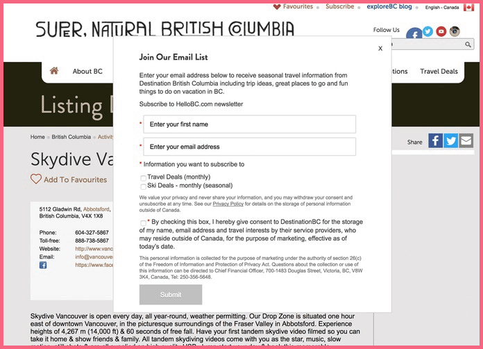
Here’s an example of a bad pop-up from Hellobc.com. It pops up before you can read any content. Pop-ups should be used after the reader has read some of the text because you can be sure that they liked the content. Also, this pop-up is poorly designed and there are too many words that probably no one will read.

2. Small Font Sizes
Visitors shouldn’t struggle in order to read a text on your website. They eventually leave you for competitors if they see that the text is hard to read. Plus, your buttons, links, forms, and other elements should be larger than your text size to make them easily recognizable.
Here’s an example of a small font size from localhost:


3. Changing Users’ Window Sizes
Do not change users’ window sizes! Users know better than you what to do with their software works. They could change it themselves if they wanted to.
4. Bad Navigation
Your navigation should be simple and contain the primary elements customers look for. A cluttered navigation makes it difficult for customers to find what they’re looking for. Instead of stuffing your navigation menu, you can always use subpages or sub-menus, but don’t use them excessively. For this purpose, you should learn navigation best practices to design your website in the best way possible.
This is an example of a very disturbing and cluttered navigation that will confuse visitors instead of leading them. There are too many elements, and users can’t easily find what they are looking for.


5. Slow Loading Speed
Use website performance testing tools that measure your website’s speed. Studies show that customers leave for another website if it takes longer than 2 seconds to load. So you need to make some changes if your website takes 3 seconds or more to load.
6. Contacting You Is Not Easy
It’s a big mistake to put the ‘contact us’ button where it is hard to reach, or not have such a button at all. This simple button is what makes you trustworthy; if you don’t have it, then you’re going to lose many opportunities.
7. Links Not Opening on the Same Page
It’s visitors’ choice if they want to open a link in a new tab. When you make this decision for them, you’re taking their control from them, which is annoying.
8. You’re Not Consistent
The design of every element on different parts and pages of your website should be coherent. Your fonts, color palette, button design, navigation labels, and other elements should work together to make your website unique, recognizable, and a unified whole.

9. Bad User Interface
If your visitors can’t understand how to work with your website because it’s complicated, inconsistent, or slow, that means you have UI problems, and you have to fix them as soon as possible.
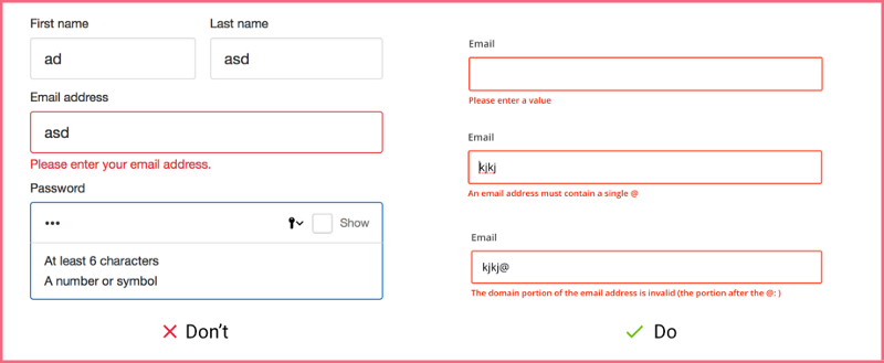
This is an example of a terrible UI from Yale School of Art. It’s not what people are used to. The navigation menu is stuck to the left side of the page. Overall, people will get confused and need time to learn to work with this website.

10. Poor Error Messages
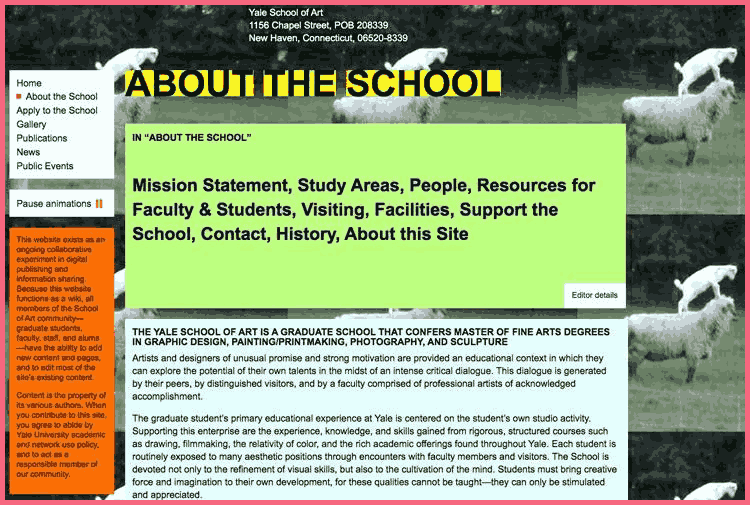
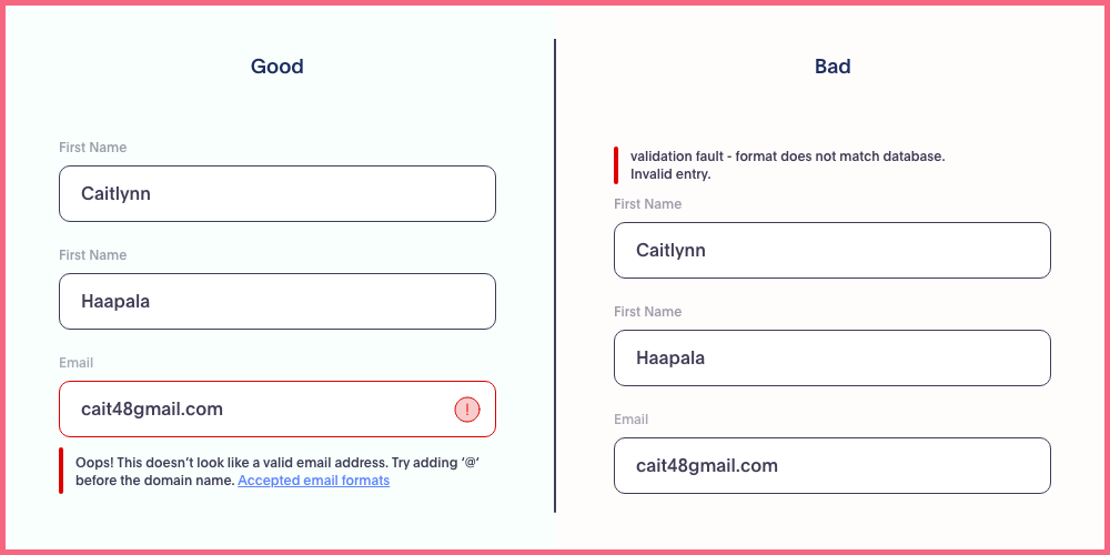
Customers hate to be faced with error messages constantly and for every little thing. For example, if the passwords on your website have special scripts tell the visitors in advance before shoving an error message in their face. Tell them that they need to include, for example, letters and symbols before they choose a password. Use error messages when it’s actually needed.

Usability Issues in Mobile Applications
Mobile usability issues are pretty common. Mobile users form 54.4% of web traffic, so if you’re developing a website, make sure to make it mobile-friendly. Here we’re going to review the most common usability problems in mobile applications.
1. The Lack of Compatibility with Different Devices
Your design should be compatible with different types of mobile devices and operating systems, so everyone can have a smooth experience with your brand. Don’t forget to consider different screen resolutions.
2. Vague Content
The content for mobile devices should be concise and informative. Too much information will be hard to read on a small screen, and too little information won’t help users in completing their goals. Make the content simple but informative.
3. The Lack of User Freedom
Make sure that your design supports back and forward buttons so users can go back if they accidentally take a route they didn’t mean to take. They should have the freedom to enter and exit a page without facing lengthy explanations.
4. Poor Error Handling
One of the user experience problems that cause frustration is the combination of poor error handling and bad error messages. Your error messages should be descriptive and explain why the error happened and what they can do to fix it.
5. Complex Navigation
One of the main reasons for a high abandonment rate is complex navigation. A poorly designed navigation makes users leave you for competitors. They shouldn’t struggle to learn how to work with your app or website. Minimize the number of options and avoid adding unnecessary buttons so users won’t get lost.
6. Long Scrolling
Try to keep the important content above the fold where there’s no need for scrolling. Scrolling is inevitable in most cases, but users need to find the information they need within the limits of their screen. The main actions should be easily accessible. Whatever you do, don’t use side-scrolling since it hides valuable content.
7. The Lack of Landscape Mode
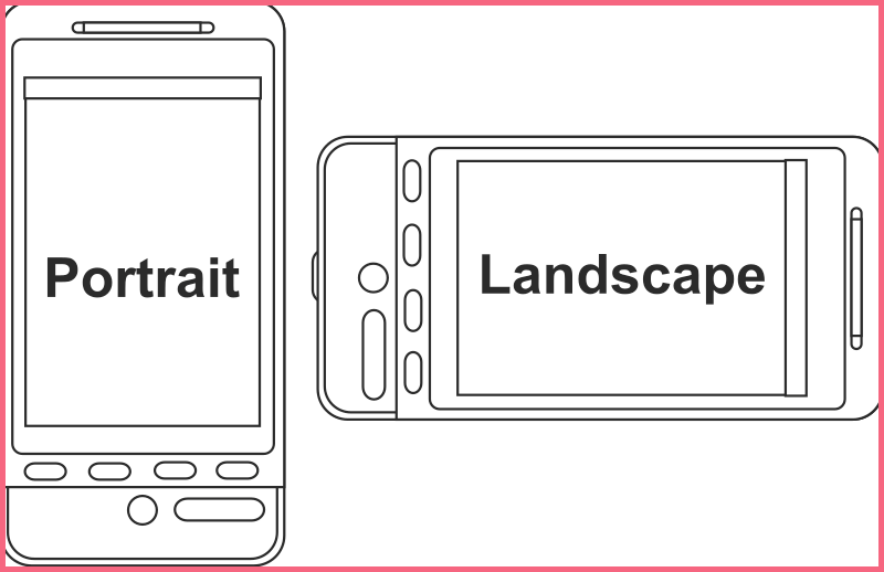
Mobile devices have two modes portrait and landscape. Many designers think that the landscape mode is not necessary, which is totally wrong! Your app should support both modes for the perfect UI/UX design, especially if your app includes video content.

8. Tiny Text
Tiny text and elements increase the percentage of accidental and incorrect inputs, which is very frustrating. Use a reasonable text size and font to help users have a better experience.
9. Not Offering Auto-Suggestion and Auto-Complete
Auto-suggestion is one of the best ways to be user-friendly. When users visit your website frequently, entering their information several times becomes frustrating. With auto-suggestions, you’re enabling users to skip typing recurrent information each time and speed up the process.
Your auto-suggestion should consider user search terms, related searches, and trending searches. But keep in mind to have an edit button so users can choose between several options or undo an incorrect suggestion.
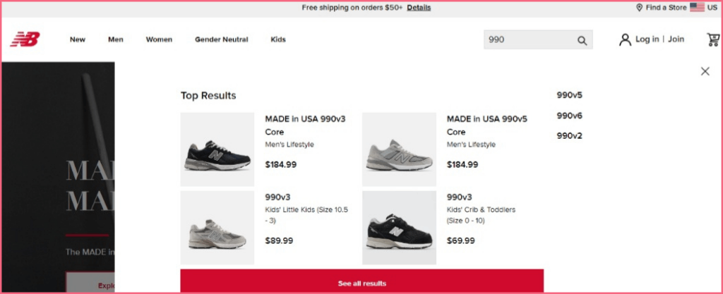
Here’s an example from the New Balance website. When you search the starting numbers of a shoe code, it will bring up products that start with that code. This makes it easy for users who are looking for a specific kind of product.

10. Not Providing Visual Feedback
Users need some kind of visual or auto feedback on user interactions so they can have a smooth experience.
Conclusion
Usability shows how easy users use your product and if they can complete their goals. Your product’s usability should be efficient, easy to learn, and satisfying.
Your website and mobile application are where people have their first impression of your brand, so it should be designed in the best way without having any usability issues.
One way to understand your website or web app usability issues is using session replay software like WatchThemLive, which records visitors’ interactions. Sign up here and start evaluating your website usability now.

