Page Contents
The “add to cart” button is a crucial visual feature that contributes to your online store’s success. Most eCommerce businesses take action to improve the shopping cart design. But “add to cart” buttons are viewed as an afterthought.
You may say, “it’s just a button!” but it’s not.
Neglecting the importance of this button’s design may result in lost revenue opportunities. That’s because this simple button has a high impact on the revenue-making of your business.
So, if you want to boost conversion on your eCommerce platform, redoing your “add to cart” button is a good idea.
There’s a lot to experience and apply to your online shop, from color to shape to size, etc. But where should you start changing your “add to cart” button?
Let’s follow these five tips for designing the “add to cart” button on your website:
1. Contrasting Colors
There has been much discussion about which color is appropriate for your “add to cart” buttons.
Some people believe that red converts the fastest. However, some believe it is the color green that will transform your button into an effective conversion machine.
The truth is there is no “one-size-fits-all” solution.
Instead, you should consider color contrasts when designing your button. The color that converts the most stands out from your website’s background color. Hence, using contrasting colors can boost your eCommerce website’s conversion rate.
You can use the color wheel to see what color contrasts with your website’s color scheme. In the color wheel, the complementary or contrasting color of each primary color is located opposing it.
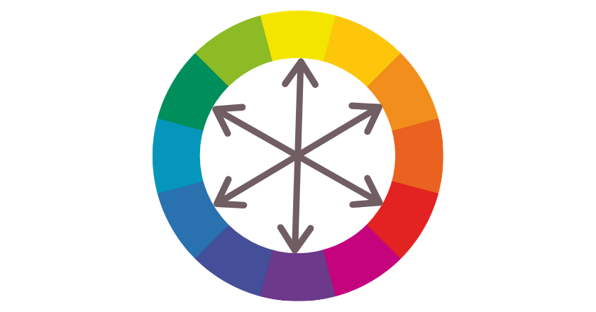

For example, if the website’s color scheme has many purples, a yellow “add to cart” button will stand out. Thus, visitors will be more willing to click on a yellow button than an orange one.
For more insight, you can check out this article: Using CRAP Design Principles for Creating a Great UX Design
2. Button Shapes
Different shapes are used for the “add to cart” buttons on eCommerce websites. For example, some websites use rectangular buttons, while others use pill-shaped buttons.
Walmart and Wayfair use a pill-shaped button for their “add to cart” button. Victoria’s Secret, eBay, and Macy’s have rectangular “add to cart” or “add to bag” buttons. On the other hand, Amazon uses a rectangular shape with rounded corners.


Regardless of the shape of the buttons, it’s important to have enough space around them so that they are clickable without much effort from the user.
3. Optimize the Size
Like the “add to cart” button color, there are controversial views about button size. Many people think that using large-sized buttons converts better. Others use button sizes below 100 pixels.
Again, there is no “one-size-fits-all” button size for the “add to cart” option. However, you should find an optimum size compared to the other elements on your website.
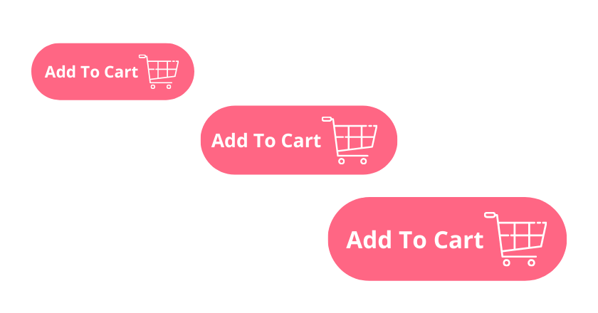

If you use small elements like fonts and images on your website, a slightly bigger button works well. Now, for a website with large elements, the button size needs to be bigger than the one you use.
The point is that the button should be large enough to be more noticeable than other elements but not too large.
You can test if the button attracts your attention within the first second you look at the product page. You will see the other elements and then the add to cart button or notice the button immediately.
4. Design Details
There are some details that you can consider while designing your unique “add to cart” button. If you want people to click on your site’s buttons, they have to look like buttons.
So, use design features to make it evident from the start. Subconsciously, features like a slight gradient, shadow, or, better still, an arrow saying to the visitors, “Click here!”
Such details attract their attention and show that there is something to do.
Look at these two buttons. Which one do you find more interesting and like to click on?


The “add to cart” button on the left has a solid color without specific details. However, the one on the right side has gradients and seems to be more noticeable and clickable. Its design makes us curious to see what happens if we hover or click on it.
5. Make it Sticky
Consider making the “add to cart” button sticky for your mobile website or mobile eCommerce app. A/B tests show that sticky “add to cart” buttons increase orders by 7.9%.
Seeing a sticky button below the screen while being able to read the whole product details is very effective. It reminds users to click on the button right after making their decision.
Ready to Optimize Your Add to Cart Button Design?
Are you ready to improve your Shopify, WooCommerce, or other shopping platform’s “add to cart” button? Let’s see how WatchThemLive empowers you to analyze your current button effectiveness and test your new button design.
Website Heatmap
The website heatmap service lets you see which parts of your website get most of the users’ attention. A heatmap illustrates how users interact with your website to accomplish the conversion goal. For example, if there is an issue with your eCommerce website’s UI/UX design, they cannot complete the goal.
The good news is that by using a heatmap, you can fix issues before it’s too late and your customers are gone.
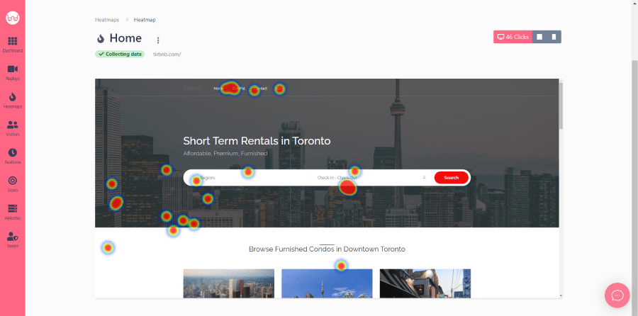

You can find out what’s preventing visitors from converting. Heat mapping provides insights on how to create more converting “add to cart” buttons and increase conversion rate.
Session Replay
Session recordings or replays are a smart way of testing your newly designed “add to cart” buttons. Using them, you can achieve a higher conversion rate.
WatchThemLive lets you see how users browse your site in real-time and fix issues as soon as they happen. Watching these recordings, you can understand users better, which eventually contributes to your conversion rate and business bottom line.
Conclusion
We discussed various design aspects of the simple but important “add to cart” button throughout this article. As you know, different colors, shapes, and sizes are used to design these buttons by well-known brands. The point is to find the right design for your unique eCommerce website.
Similarly, consider design details such as shadows and gradients or specific shapes and icons to increase engagement.
More importantly, use practical tools to check how real users interact with your current and new buttons. WTL’s heatmap and replay services are functional solutions providing you with beneficial insights on your “add to cart” button design.

