Page Contents
Above the fold is the part of your website that makes the first impression on your visitors. And we all know how first impressions count. That’s why you must make sure the first thing people see on your website encourages them to stay.
So, in this blog post, we will discuss the best practices to design a more effective above the fold. We’ll also show you some excellent above the fold website examples and a useful tool to track your own.
Let’s waste no more time and get to the point!
What Does Above the Fold Mean?
What is above the fold, by the way? The term originally refers to the upper half of a newspaper’s front page; while, below the fold is the term for the lower half of it.
Newspapers are published on large-size pages which are folded in half. This way, only the top half of the front page is visible to the customers on newsstands. Publishers make the most out of the above the fold by presenting their most attention-grabbing content on this part. Therefore, people would be persuaded to buy the paper.


Image credits: litmus.com
What Is Considered Above the Fold on a Website?
So, what’s above the fold on a website? It’s the part of your website that visitors can see without needing to scroll down. And the area that becomes visible after scrolling is below the fold.
You can see the two sections separated by the fold line in the image below.
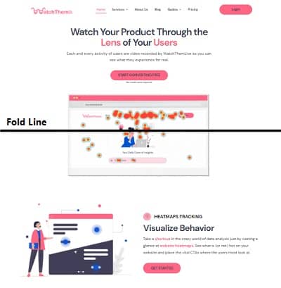

Although people scroll on web pages more than before, they still pay more attention to the above the fold content. Therefore, the content you put into this area really matters. It should capture visitors’ attention and make them interested in your offer, just like newspapers.
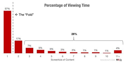

Image credits: Nielsen Norman Group
These days, a considerable variation of devices and screen resolutions exists. On each device, users will see a different above the fold placement. Thus, It’s impossible to define a specific fold line.
Above the Fold Website Best Practices
Above the fold is a highly important area on web pages. If visitors don’t find the information they’re looking for right away, they will leave your website. In fact, people usually abandon websites in 10 to 20 seconds.
However, by clearly communicating your offer in the first few seconds, you can keep them engaged and prevent them from leaving so quickly.
Here are some above the fold best practices to intrigue users to scroll down and take action. Make sure to follow them to increase your lead conversion rate.
If you want to design a more professional above the fold, this blog post can be useful: Using CRAP Design Principles for Creating a Great UX Design
1- Make Your Offer Clear
When people visit your website, they should clearly understand what your offer is. If you don’t make it known right off the bat, visitors will leave without any hesitation.
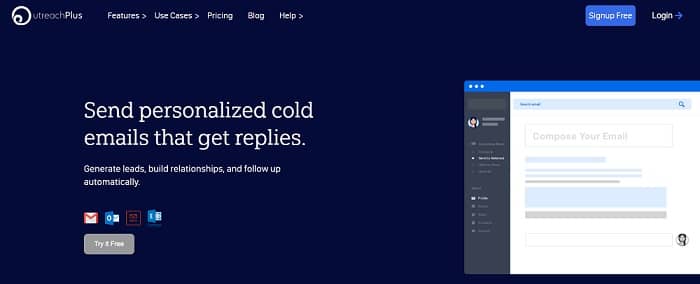
Write a headline that tells visitors what your business does. Remember to keep it simple and briefly explain what problems you solve. Encourage people to take the next step and learn more about how your product or service can help them.
Below you can see how simply OutreachPlus communicates their offer.

2- Create a Great Value Proposition
Telling people what your business does isn’t enough because it’s highly likely there are lots of other brands out there that offer the same thing as you. That’s why you have to show what makes you different from others. So, let visitors know why you are unique straight away without having them scroll down.
Write an effective value proposition that tells users why they should choose your product or service.
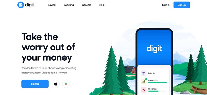
Digit does a great job at conveying its value proposition above the fold. What differentiates Digit from other savings apps is automation. When you visit their website, you can immediately understand what makes it unique.

3- Use Stunning Images
People process images much faster than text. Web pages that include visual elements are more appealing and more successful at catching users’ attention.
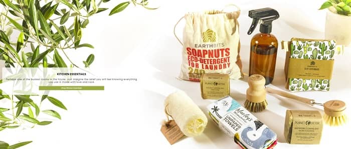
Add a photo to your above the fold to make it more interesting. Use a professional photo with an eye-catching color scheme. Make sure the image you choose matches your brand’s identity and expresses its essence. Moreover, use a more personalized one, not just a generic stock photo.
You can use above the fold area to showcase your products like Earthbits.

5- Create a Simple Design
As mentioned earlier, above the fold is where you should put the important stuff. It’s tempting to place a lot of content on this area because you might think they are essential. However, too much content above the fold makes it look busy. People will get confused and leave your website because they can’t find the answer to their questions quickly enough.
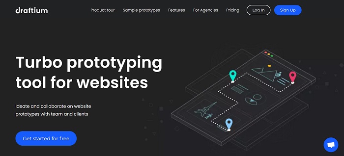
Remember to use only one visual element. Add an attractive headline and a brief explanation that describes your business. That should be enough, as you can see in the example below, the Draftium website.

6- Optimize the Navigation
Visitors want to find what they are looking for as easily as possible. Put yourself in their shoes; imagine how frustrating it is when you visit an eCommerce website, but you can’t find the product you want.
Simple and user-friendly navigation is necessary for each website. It helps people quickly find out what you have to offer.
Ensure that your navigation bar is visible enough and guides people to important pages. These are the pages you must include in your navigation bar:
- Products or services pages
- Contact page
- About page
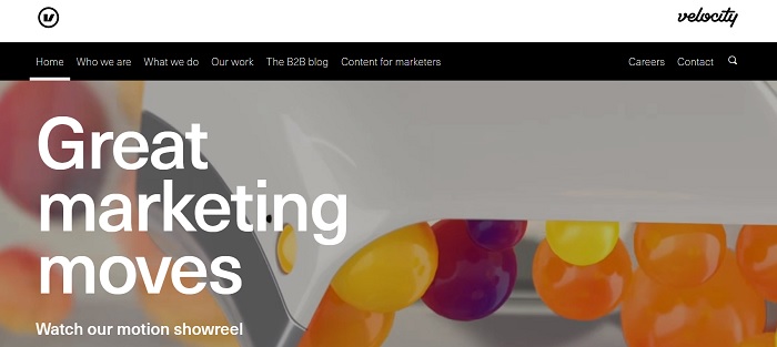
See how simple and user-friendly the Velocity Partners’ navigation menu is.

How to Measure the Success of Your Above the Fold?
Now, you might be wondering how to know if your website’s above the fold is engaging enough. You can get help from a user behavior analytics tool such as Watch Them Live. This tool offers a heat mapping service that enables you to track users’ interactions on your website.
Maybe you have added a CTA above the fold of your website and want to know how it’s working. WTL heat maps allow you to see how visitors interact with the CTA button so you can optimize it.
You might want to improve your website’s navigation menu. If the heatmap shows you an item on the menu is not receiving any clicks, you should probably remove it.
Heat maps can help you in many ways to optimize your website. They have become one of the most popular tools for tracking user behavior mainly because they are very easy to understand.
Want to try out Watch Them Live heatmaps? Sign up now and get your free trial!
Conclusion
Creating a compelling above the fold is essential for engaging users and encouraging them to convert.
In this article, we discussed some practices and above the fold website examples to help you improve your design. You can also use a behavior analytics tool to make your design even better.

