
Page Contents
A landing page is one of the crucial elements that can repel your customers or absorb them. Every single detail of your page is important and can impact your visitors and help to convert them into customers. If you are looking for some tips for your landing page, here we will discuss four fascinating landing page ideas to boost conversions of your page.
Note: Understanding the function of your landing page is a crucial element in improving your conversion rate. If you are looking for a tool to track your users’ interaction data, sign up to WatchThemLive and get immediate access to it.

What Is a Landing Page?
A landing page is a page for marketing and advertising purposes to which you refer the visitors whenever you want to draw website traffic and conversions. For instance, look at the Codecademy’s landing page:

Codeacademy’s landing page has a simple form and design. You only need an email address and password for creating an account. It also uses a real-life picture that can affect its page’s conversion rate at first sight.
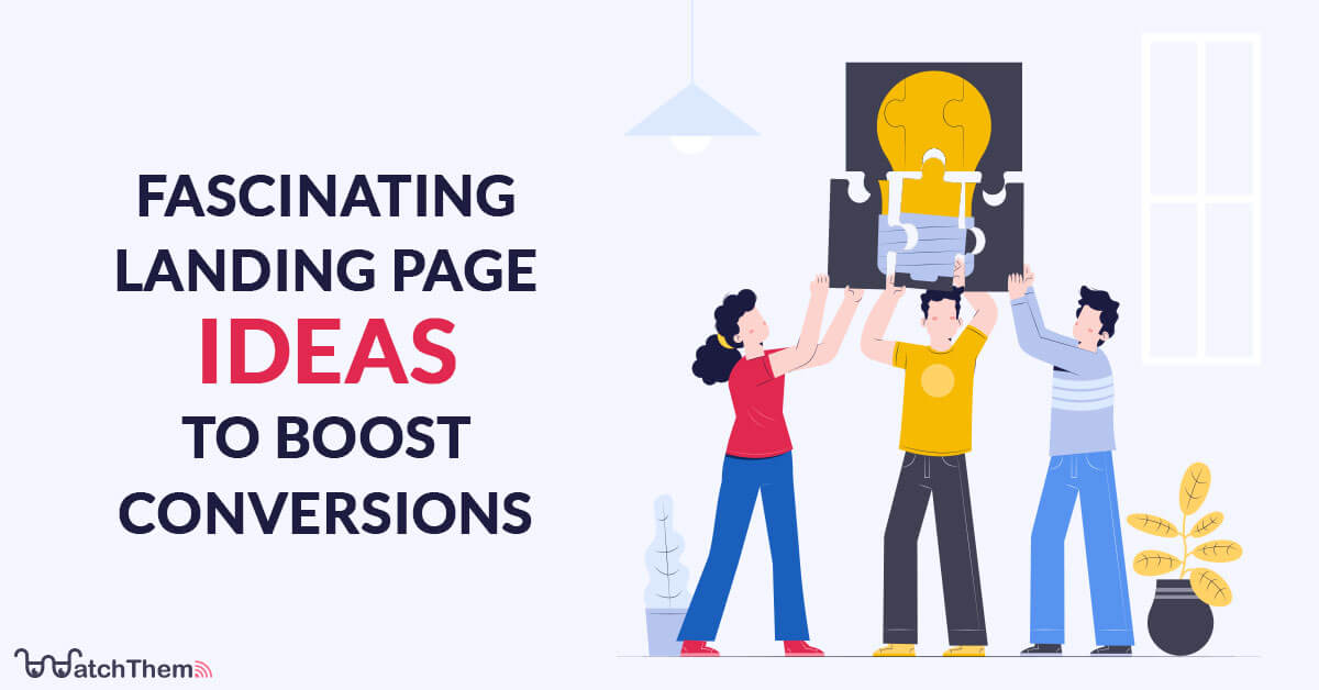
4 Captivating Landing Page Design Ideas to Increase Your Conversion Rates
Creative landing page ideas help to keep viewers on the page. Creating and testing landing page optimization is one of the challenges you need to know in the marketplace.
Your landing page should be attractive and grab the viewer’s attention when they run into your page. We highly recommend these ideas to anyone who wants to improve their landing page’s engagement rate.
You can apply these incredible landing page ideas, and then by tracking your user’s behavior, you can see how each idea pans out.
1. Applying Powerful Calls- to- Action (CTA)
Your call-to-action is one of the essential elements of your landing page because it persuades the visitor to take the next step and become a customer. To make it stand out, ensure the design is eye-catching. In most cases, you should have your CTA come in the form of a button on your page.
If you want to attract the viewer’s attention, the button’s color should contrast with the rest of the page. Your CTA will be more effective if it differs from your primary colors as long as it stands out.
In addition, a compelling copy that is clear and relevant to what you’re offering is essential. Instead of making a big red button that only says ‘submit,’ make a button that says ‘get access now,’ ‘grab your free download,’ or ‘start your free trial.’
If your page has multiple elements that highlight the value of your services, you’ll need to add a few more buttons for the same action. So people know what to do at the next step.
If you’re using the landing page as an endpoint of your subscription campaign, there should be no problem showing monthly and yearly options. Remember, CTAs should be consistent with each other and in service of the goal at hand; if you propose more than one action, viewers feel overwhelmed with too many variables to process before making a final purchasing decision.
An excellent way to measure your CTA’s effectiveness is using heatmaps. To set up a heatmap on your landing page you need a behavior analytics tool such as WatchThemLive.
With heatmaps, you can track visitors’ interactions with your landing page’s elements. This way you will determine whether your CTA is attracting attention and which elements are distracting to improve your design.

Sign up to WatchThemLive and get started with heatmaps and more!
2. Using Great Graphic Designs and Pictures
Images can easily have a positive effect on users and visitors. They can convey your message more effectively. Processing visual information happens faster than understanding a text because our brain can process images 600000 times more quickly than texts.
Images should be large and easy to digest; they should be relevant and specific and transfer a message that serves your landing page’s singular goal to help visitors figure out what you offer.
3. Avoid Unclear Explanations
The question is, why are you bringing people to this landing page? You must have a clear explanation of what you’re offering. Besides the headline and subheaders, add a paragraph for more explanation.
This section is super important because it offers you an opportunity to explain yourself. The best way to grab the viewer’s attention is using the pain-pleasure principle. If you talk about customers’ pains and then try to solve them, it makes the visitors think about it and feel that pain. As a result, they subconsciously want to relieve themselves and ease the tension.
Now, you can relieve the tension by offering some solutions. Remember not to impose your will on customers.
4. Appealing Headlines and Subheaders
Your viewers get their first impression of your landing page from your offer. In this process, you have to keep viewers hooked enough so that they’d move to the next level on the page.
Viewers look at the headline, which is the first element of the page that grabs their attention. The reader should get a summary of what they’ll gain and what the offer is about by looking at the headline. Therefore, it should be intuitive, simple, and clear.
The headline must capture the viewer’s attention; moreover, the subheader needs to keep them on the page. It needs to be persuasive and positioned under the headline. For example, you can use action verbs to connect with the person reading it.
Conclusion on Landing Page Ideas
To conclude, it is vital to keep in touch with your designers and work together to improve your landing page conversion rate. Now you can apply these ideas on your landing page and get the best results!
Want to improve your landing page design to boost conversions? WatchThemLive heatmaps are what you need. Sign up for free now!
