Page Contents
When you see a bad website design, you quickly know it is not user-centric. But it is difficult to find out the cause of this bad design on the websites. Today, designing a website is not a very difficult task, and even if you do not have enough experience in this field, you can create a beautiful website for yourself.
Of course, some elements define the differences between an amateur and a professional designer. Keep in mind that the purpose of removing signs of bad site design is not only to create a more beautiful page but also to create more effective relationships with visitors and improve customer experience in the long run.
In this article, I am going to show you some bad website design examples and define what makes a website ‘bad’. Keep reading to find out what they look like!
Also, if you’re looking for a reliable tool to evaluate your website and its data, WatchThemLive is the right tool for you!
What Makes a Bad Website Design
Bad websites have five features: lack of color contrast, hidden navigation menu, cluttered layout, non-responsive design, and inconsistent typefaces. But the main issue of poor design on websites is a lack of user-centricity.
Users come to your website to buy products or learn. Bad websites have difficulty accomplishing any of these tasks. A bad design could cause frustration, and your visitors may immediately exit your website.
For these reasons, it’s essential to identify and remove what’s causing the issues. One of the most effective ways to do this is directly watching users’ interactions with your website. This way you can see all of their movements, the cause of their frustration, and if they’re having products with an element on your website. Watching their sessions is the best way to do this and to do so, you can use a reliable Session replay software.
Session replays record the whole user session during their whole stay on your website. You can watch and autoplay the session with advanced filtering. For example, you can filter the sessions by name, email, device, browser, screen resolution, etc. By filtering by name and email, you can exclude your own employees’ sessions so you won’t waste your time on them. By filtering by device, you are able to figure out if your website is mobile-friendly or if all kinds of device users are enjoying interacting with your website.
All of this information helps you boost user engagement, create an excellent customer journey, and an exemplary website, and increase your conversion rate and sales as a result.


What Are the Differences Between Good and Bad Website designs
There are some main components that set a good website design apart from a bad one. A valid point to consider when thinking about good vs. bad website design is the fact that it goes beyond its appearance. For example, when visitors enter a website, they expect an effortless browsing experience. In the following we provided the elements of good website design:
1. Responsive Website
Since most visitors use mobile to visit websites, you need to adapt your website to different screen sizes. You should focus on your website content and keep in mind your website objectives and display the content based on them.
2. Text-to-Image Ratio
Text-heavy design is as bad for your business as designs that are laden with images. There should be a good balance between text and imagery to make browsing your website easy for visitors. This way, the visitors can find the information they want and take the necessary actions.
3. Clear Call to Action
A call to action must be clearly and strategically featured throughout your website as it is one of the main goals of a website. Every website has a call to action both in the first and last sections. Without a clear call to action, your visitors do not know which steps to take next.
One of the main elements of good website design is to avoid using features that bad websites use. If you avoid all the bad things mentioned below about poor web design, you will probably have a decent website.
What Are the 10 Characteristics of Poor Web Design
It may be a little subjective to describe the characteristics of poorly designed websites, but in the following, we define 10 characteristics of poor website design.
1. The Design Does Not Fit with Business Objectives and the Target Market
So, sometimes a website designer provides a visually attractive design, but they have forgotten core elements to help fulfill businesses’ objectives. This kind of design leaves out what the visitors need and the usability standards. Website designers must think about the visitors first, then work on web design accordingly.
2. There Is No Balance Between Content and Design
A visually appealing design is not enough. If the website doesn’t offer the information the target audience needs, it won’t work out in the end.
3. A Bad Design Provides a Wide Range of Unnecessary Features
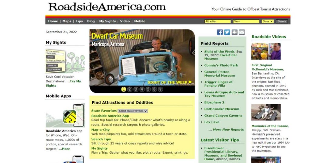
Offering unnecessary features on the website with various elements will overwhelm your visitors; by doing so, finding what they are looking for becomes so difficult. Here is an example of a bad website design with a wide range of unnecessary features.

4. A Poor Design Is Not Up-to-date
websites with old-school design can hurt your business in terms of brand image and functionality. You should keep up with design trends and the latest technology to impress your visitors.
5. Typography That Is Not Matched with Brand Personality
The wrong typographic choice on your website causes the wrong message to be delivered to your site visitors. But you may ask how? Typography gives your brand meaning. It has a set of connotations and represents what your brand stands for. For example, Blackletter fonts are personal while Monospaced fonts have a technological feel. That is why you should choose typography wisely.
For example, Coca-Cola has used the Spencerian Script type font since its inception in 1886, but the popularity of this type of font ended nearly a century ago. While this ensures brand recognition, Spencerian Script is not a timeless font.
6. Lack of Mobile-Friendly Design for the Mobile Audience
Most people use mobile phones to visit a website. Website designers must design a responsive layout. This is crucial because users are spending more time on mobile devices. Instead of marketing just for people who sit in an office or at home, the mobile-friendly design opens many doors. for example, people who are sitting in the park can also check your website.
7. Lack of Social Integration
If your website does not incorporate social media, you will lose the opportunity of engaging customers and attract them. Businesses take advantage of share-centric phenomena. Marketing in social media helps you engage visitors to derive actions that are relevant to your business. For example, if you have a cloth brand and your goal is to become famous and increase revenue, you should build brand awareness by integrating into social media.
8. Lack of Google Maps
Today most people use their phones as GPS. The lack of Google Maps on your website causes losing a customer for good. Google maps help your customers get directions, and also it will help your business rank higher on Google.
9. Poor Site Navigation
Your visitors will abandon your website if it is difficult to navigate. Poor navigation is one of the reasons for losing customers, even if it contains relevant content. Poor navigations have different characteristics. One of them is navigation with too many options. when visitors face this kind of navigation, they are forced to read all content so the decision-making process gets frustrating.


As you see in the picture above, this website uses too many options in its navigation. There are also unimportant links in the primary navigation menu.
10. Hard to Find Contact Information
To avoid it, you should put the contact information above-the-fold and make it easy for the customers to contact your business.
What Are Some Examples of Bad Websites
Here are some examples of bad website design.
Bad Website Design: eCommerce
The primary goal of eCommerce websites is to generate sales. Keep reading to prevent the following mistakes in your website design. Websites with difficult or complex navigation may have high bounce rates or cart abandonments.
1. ZARA
What is the problem? Unconventional navigation.


Visiting ZARA’s website is like looking at an editorial magazine. The design of this website is visually attractive, but shopping, which is the goal of visitors, is difficult.
As you can see, the text on the site is small, and it has a hidden navigation menu (behind a hamburger button.) There is no explicit CTA so the visitors will get confused.
How to improve: The user experience should be a priority in designing. How? by placing a more explicit navigation menu and trying to simplify the user journey.
2. Wayfair
What is the problem? No visual hierarchy.


Wayfair’s homepage will make visitors feel paralyzed with indecision. Whereas ZARA’s homepage does not offer enough choices, there are plentiful options on Wayfair’s homepage. The main issue in this website is the lack of visual hierarchy. Visual Hierarchy is the way of organizing site elements for visitors to gravitate toward the critical elements.
The problem with Wayfair’s homepage is that all elements are the same size and color. This homepage tells the visitors to buy chairs, pillows, and area rugs simultaneously.
How to improve: Wayfair must create a homepage by implementing visual hierarchy principles instead of telling the users to buy everything at once.
3. eBay
What is the problem? Complex product page.


In the screenshot above, there is an excess of information on the product page such as name, payment, shipping, return information, condition, and price. This website presents several options at once. If you scroll, there is another section with more descriptions on shipping and payments.
How to improve: eBay should fix its bad design by cleaning up these complex pages and placing just one or two calls to action.
4. Lipton
What is the problem? Low-resolution images.


Look at this website with low-resolution images. Images on your website can make it informative and memorable if they are high-resolution. T Lipton images take a long time to load and they are also fuzzy.
How to improve: Placing some images on your website is not enough. They should be loaded quickly and can’t be grainy.
5. Madewell
What is the problem? Unclear mobile navigation.
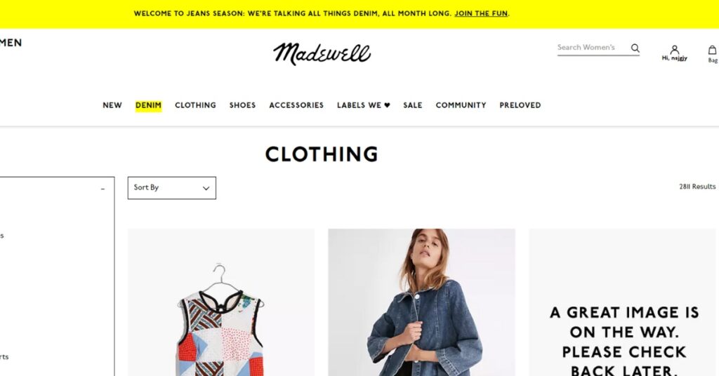

In the second quarter of 2022, 59% of global web traffic will be mobile. Madewell’s mobile site does not balance all navigations and information a visitor needs. It is sleek and clean but missing some crucial features that impact the user journey. For example, you should click on “HI, [Name].” this unclear navigation label is for getting an account and changing your password.
How to improve: Madewell should provide more transparent and obvious navigation. Clear navigation can reduce user frustration and make the user experience more intuitive.
6. Paper Source
What is the problem? Old fashion or outdated design.
Paper Source was founded in 1983, and its website also has an outdated design. As a result, customers may think the products and overall brand are outdated, and they may choose the other one. The other issue in this example is the double CTA placed above the logo, which is confusing for visitors.
How to improve: Paper Source can clean up some clutter on the landing page.
Bad Website Design: Movies
Movie websites try to persuade users to purchase tickets or film rights. If the design of the movie website is old-fashioned, outdated, or difficult to navigate, the visitors may exit. Here are a few examples of the worst websites.
7. The Room
What is the problem? Lack of credibility.


Room’s website has several UX issues contributing to a lack of credibility. There is no navigation menu on this website, and it has a very long homepage. You may think the items below the featured image are the navigation menu, but it is not. These items will open up a new tab if you click on them. Some of them are black tabs. So you should abandon the website.
How to improve: The main problem in this website is the lack of credibility, so by adding a navigation menu and fixing broken and blank tabs, the website will get a significant boost.
8. IMDB
What is the problem? Cluttered layout.


IMDB has changed the design of many pages, but some of its pages still have outdated designs. In this screenshot, there are some UX pain points. There is little whitespace, small fonts, and many ads and other content. There isn’t an easy way to navigate the page either.
How to improve: This website has an overwhelming layout. In this case, the website manager should fix the outdated design, reduce clutter and add whitespace.
9. Fandango
What is the problem? No clear CTAs.
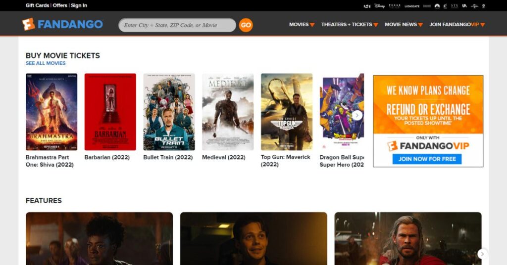

Fandango’s website lacks a clear path for visitors, like Wayfair, ZARA, and other mentioned sites. The explicit CTA instructs visitors to buy tickets, but there is no live link to checkout. The other issue with this website is that using muted color schemes can cause lack of visual interest.
How to improve: This website should add a live link for visitors. This way, visitors can rapidly purchase their tickets. By doing so, it will enhance its website UX.
Bad Web Design: News
The primary goal of a news website is to serve as much content as possible. This goal will be achieved by promoting various content without overwhelming or confusing visitors. Here is an example of a news website that misses the mark.
10. Yahoo
What is the problem? Whitespace.


Yahoo is one of the popular websites with bad design. The problem with the Yahoo website is whitespace. There is too much negative space above the fold and too little as you scroll—this issue combined with the small font size makes Yahoo an example of bad website design. Various ads also confuse users. As a result, users may decide to abandon the website instead of browsing different content.
How to improve: Yahoo can enhance its website design by reducing the number of ads and being mindful of the amount of whitespace.
11. CNN
What is the problem? Slow load time.


One of the enemies of websites is slow load-time because no one wants to wait for a long time to load a page. Most visitors exit websites if they take more than 3 seconds to load. CNN is an example of slow load time, while it is designed to showcase a variety of content. This website is losing its visitors and positions on SERPs because of slow-to-load issues.
How to improve: It takes time to load, because of its vast content library. the solution is to reduce the number of images, videos, and even text.
Conclusion
The mentioned websites are examples of bad website design because they are not user-centric in some way. Some of them have accessibility issues, such as a lack of navigation; others confuse users with cluttered layouts and the absence of visual hierarchy. You can learn from these mistakes and provide the best experience to your visitors by avoiding them in your design.
WarchThemLive is a behavioral analytic tool that can help you know everything the users do in your domain. Using this tool, you will identify the weak points of your website that made them exit. Sign up now and try!

