
Page Contents
UX design has become increasingly vital in today’s market of rapidly developing interfaces. The user experience (UX) refers to how a person feels when interacting with a system. This encompasses any type of human-device interaction, such as a website, web application, desktop program, and so on.
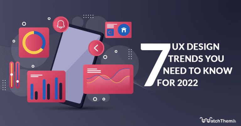
UX is crucial since it aims to meet the demands of the users. Its goal is to provide good experiences that encourage people to stick with a product or brand. Furthermore, a rich user experience enables you to create consumer journeys that lead to commercial success on your website. This article will go through 7 UX design trends that you should know in 2022.
Web platforms need to understand their users’ behavior in order to deliver the optimal user experience and increase conversions. WatchThemLive makes it easy for anyone on your team to find out exactly where users drop off, and what they like and dislike in your product, so you can make the right changes to make a deeper impact. SIGN UP for FREE right now!
What Are the Latest UX Design Trends?
UX design, like everything else, has developed over time. Every year, new trends emerge, some of which stick around and become new norms, while others fade away as they fail to survive the test of time. By learning from good UX design examples and keeping your UX design updated, you may get rid of parts that don’t operate as well as they should or have just aged and lost their luster. You can optimize your website for the best efficiency, user experience, and aesthetics by following these UX trends.
1. Personalized Experience
The trend of personalizing user experience is one of those that will surely stick around for a long time. With so much material available on the internet, more applications and websites are tailoring their experiences to the individual user, whether it’s through giving personalized recommendations or meeting accessibility guidelines. The UX designer’s objective is to produce a design for the product that gives users exactly what they expect and want from it.

Some examples of things based on which you can personalize your users’ experience are:
- Localization (recommendation based on the approximate location of a user)
- Demographics (statistical data like age, education, sex, etc.)
- Behavioral data (data collected from a user’s interaction with a website or an app.)
UX designers use this information to create a personalized experience and journey based on what people expect, want, or need.
One of the best tools out there that can help you gather behavioral data about your users is WatchThemLive. With its user tracking feature, it can show you the journey of each of your visitors, and with the heatmap feature, you can see which sections of your website are more popular. WatchThemLive has lots of other features as well that will give you tons of helpful information. It can also provide you with data such as your visitors’ location, devices, OS, etc. By analyzing all of this information, you can get a deep understanding of your users and personalize your website for each of them. Make sure to SIGN UP. It’s FREE!
2. Passwordless Authentication
According to Google, 75% of Americans feel frustrated trying to maintain and keep track of their passwords. Forgetting passwords is a common user pain point.
We could say a big part of this problem is related to password-setting requirements that force users to include special characters, digits, or upper and lower case letters in their passwords. Although these measures are required for security reasons, they add to the complexity and force users to reset their passwords regularly.
Transitioning to “passwordless” logins, such as using Google, social network accounts, fingerprints, or phone unlock patterns, is an approach that might solve this issue.
It’s one of the latest UX design trends, and several major corporations are already using it.
Although it was not as popular as other types of login methods before 2016, the idea is progressively gaining attention.
3. Dark Mode
Dark themes are all about altering UI design’s brightness and contrast levels to make it more pleasing to the eyes, especially at night time.
Many applications are trying to accommodate this trend. This new UI design style has had a favorable impact on UX and is growing in popularity. UX design teams are making the most of the available design options by creating themes that adapt to the user’s surroundings. The theme is brighter during the day and darker at night, resulting in a way more user-friendly design.
Take a look at the appearance of Spotify’s design as one of the well-known dark themes:

However, before you update this aspect of your UX design, you should compare your app’s usage rate during the day and at night time.
Spotify, Amazon, Netflix, and YouTube already have dark themes because many people tend to use these apps at night.
On the other hand, light themes are ideal for news websites, social media, and other sites that receive the majority of their traffic during the day.
4. Neomorphism
The term “Neumorphism” refers to a new approach to skeuomorphic design. Even though it is related to skeuomorphism, neomorphism brings a fresh focus to the UI design approach.
Consider a calculator in the familiar iOS or Android UI. You have the background, on which there are different components and layers that create depth. In Neumorphism, the interface is soft, and the UI components are hidden behind the background rather than in front of it.
It gives the impression that elements such as buttons or cards are hidden inside the background and are only visible because they are sticking out from within.

The overall design approach is based on solid colors, low contrast, and the proper use of shadowing in the user interface.
5. No More Hamburger Menus
The hamburger menu, or the hamburger icon, is a button that brings up a side menu or navigation drawer in websites and apps. You must’ve come across this icon countless times on so many websites and apps.

Even though it makes the design seem clean and tidy, it is increasingly losing its relevance for two main reasons:
- The features don’t get enough attention: your features are hidden off-screen behind a symbol in the corner.
- Click rates are low on the top corners of the screen: after examining the ease of accessibility of different zones on a mobile device, you can find that reaching the top corner with the thumb is not simple. As a result, putting a hamburger symbol in the top corner is likely to diminish click rates, which might result in customers abandoning your app.

6. Voice User Interface
Voice assistance may not be a new trend but what’s new is how it’s evolving these days. Initially, UX design for voice interfaces was screen-first, which meant that the screen was the first and primary point of contact. As a result, enough focus was not given to the voice interface, and it usually tended to be glitchy and defective.
Speech interfaces are becoming more important, and more people are using them; thus, there is a greater need to provide a seamless experience between the user and the voice interface. That’s why it’s crucial to think about the experience not just from the perspective of a screen, but also from a voice-centered perspective, or at the very least a combination of the two.
7. Inclusive Design
Inclusive design is defined as “intentionally including the needs of users who are likely to experience exclusion in different aspects of their daily lives for being part of a statistical minority.”

A designer needs to consider the fact that their own perception won’t apply to everyone. To avoid this problem, a product should have a physically, cognitively, and emotionally adaptable design for anyone.
“If we don’t intentionally include, the risk is to unintentionally exclude.” -Stephen Frost
There are three essential principles in inclusive design:
- Recognize exclusion
Inclusive design not only makes the products and services more accessible to a broader audience but also mirrors how people are in real life. A design should represent how humans evolve and adapt to the environment around them.
- Solve for one, extend to many
Everyone has abilities as well as limitations to those abilities. Designing for persons with persistent impairments leads to designs that are beneficial to everyone.
- Learn from diversity
Humans are the true experts when it comes to adjusting to diversity. People are at the core of inclusive design from the start, and their new, different viewpoints are the key to meaningful understanding.
Conclusion
At this point, you must be completely aware of the impact that your UX design can have on the success of your business. By understanding the essential UX design principles and applying the UX design trends discussed in this article to your website or app, you can give your users the best possible experience in 2022.
Are you wondering how you can track your user activity and analyze it to improve your design to a very great extent? WatchThemLive offers features such as heatmaps, analytics, session replays, etc., to give you a deep insight into your user behavior. SIGN UP for FREE!
